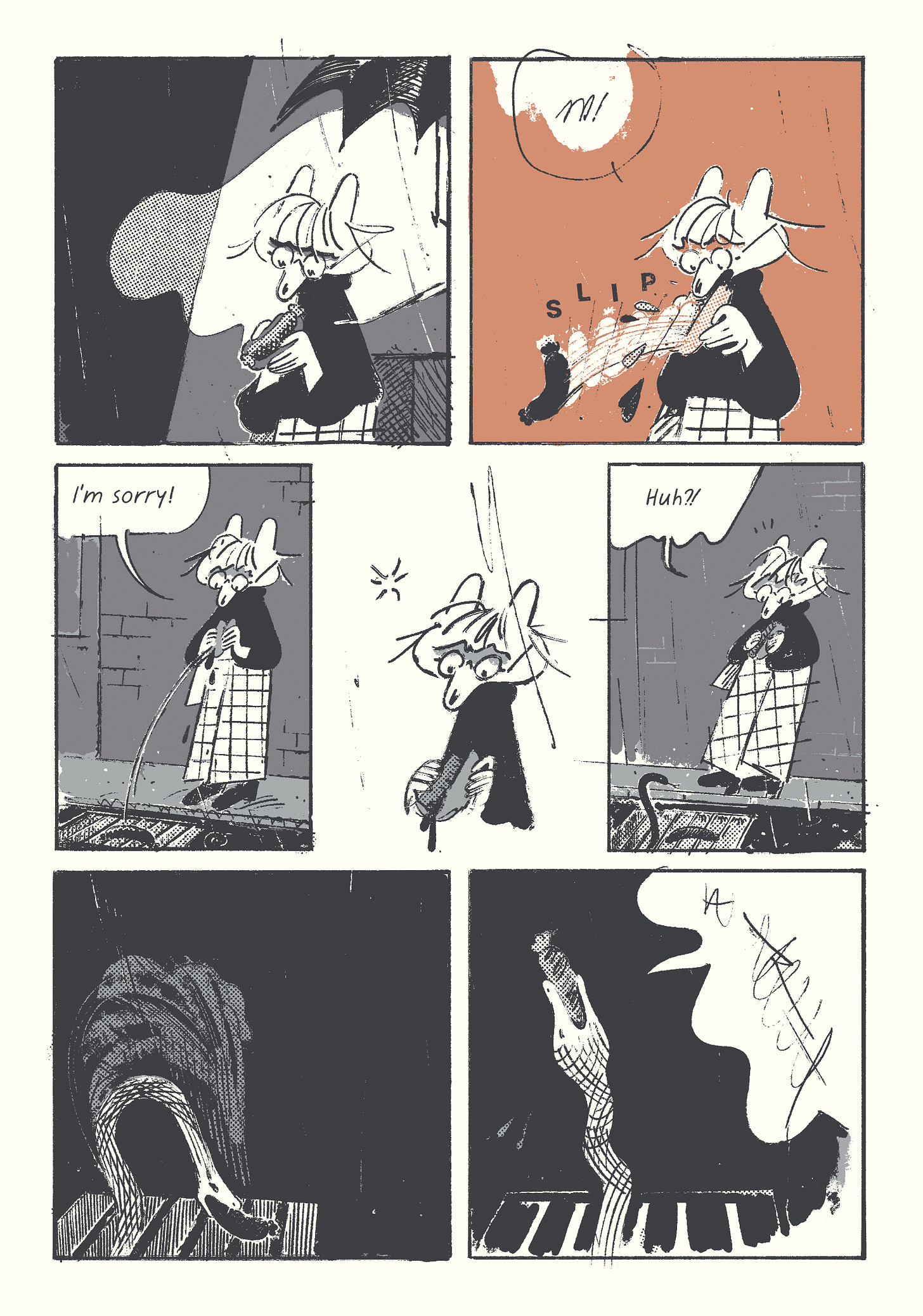
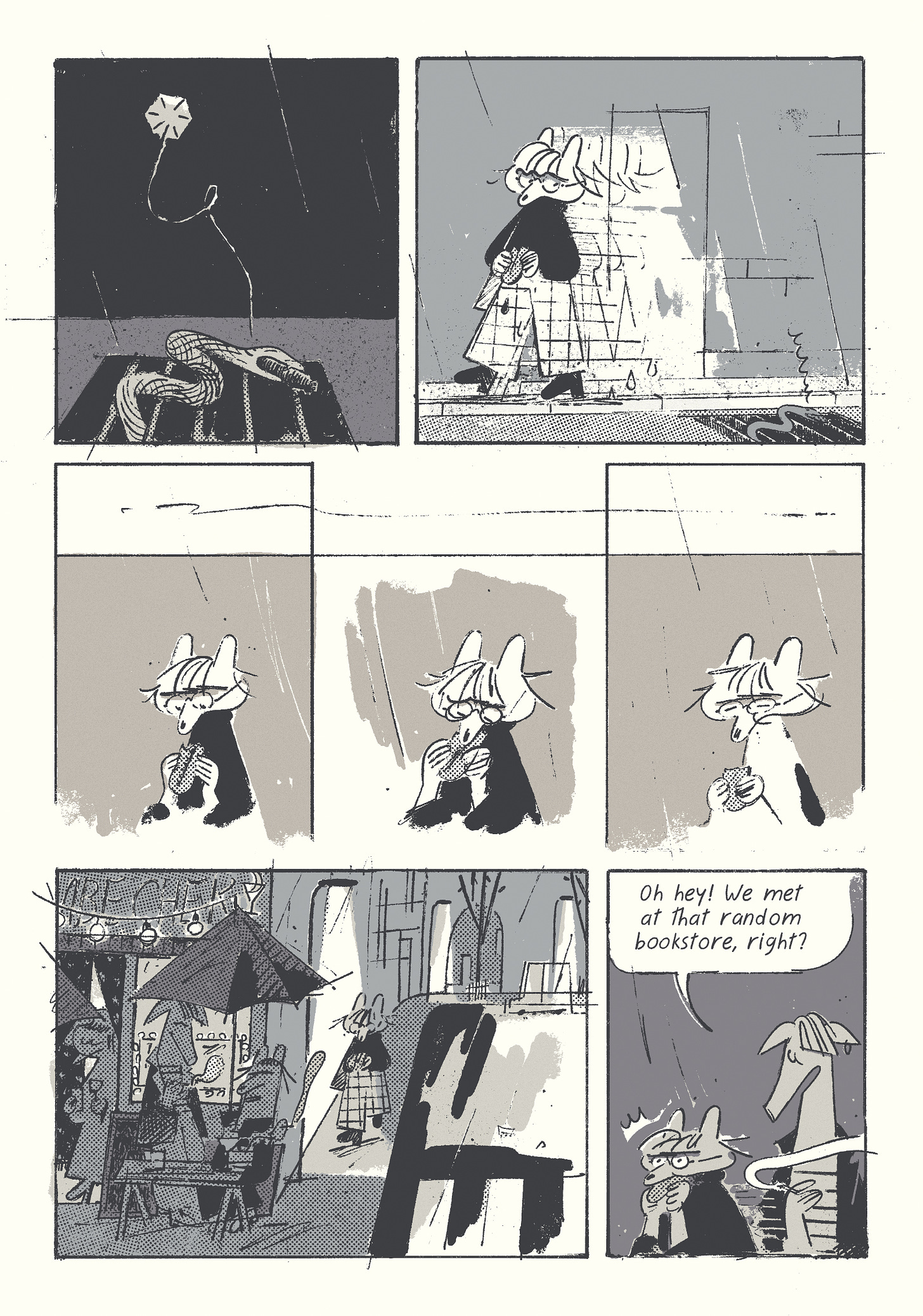
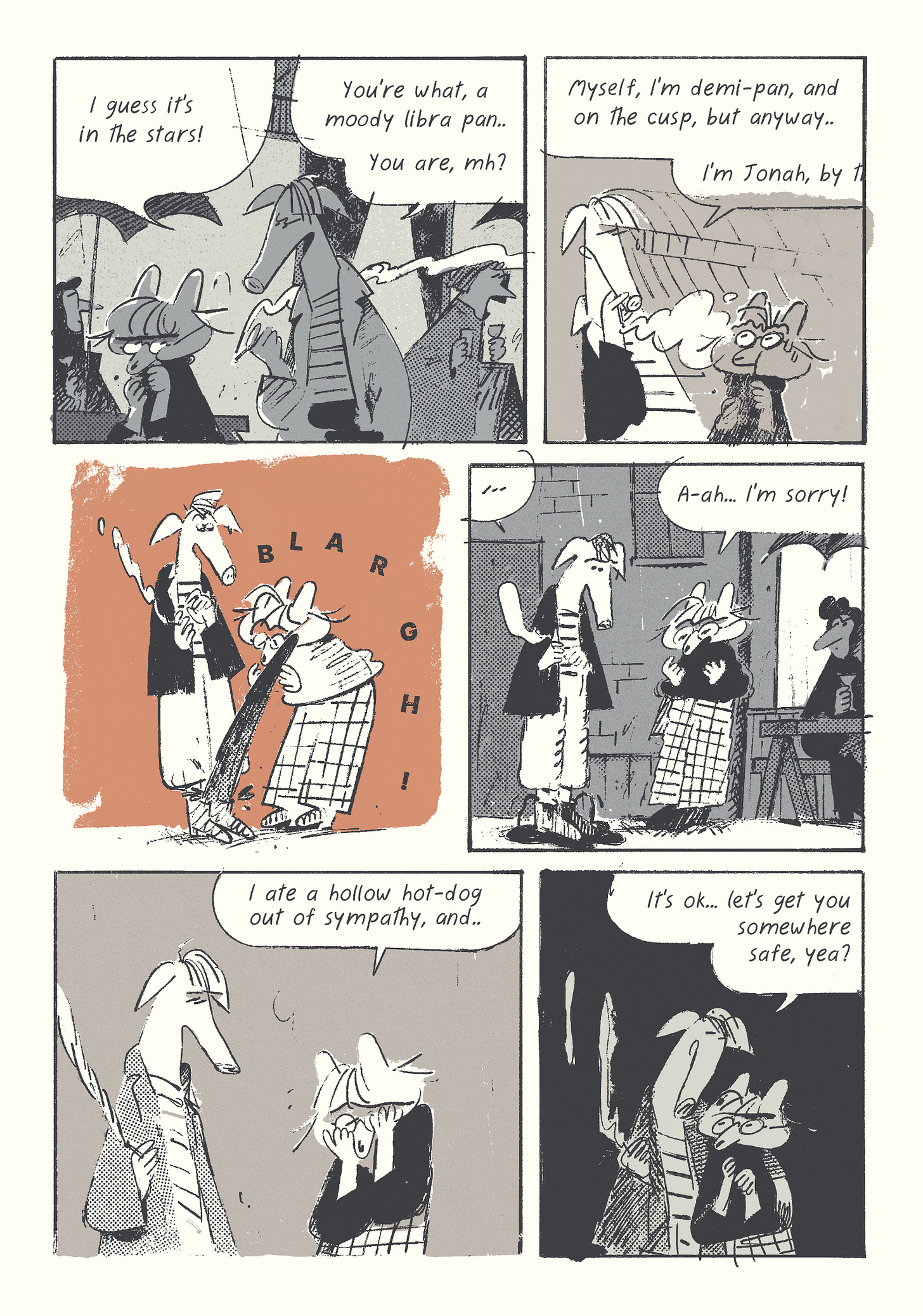
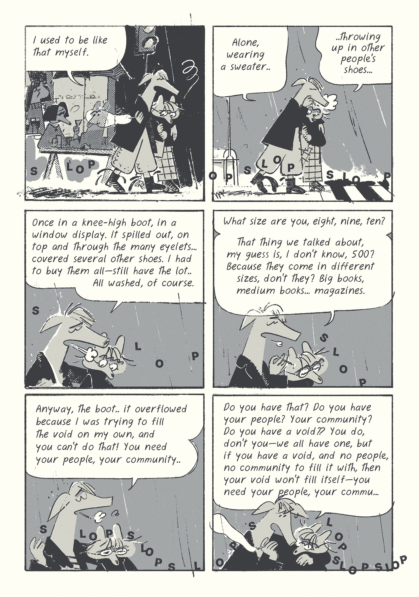
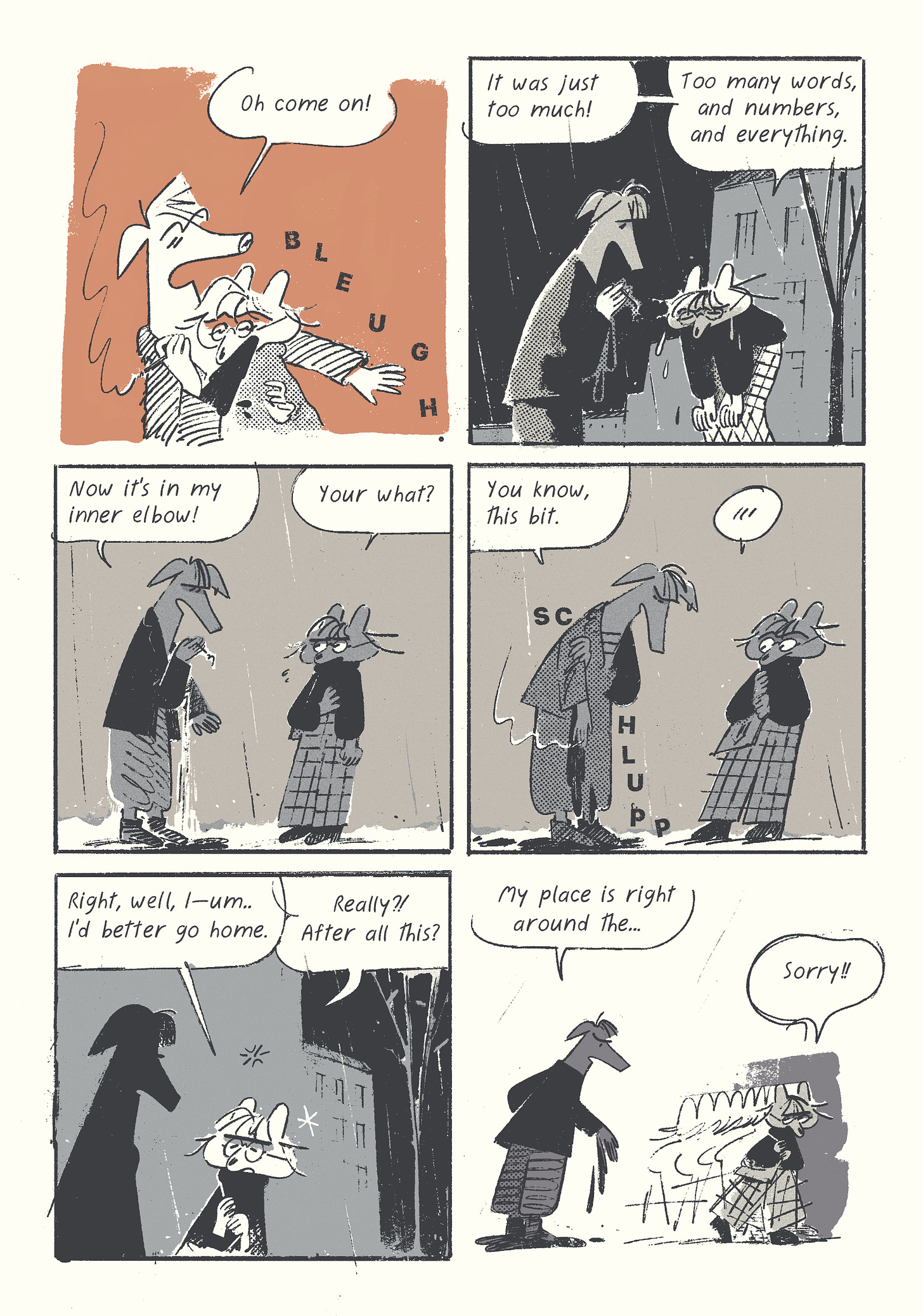
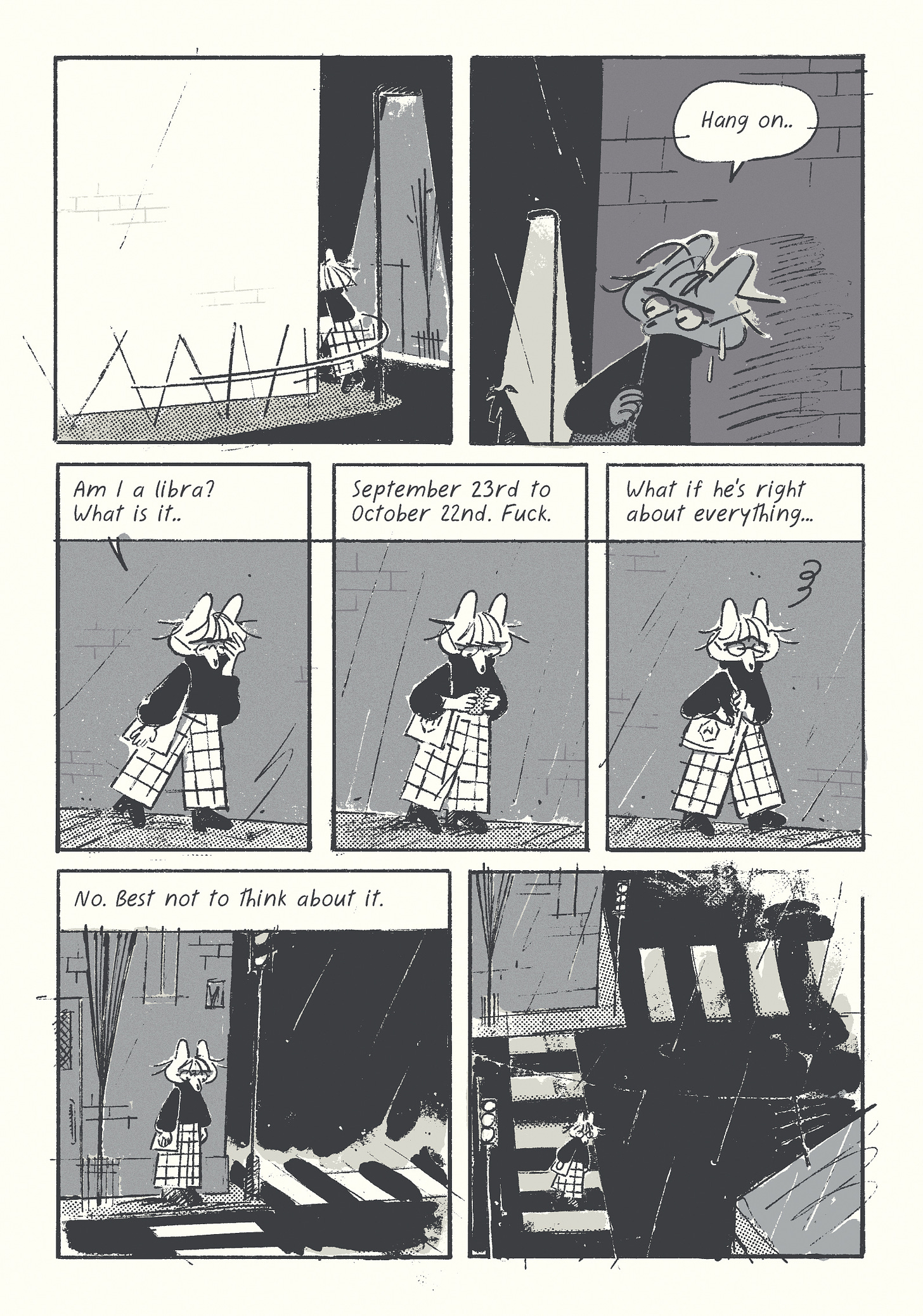
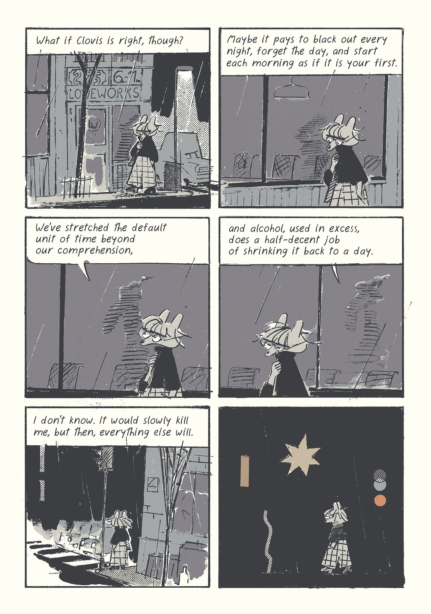
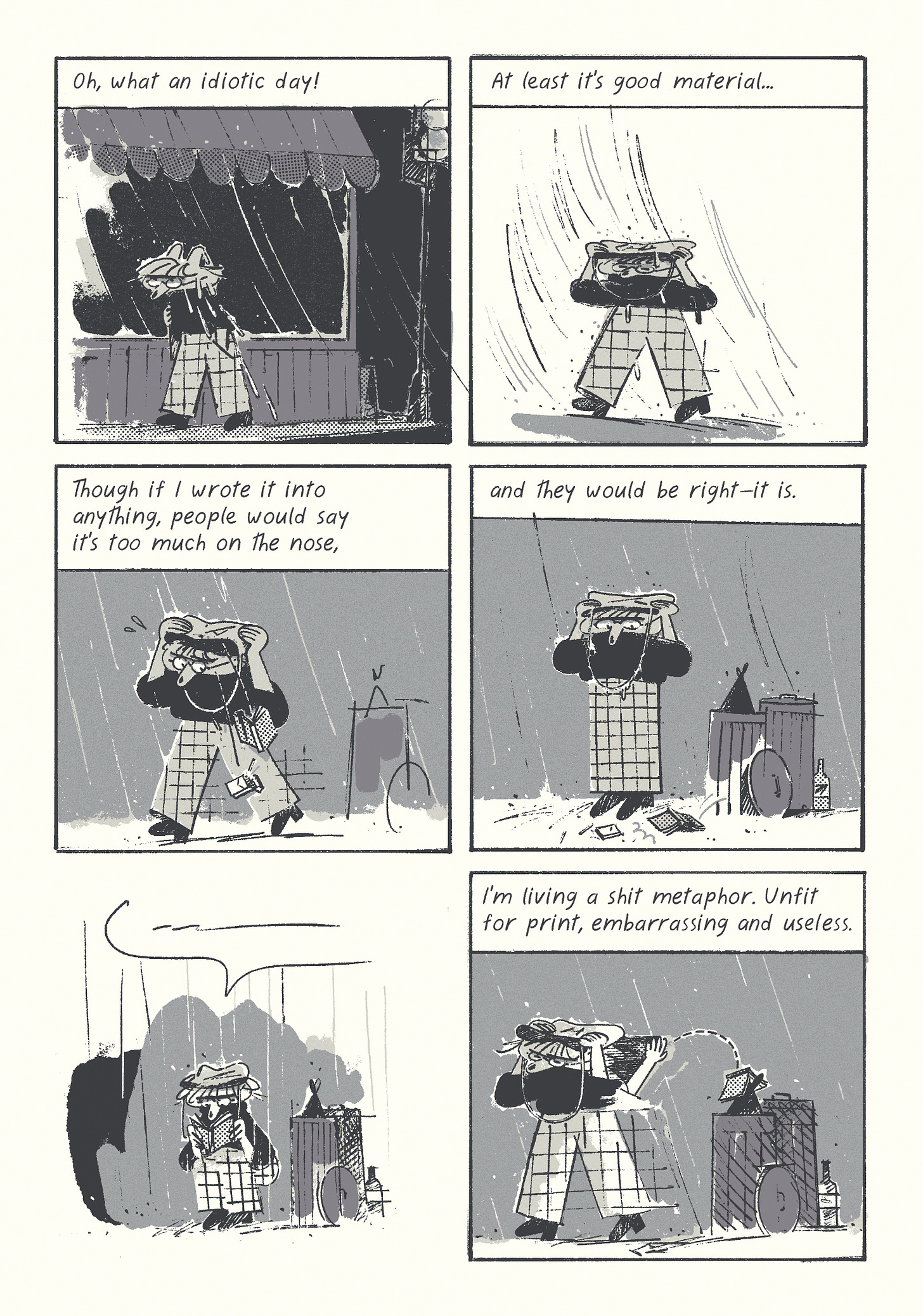
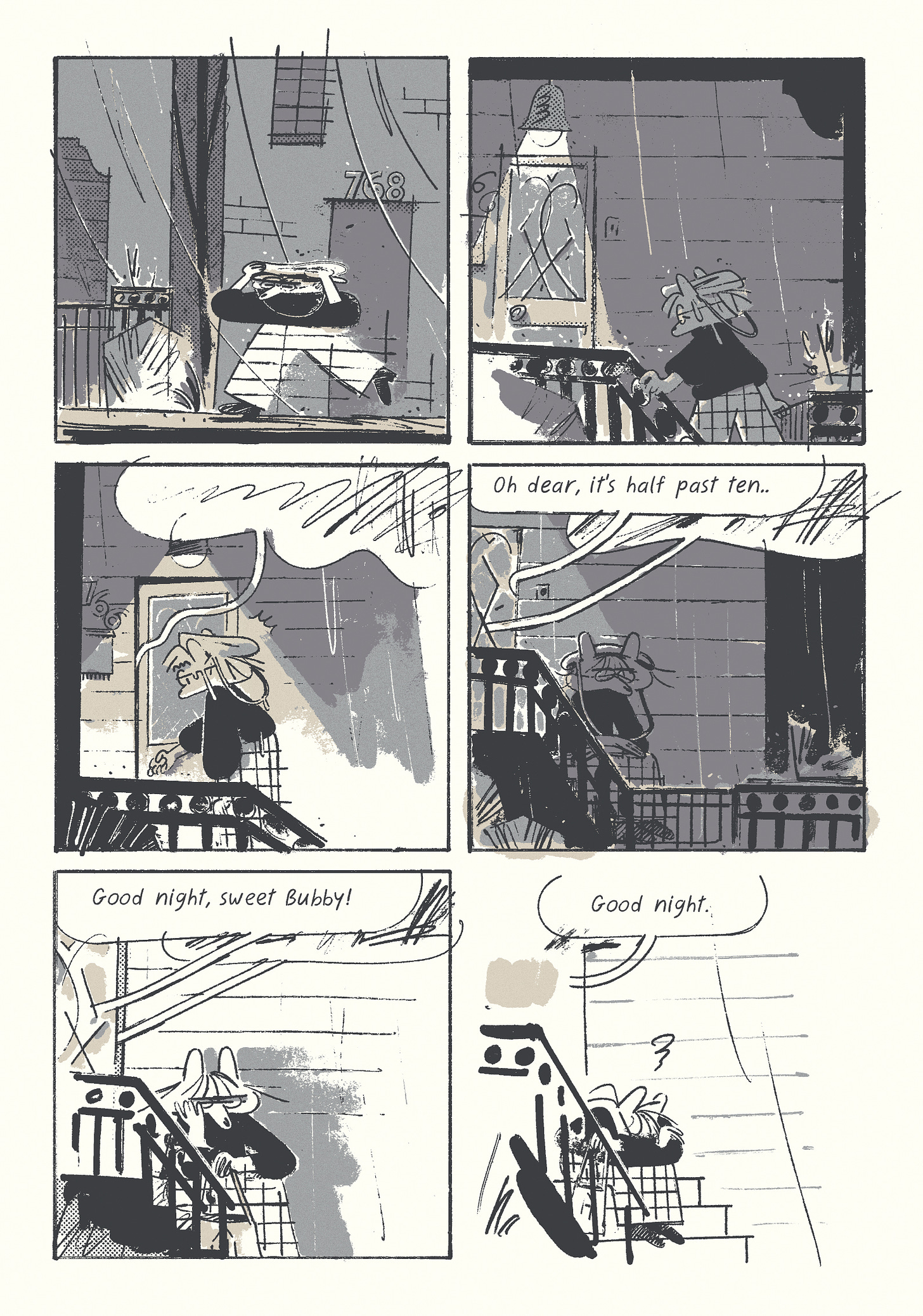
In today’s issue, a predictably depressing end to the first chapter of Foghorn! But first, let’s reinvent the pencil.
BEVERLY HILLS ACCESSIBILITIES
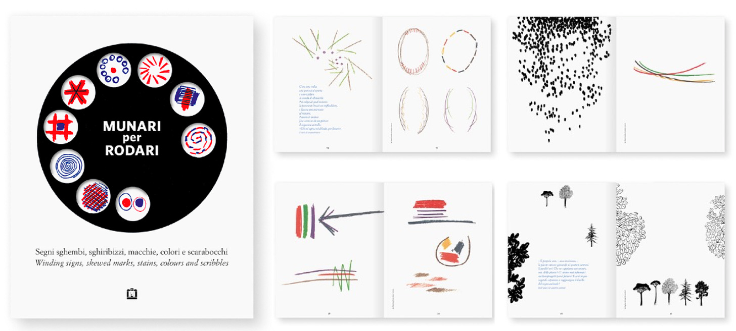
Shortly after the announcement of the new iPad Pro, Apple did a showcase of new accessibility features. Eye-tracking, motion compensation, and fake shadows got me thinking about re-designing the digital pencil, in the manner of Kenya Hara/Bruno Munari. In their writings, they often return to the same few points:
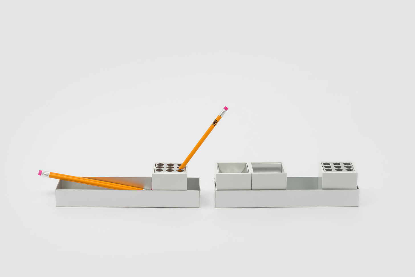
design should be informed by functionality, and accomplish as much as possible with as little as possible
the product should fit with the human needs and abilities
the most accepted and widespread things can be re-examined
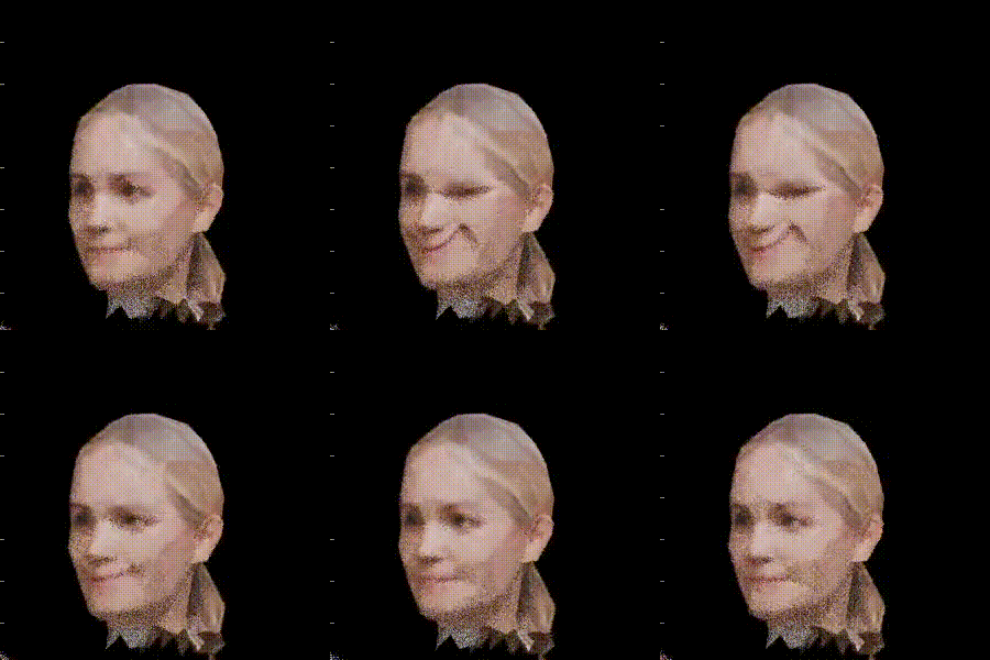
So, assuming I have some magical technology that makes anything possible, here’s how I would approach a pencil redesign, using state-of-the-art 3d simulation software to back up my concepts.
PRESSURE AND PINCH
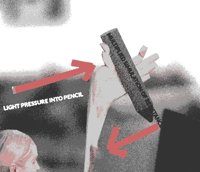
There is a degree of variation to how we hold a pencil, but in most cases, a good amount of pressure between the first two fingers is involved. This is a cause of much grief—I have hypermobility/chronic pain, and drawing (or doing anything physical, really) gets harder every year. There are ways of mitigating it right now—most importantly, putting a rubber grip, and adjusting the pressure curve so you don’t have to press as hard. That, however, can lead to an odd disconnection between the input and output. What if instead, you had some kind of haptic surface that simulates the sensation of resistance equal to the pressure applied, so that the amount of pressure you’d be inclined to place would be cut in half.
The same idea can be applied to the pressure on the screen, for those who tend to press too hard (it would also improve durability). That implementation is a bit harder to imagine, but with either case, everything is processed through the brain, so it’s only a matter of tricking us into applying less pressure, and tweaking the software to produce lines that correspond to the perceived pressure, rather than the real one.
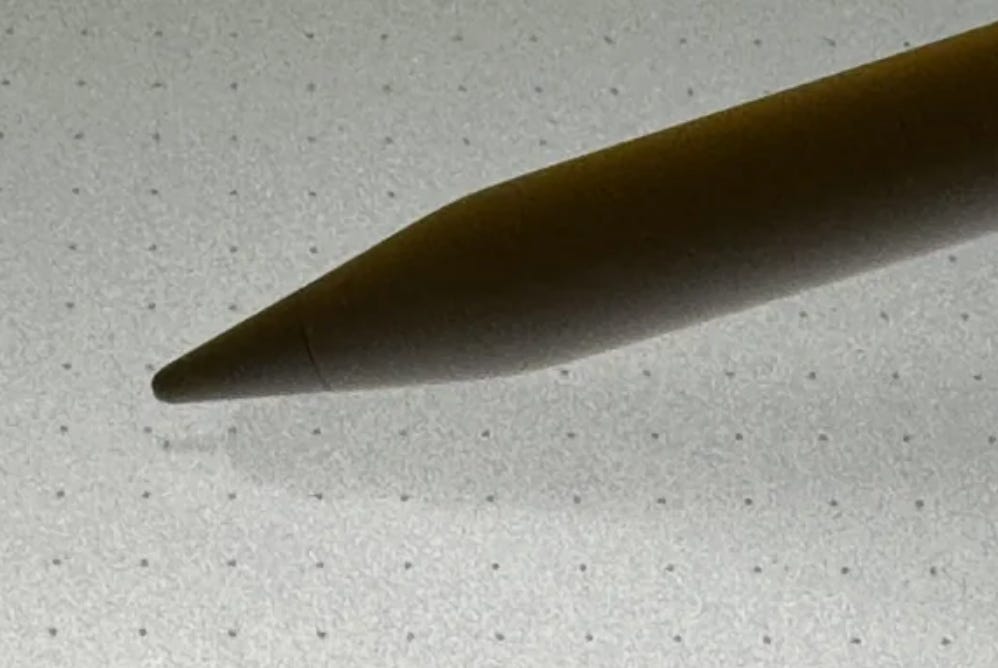
This raises the question of the separation between digital and analogue—are the fake shadows a way to acclimatize people, or do they serve an actual function? I think they can be potentially useful, but there’s something off-putting about having a fairly realistic shadow next to a perfectly digital preview of the stroke (which I have turned off, because I like it when it’s less predictable)—you get that clash of realities that I talked about last month in regards to the depiction of UI in comics. My general take is that digital tools shouldn’t try to imitate real stuff, but should interpret (rather than translate) some of their qualities.
A PENCIL THAT’S NOT A PENCIL
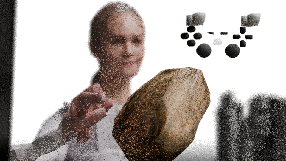
If we move further into sci-fi, the entire stylus can be removed and replaced with another object, better suited to the human hand—a blobby shape that fits and molds into your palm effortlessly. A kind of futuristic version of a rock that we’d grab to bludgeon each other back in the day.
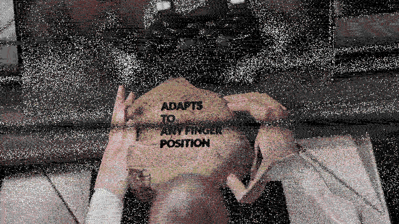
This multi-purpose device would be entirely covered in sensors, sending resistance feedback to the brain, and transforming it into a pointer/stylus/gamepad/anything depending on the software. It would map fingerprints for calibration, so that you can hold it any way you like.
Sony made a big song-and-dance with the DualSense controller that adds real resistance to the triggers, emulating an assault rifle and whatnot, and this is exactly the kind of stuff that gets the boardroom humming, but doesn’t make much sense when you consider the cumulative damage it can cause. As a Dark Souls veteran, I’d kill for a controller that does the opposite—lets you feel like you’re pressing the trigger, without actually doing so. I don’t think it’s too much to ask—we already have fake buttons that feel pretty real, after all. The squeeze haptic on the new Apple Pencil is pretty convincing already.
BACK TO PERTH
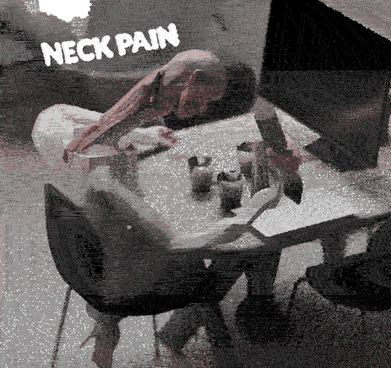
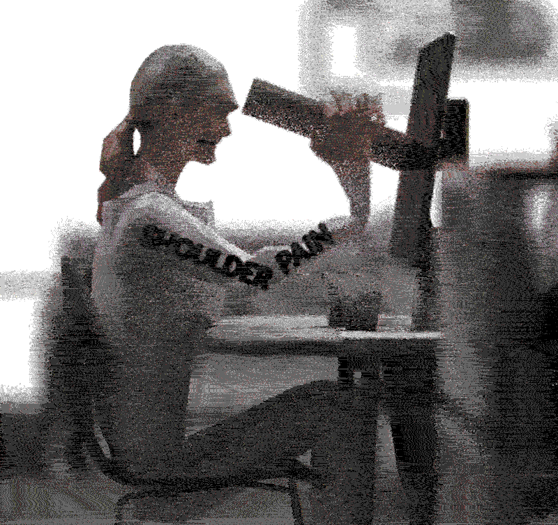
A more realistic approach might be returning to the Wacoms of the past, the ones without a screen. For all their obvious faults, they allowed for a much healthier posture—you don’t need to crane the neck, or raise the arm. Some people manage to get used to it, but most of us find it pretty uncomfortable. The problem is in the eye coordination, and that’s where Apple’s eye tracking and fake shadows might come in handy.
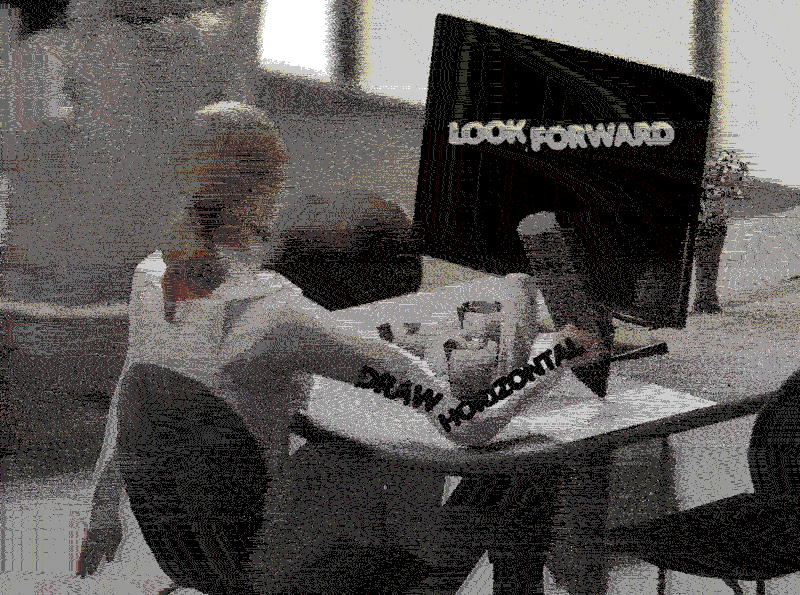
Imagine you have a tracker that translates and replicates the position of the pencil-on-paper onto the screen, with no latency, so it’s not just a brush shape. On its own, that wouldn’t be enough, because the hand and the brush are on perpendicular planes, and no degree of accuracy will fix that discomfort. So, what we need is for the vertical screen to feel like it’s horizontal.
Remember that our eyes see everything upside-down, and the brain tricks us into thinking that we’re seeing straight. And that’s just the most blatant trick, there are other, subtler ones (nose, for instance, although it works pretty badly on mine). So, I don’t think it’s too far-fetched to imagine a screen that tricks our brain into thinking that we’re looking down, rather than forward. VR can possibly provide that illusion, though I’m not a fan of headsets, so far.
Some of you might find all these speculations a bit dystopian, but the point is having the option to not interact with technology in the awkward ways that it has given us. Myself, I’d rather save my hands for drawing on actual paper, petting cats and touching linen, rather than scrolling and button-mashing.
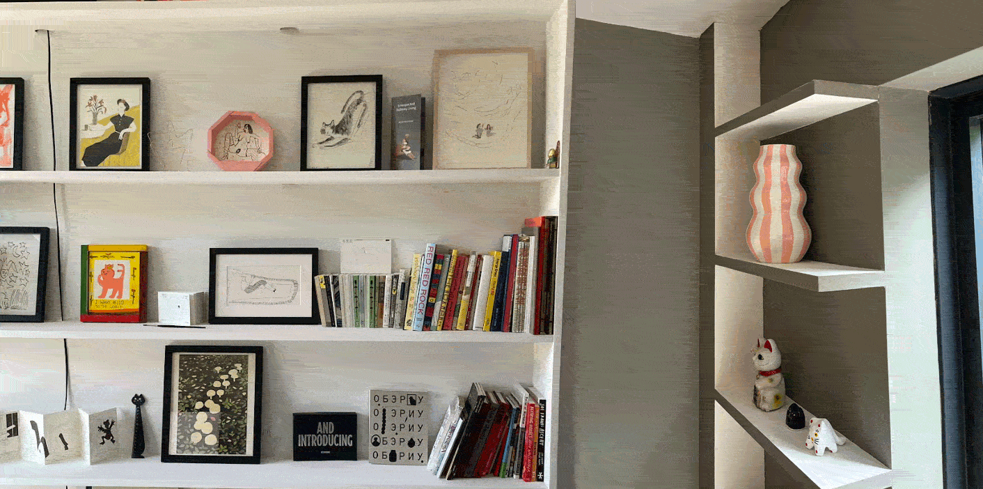
I haven’t had a chance to design too many physical things, other than some shelves (the first ones I modeled with semi-circular holes (useful for pulling cords through, plus they make it feel less heavy), the second one was color-coded to be a mix between the wall and the shelf colors, which also reduced visual weight and accentuated the geometry), and some walls for an eyewear store that have little tricks of perspective. Would very much like to do more—one of the reasons I got into Blender a while ago: you can build anything, for free.
FOGHORN CONCLUDES
⚠️UPDATE: read the fully edited first chapter HERE⚠️
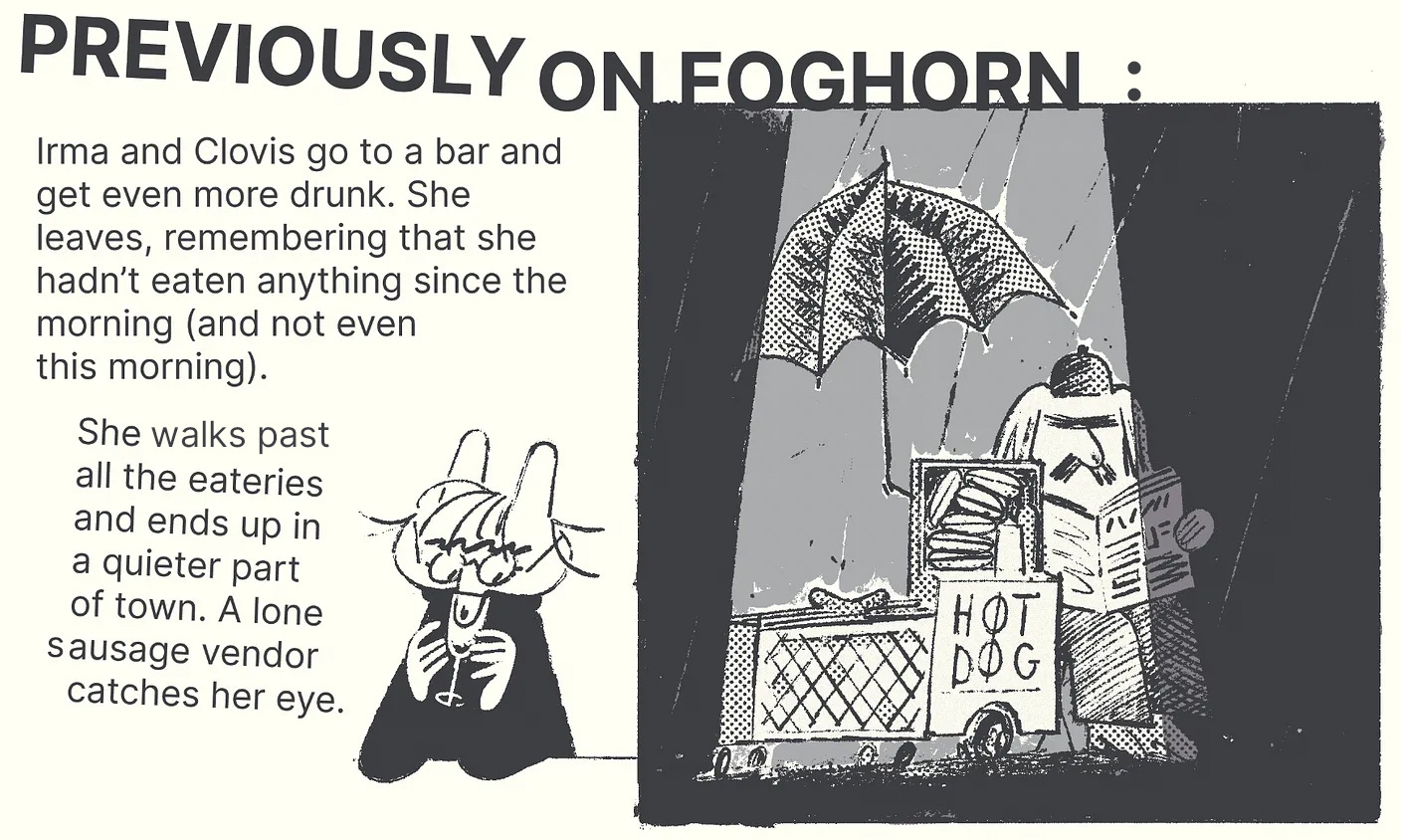
If you haven’t been following the story, DON’T start now, close this letter and go to sleep. I’ve already started to edit and revise the previous pages, so wait a little bit, and I will put up a polished first chapter on my website, and maybe even make a printed version, too. Think of the Substack installments as drafts. If you have been following, here’s a recap:
For reference, here’s the first installment, the second installment, the third installment, the forth installment, the fifth installment, the sixth installment, and the seventh installment.
And that’s that. I’m off to write the outline for the next chapter, and work on some shorter stuff in the meantime. If you have been following along—big thanks, I really appreciate it! Feel free to lodge complaints.
PS
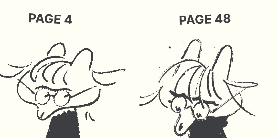
A polished and edited version of the first chapter is coming up—won’t be redoing too much, just glaring inconsistencies and whatnot. I personally love it when people let their development show. For instance, I noticed that her face got pointer through the first 50 page:
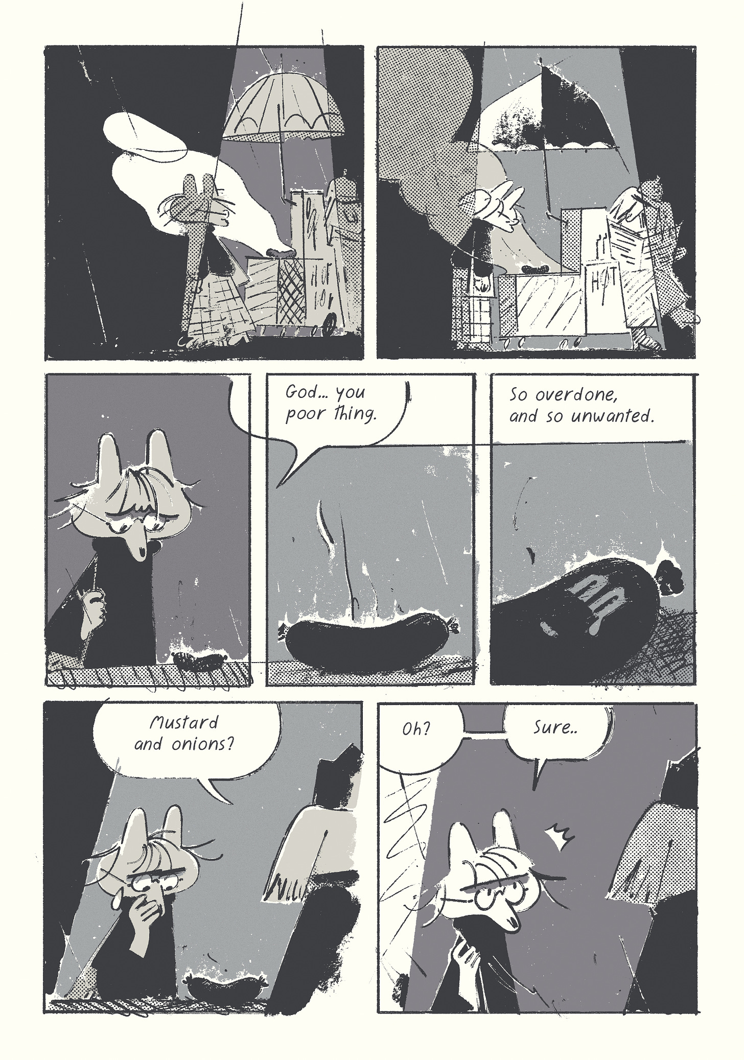
Didn’t plan for it, but here we are.. I also swore it would be a straightforward funny affair, nothing depressing—you can see how well that’s going, and this is just the beginning.
PSŞ
If you want more thoughts on things, here’s a couple of my older posts about making digital art friendlier (practical) and making Ai less moronic (speculative):


