Hello, reader. In this issue, we have another short installment of Foghorn, a few paragraphs on referencing real things in fiction, exciting visa issues, dumb cartoons, and more.
BUT FIRST, HOUSEKEEPING
From now on, there will be two DADA issues per month: a free post at the end of the month, and a part-paywalled one in the middle. This newsletter is clearly modeled on zines of yesteryear, but it is posted online, and not printed offline, so it makes sense to keep things shorter and more appropriate for the length of your commute/defecation.
For a while I was worried about spamming your inbox twice a month, but I think it’s fine, and more people are reading Substack via the app, rather than email, which I would myself recommend for these reasons:
it lightens your inbox a great deal
it gives you a place where you go only when you actually want to read something
it allows you to set the ‘inbox’ as the starting page, so it’s just a list of posts, no notes and recommendations
The DADA issues referral ponzi scheme is still alive, btw—you get a free month for sending me just one soul, and a whole half-year for six of them. Bring me all your so-called friends, work/school/farm accounts, and burner emails, I don’t care—only the numbers matter.
IN OTHER NEWS
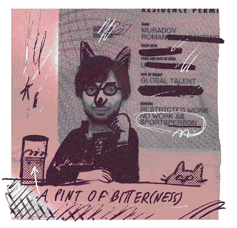
I just moved to that there London, which was a bit of an undertaking. Hopefully things will settle and I can find time to make more things. Feel free to reach out if you live here too.
FOGHORN CONT.
⚠️UPDATE: read the fully edited first chapter HERE⚠️
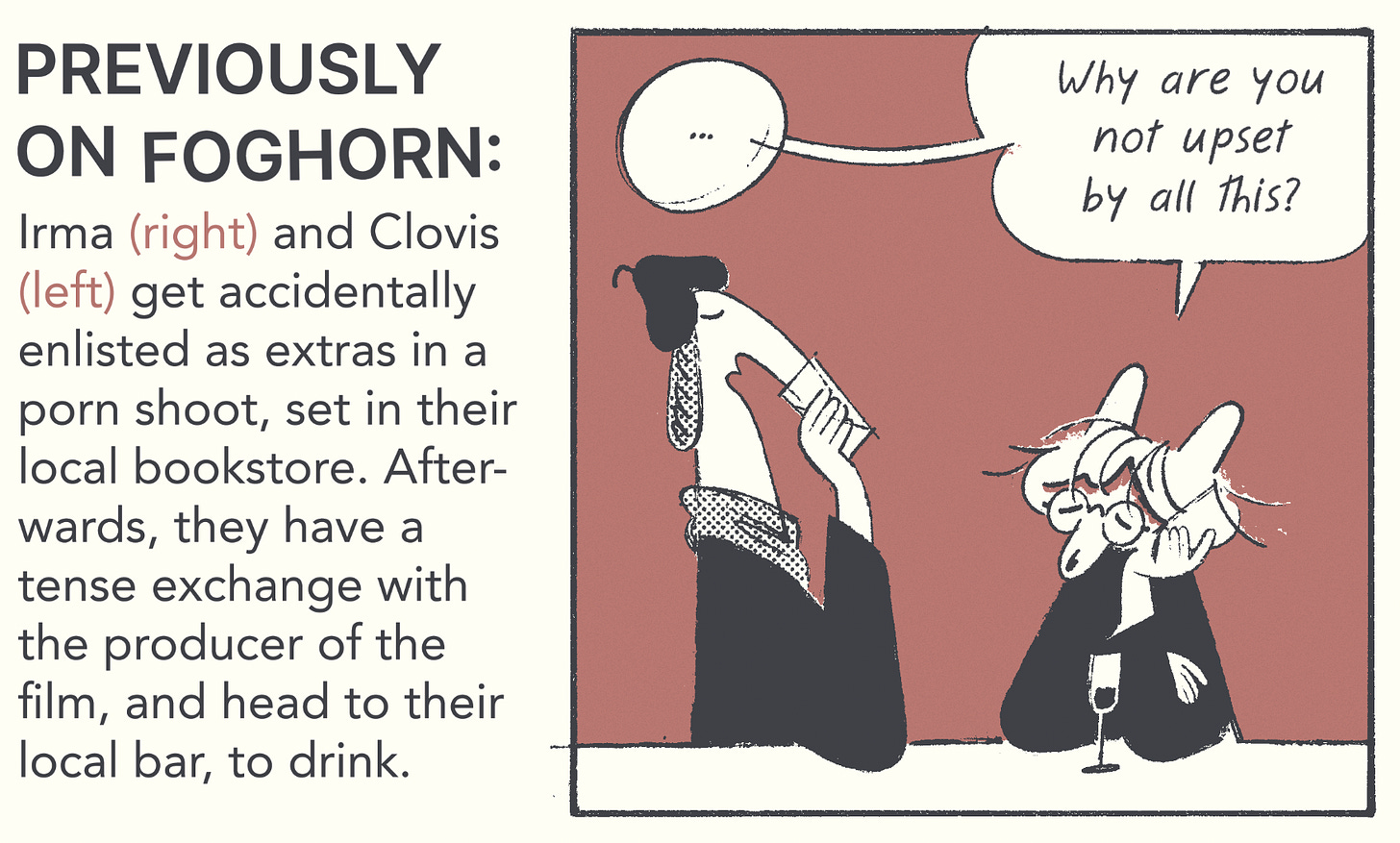
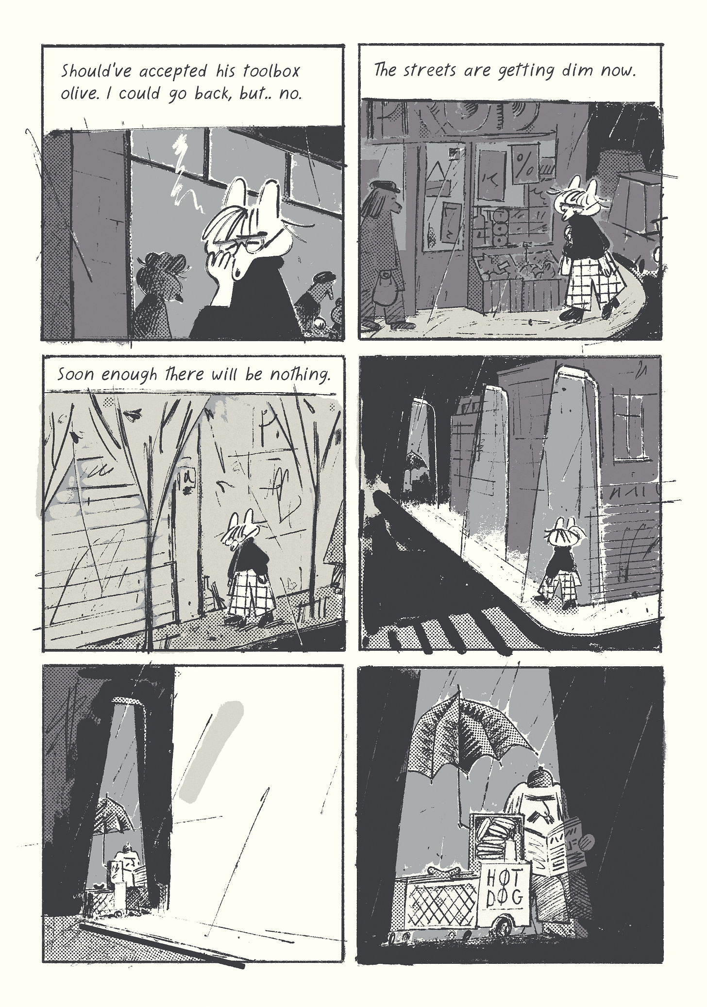
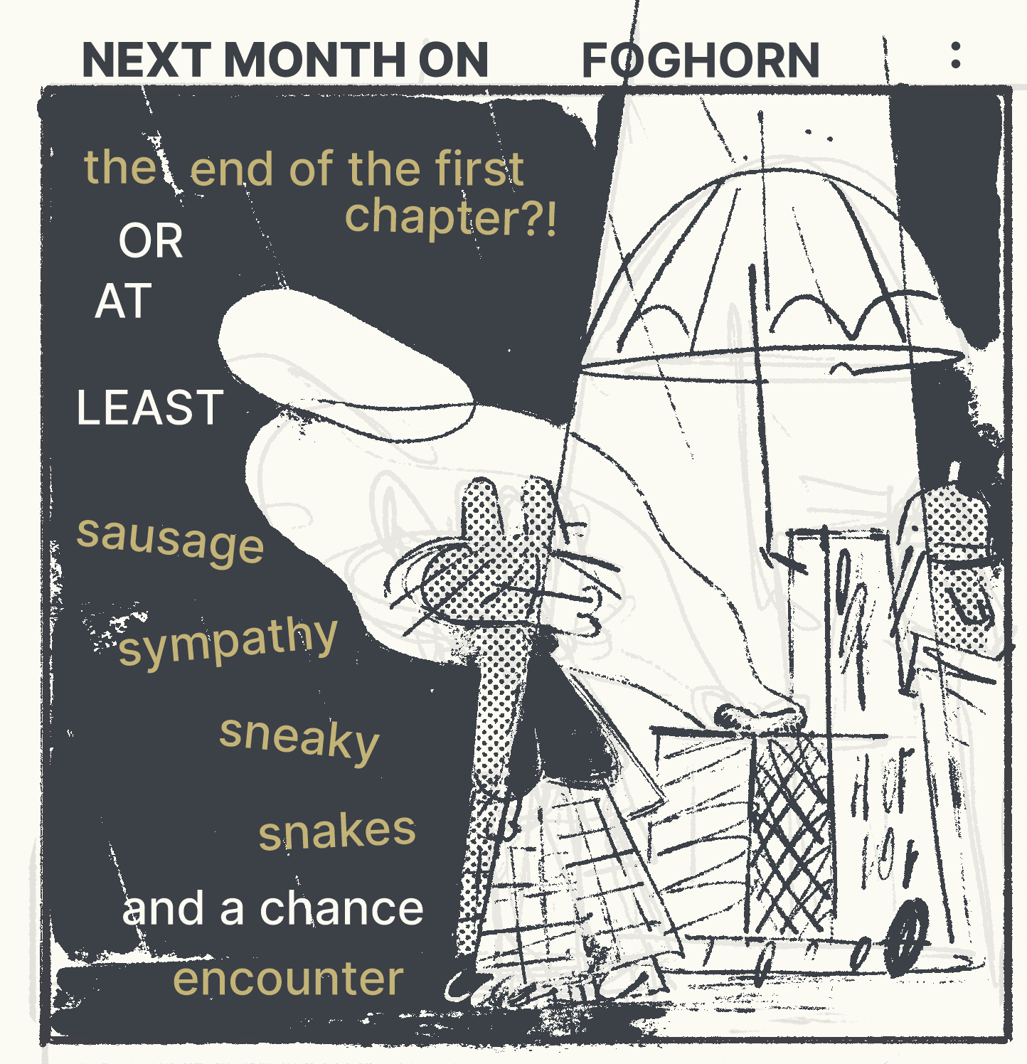
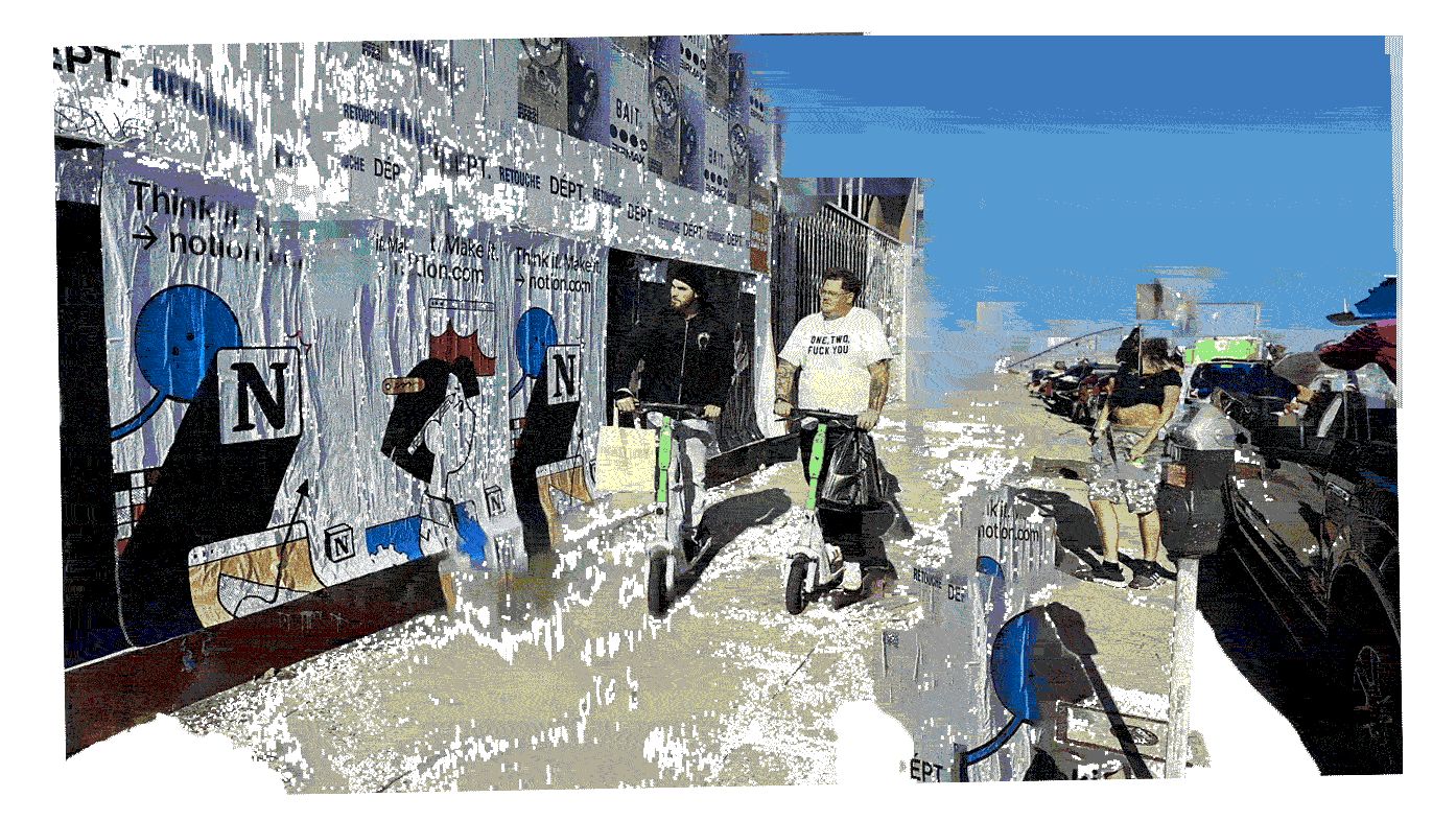
Here is the first installment, the second installment, the third installment, the forth installment, the fifth installment, and the sixth installment. Or a recap:
COMICS UI
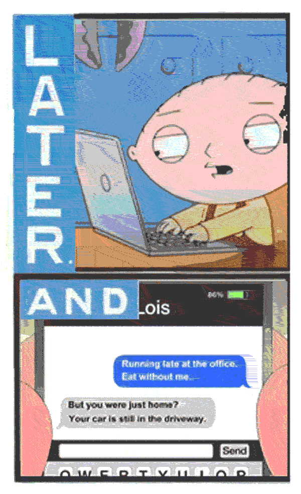
One of my biggest pet peeves is texting in comics (or any other medium, really). I’ve been wondering why it annoys me so much, and I think the reason is because it’s a language within a language. Cartooning is abstraction (even if the style is realistic), and here you have a clash of two modes of abstraction (that of reality, and that of speech).
Artists who get away with it tend to be the ones with the most naturalistic (which is not the same thing as realistic) styles, or those who reinterpret the UI to fit into their style seamlessly. Either way, any depiction of technology dates the work, which isn’t necessarily a flaw—everything depends on the story and the author’s intentions.
But, assuming you want to circumnavigate UI altogether, what’s the most elegant and unobtrusive way of doing so? I thought about it a great deal in regards to Foghorn. Normally, I just don’t have any modern devices in my stories, but since this one takes place in the world of modern bullshit, it would make it more obnoxious to avoid these things, or to replace them with something made-up.
I decided to keep phones and laptops, but use them as little as possible, and avoid showing screens as much as possible, to minimize that abstraction-within-abstraction. Speech bubbles are very helpful here, since shape and font alone can be more than enough—you don’t have that as a tool in other mediums.
REALITY-DEBASED WORLD
Another interesting question is the naming of things. Do you use actual names like ‘Google,’ or have thinly veiled alternatives like ‘Noodle,’ or avoid it altogether, which, again, can make things more obnoxious in the long run. I know for sure that the second option drives me mad—in the previous installment I had this line, and I hated it viscerally, but didn’t have time or energy to come up with anything better. I thought of changing ‘Grinder’ to some more made-up app name, but it seemed too forced. I even tried to come up with a new kind of gay (near-impossible), to make up for the unimaginative app name. In the end, I left it as is, and swore to fix it later.
Then one morning I woke up and thought: “Internet men.” Simple and sufficient, it avoided all the things that irritated me, and kept things more vague, just how I like it. I think the general solution to such issues is to find a way of referring to the thing within the language of the artist. For me, skirting around is what feels right. For others, it can be total avoidance, or a direct naming that’s buried in other bits to the extent that the reader doesn’t even register the reference, or it can be an adjustment of style that lets the two realities nest together without competing. This is all very subjective matter—you might prefer the ‘torso from Grinder,’ and you are perfectly entitled to your wrong opinion. I imagine lots of people aren’t taken aback by rendered UI, either, and that’s fine too. I wouldn’t trust them with a child, though. If they aren’t sensitive to drawn UI, they would probably see no problem with razor blades left in the middle of a Lego set, or authoritarian messaging in Pup Patrol.
I keep thinking about a phrase in Thomas Bernhard’s Old Masters: “reality-debased world.” Most of my favorite artists have this tortured relationship with reality—they often see it as a perversion that needs to be untangled, but at the same time, they can’t fully remove themselves from it. Tension is good for the art, and an unsolvable problem is a godsend. Cracked kettle, etc.
SCISSORS, 61
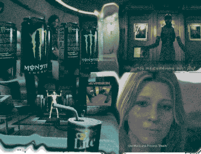
Someone who seems to be consistently getting away with the most egregious variations on all these issues is Hideo Kojima: from overt 4th wall breaks and direct namedropping to the silliest roundabout references, nothing seems to hurt the tone, because the tone is consistent in its inconsistency. From the earliest games, you know you are in Kojima’s world, where deeply researched historical fiction and post-modernist philosophy live alongside cringey melodrama and ridiculous characterization.
Consistency aside, the reason he gets away with it, I think, is that all this stuff is brought in unironically. With a lot of satire you get too much of that knowing wink towards the audience, which feels very patronizing to me. When Kojima presents his off-beat humor, or his obsessive lore-dumping, you know he means it, and he goes hard on all of it. There’s very little subtlety in the presentation, and this, paired with an absurd degree of polish and complexity, creates a very unique atmosphere.
Anyway, this is the kind of stuff that keeps me up at night. I went into Foghorn swearing it will be simple to write and draw, unlike all my previous books, but here I am obsessing over every line as usual, and already rewriting and redrawing everything in the previous pages…
PS. Please enjoy this dithery animated comic by the great AC-BU. Incredible web design, too.


