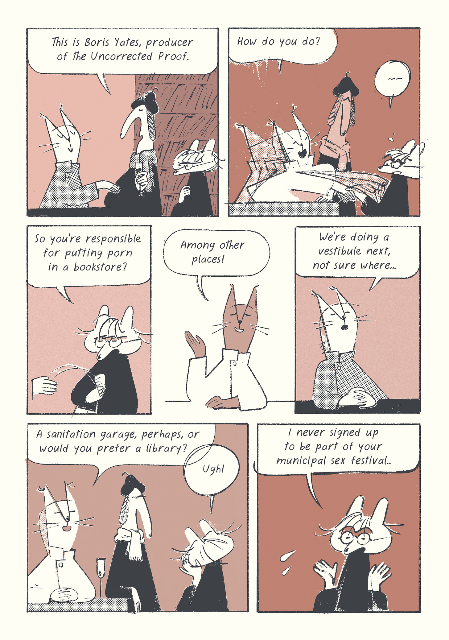
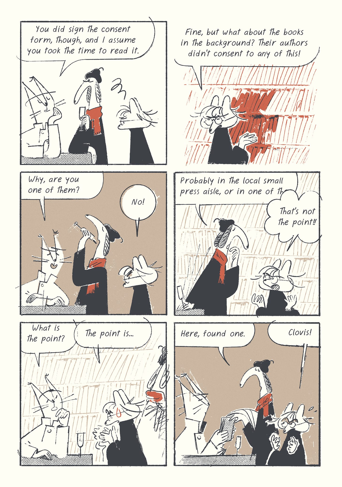
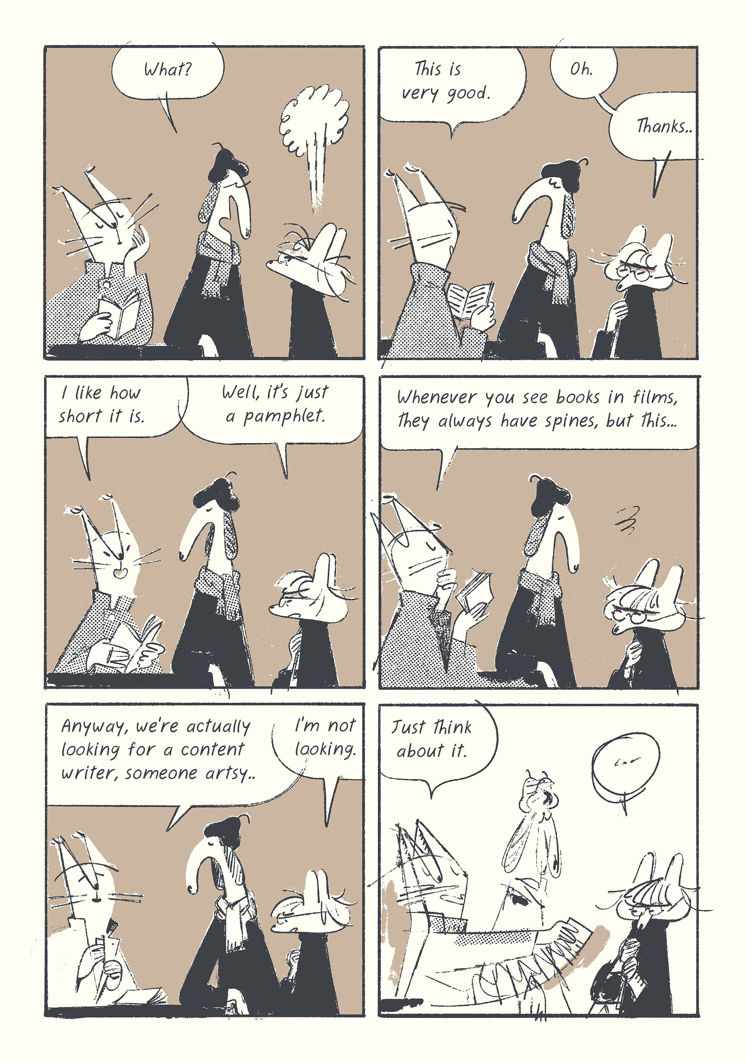
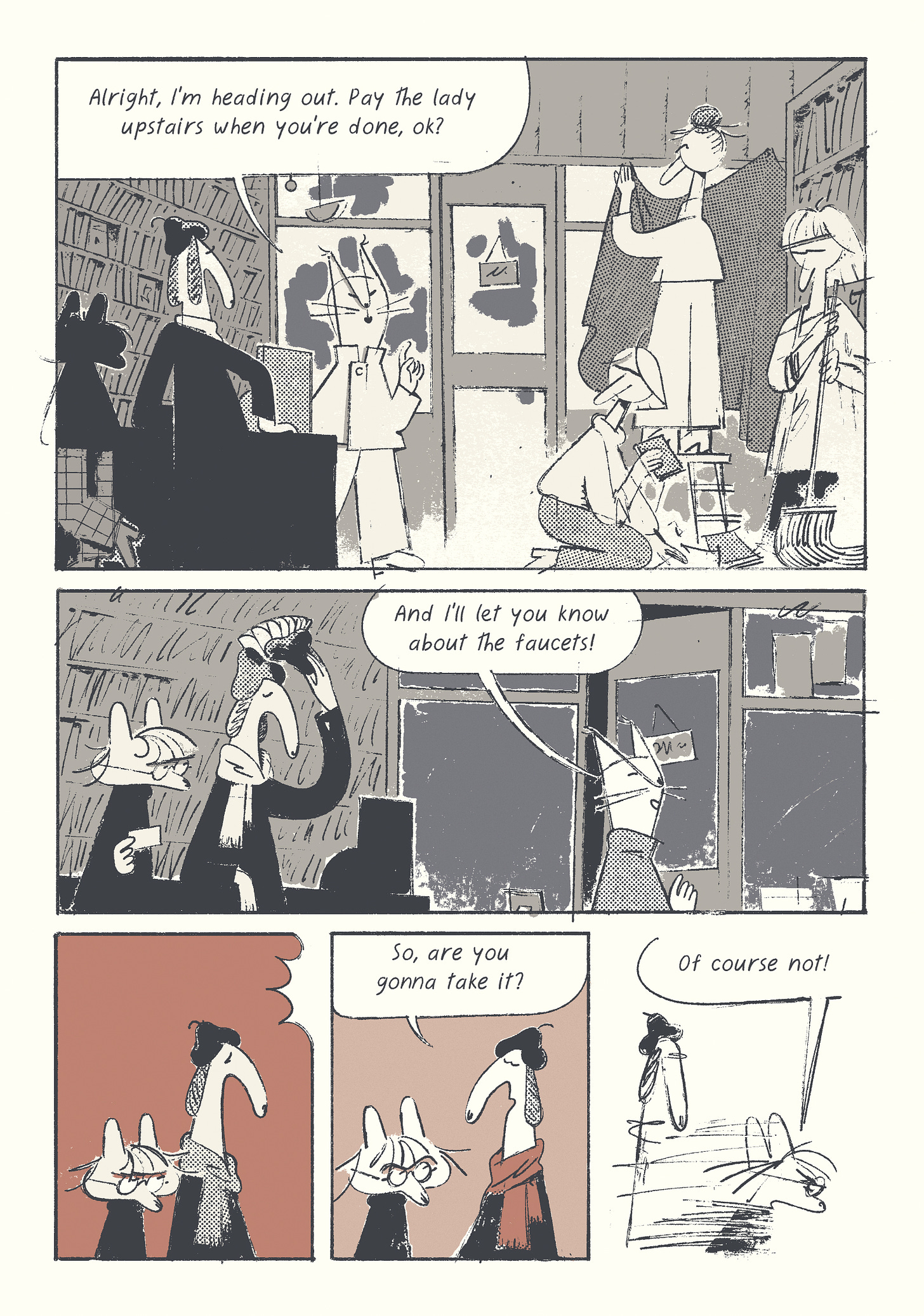
In today’s issue, we have another installment of my ongoing comic, a close look at a Nancy panel, and some hard-hitting relevant political satire in a desperate attempt to turn the average Substack reader into an insatiable paypig.
CAN YOU CALL THREE YEARS A RETROSPECTIVE?
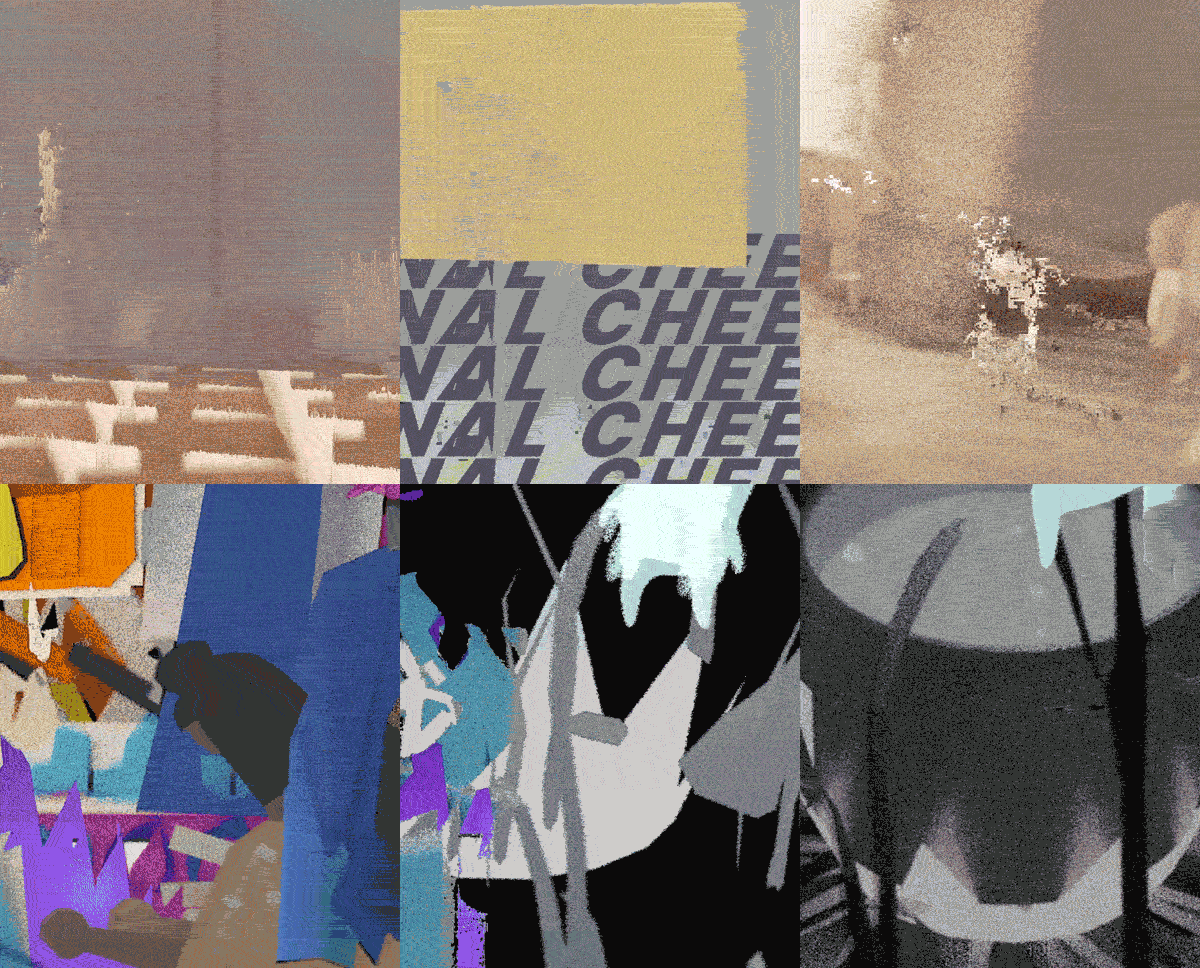
But first, if you live in LA, I’m doing a screening for Loose Frames at the Heavy Manners Library on March 15th, along with brilliant animators Natalie James and Bryan Lee. I won’t be there in person, by Dory (the composer) should be. You’ll see most of the films and short animations I made in 2020-2023, including some deep cuts.
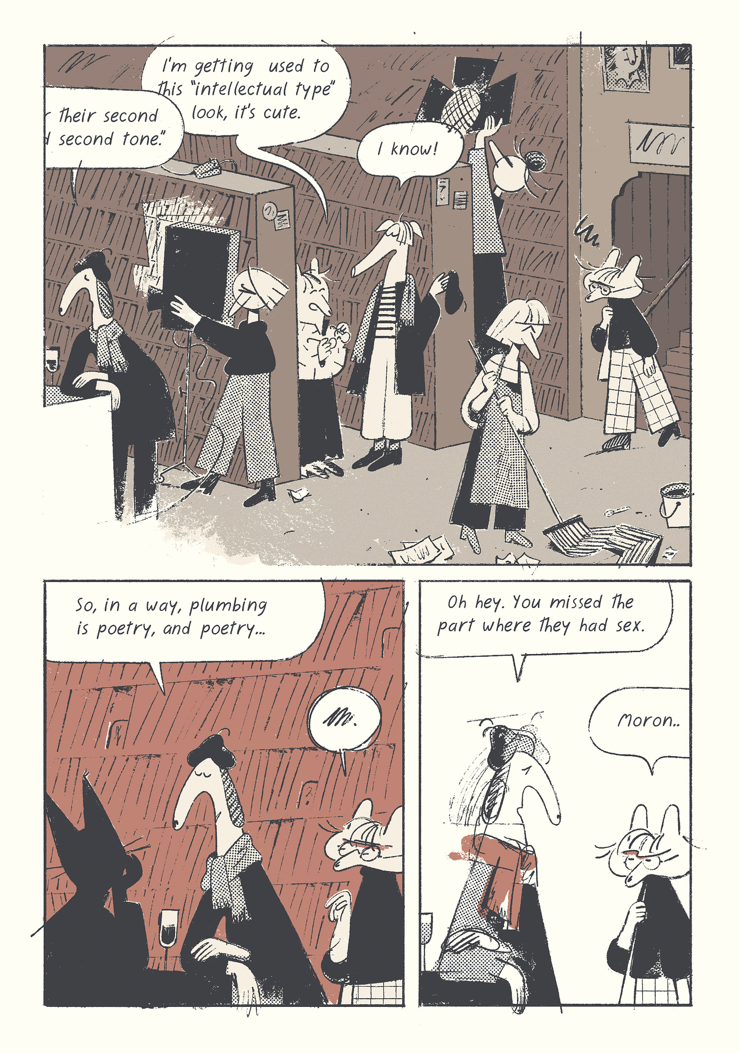
POETRY AS PLUMBING
⚠️UPDATE: read the fully edited first chapter HERE⚠️
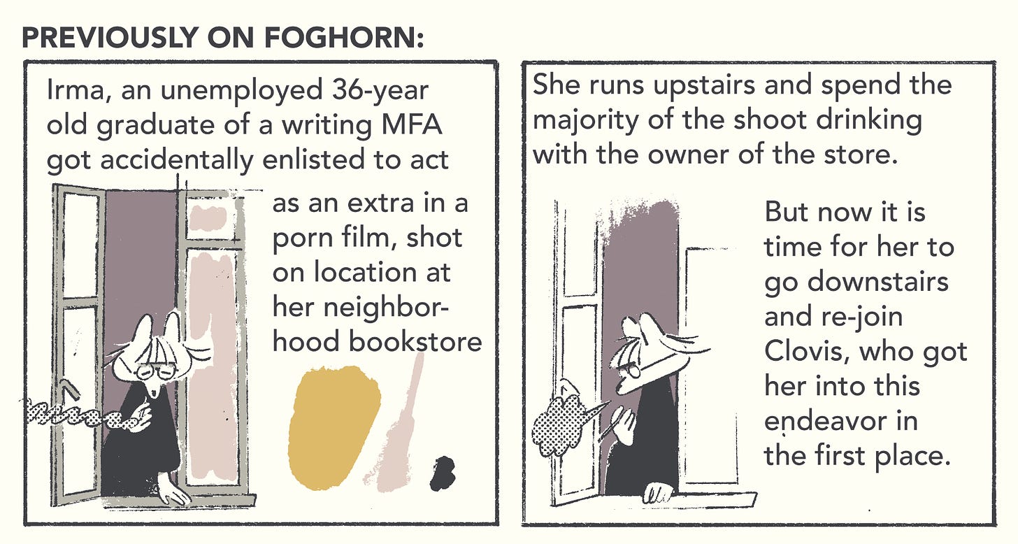
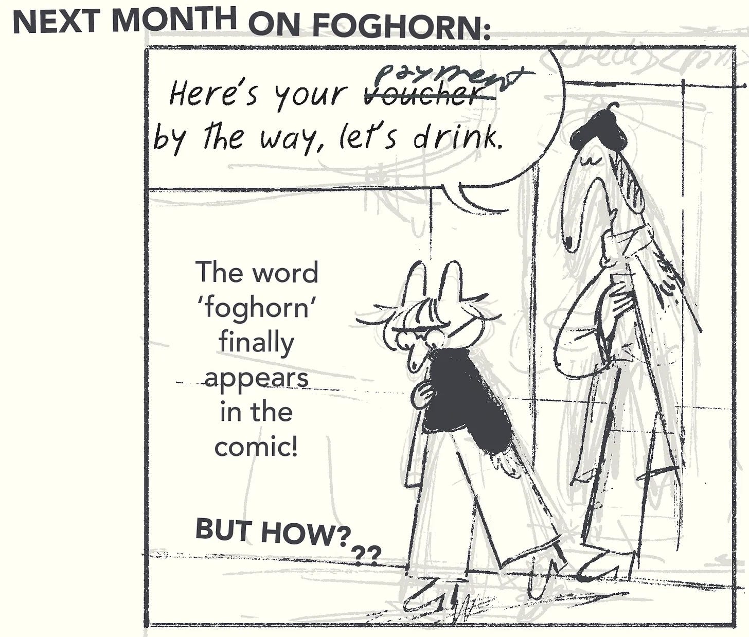
If you missed it, here’s the first installment, the second installment, the third installment, and the forth installment. Or a quick recap:
The sex festival reference is from this classic scene from I’m Alan Partridge, the series that was my gateway drug into the world of miserable British comedy, and remains a massive influence.
HOW TO BLEED NANCY
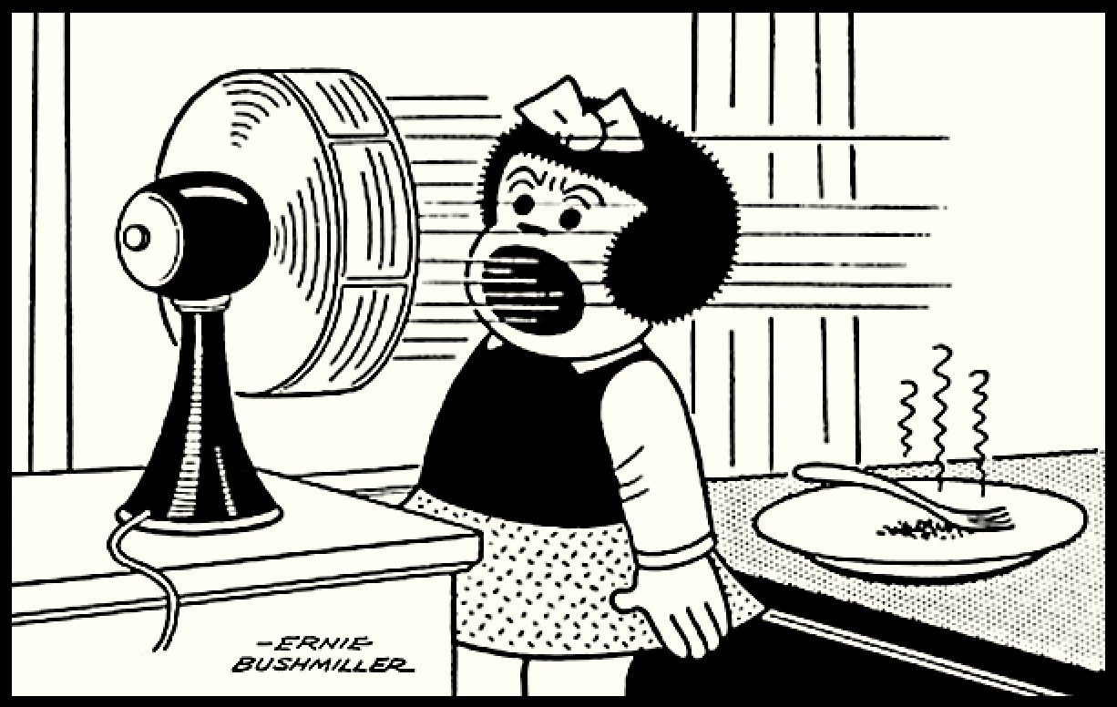
I just finished teaching a class, so I’m in a bit of a lecturing mode, and one of the things I talked a lot in that class was dissecting the composition in a comic panel, and finding ways to utilize every visual element. And who could be a better subject than Bushmiller’s Nancy? Let’s take a closer look at this iconic panel:
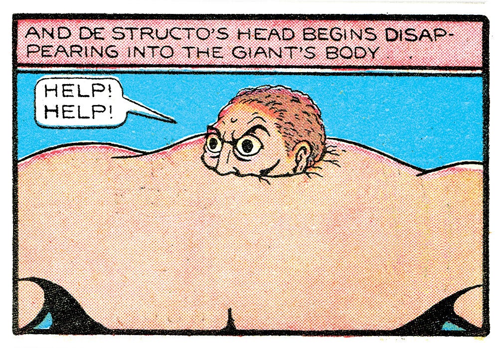
First of all, we have Nancy pinned between two bits of furniture bang in the middle of the panel. If you’ve suffered the indignity attending an art school, you may’ve been told to never put anything in the middle, because it makes everything unconvincing and stiff. In Bushmiller there’s always an odd, stilted quality to his compositions that make individual Nancy panels feel so uncanny, especially out of context. Still, it’s not exactly Fletcher Hanks—the drawing is very lively, despite the tight style and the rigid composition.
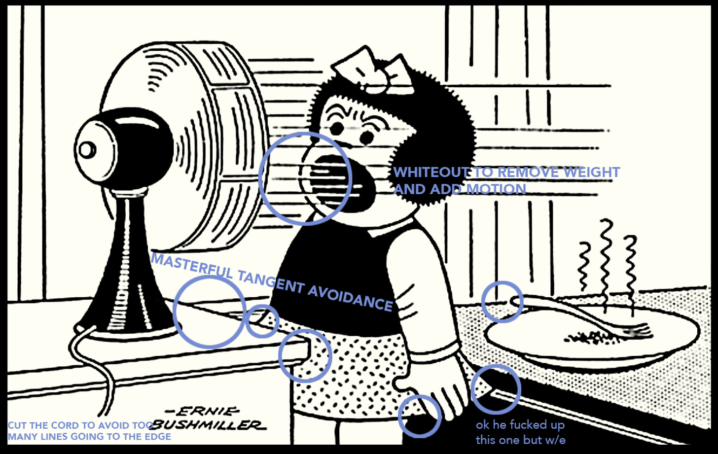
Part of it is Bushmiller’s perfectionist design, but another element is the way he lays out the composition—when you look at his straight lines in, you can often continue them (as you do in your brain, unintentionally), and find them flowing easily through each other without hitting too many dead corners and awkward angles.
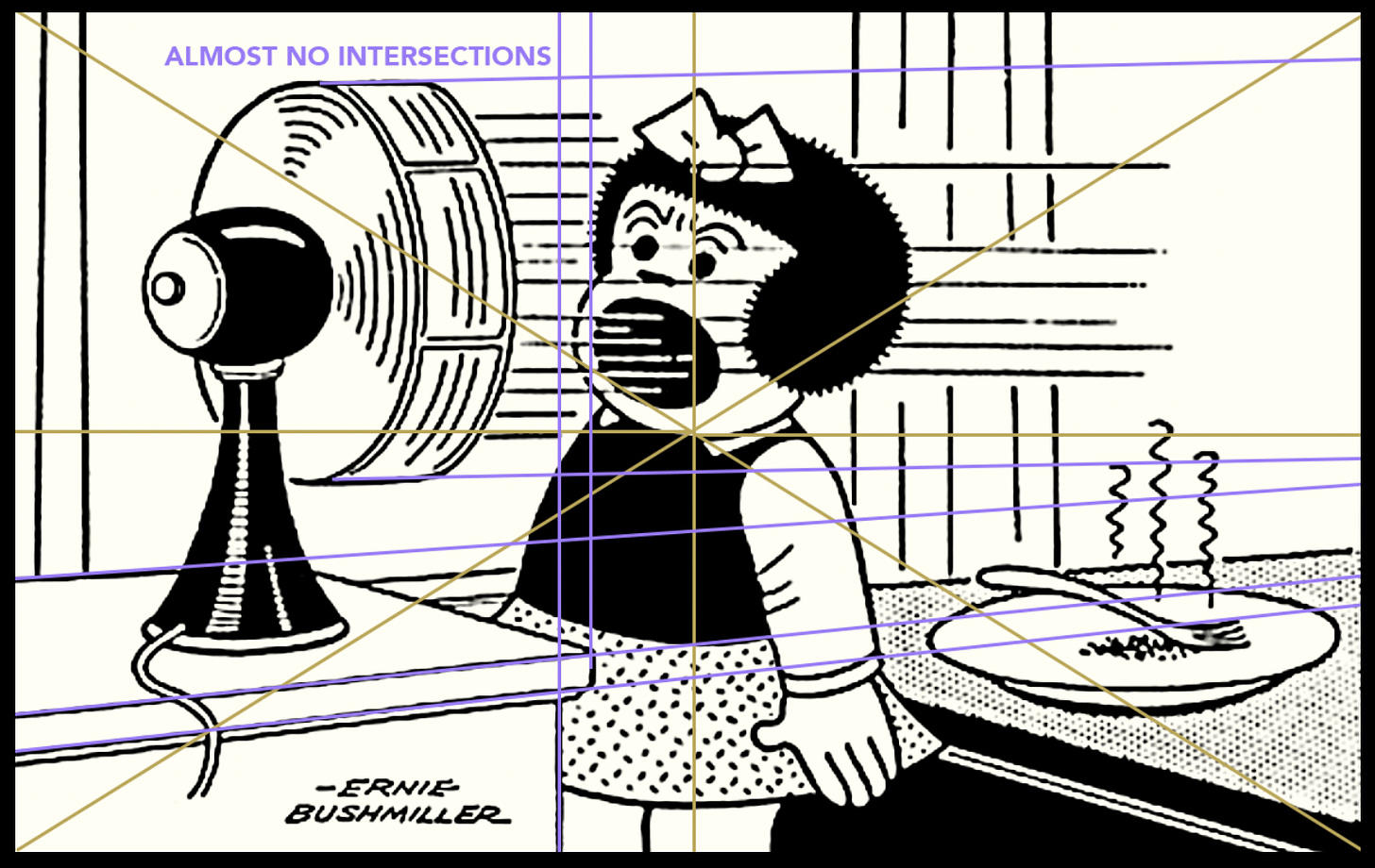
Then there’s a whole array of little tricks that are pretty much embedded in Bushmiller’s cartooning. Most impressive is how well he avoids tangents, despite the very rigid style, and often without common cheats like white gaps and unfinished lines. He does employ these here and there, but very sparingly and strategically, never overdoing it.
Lastly, there’s an effortless flow from the fan to Nancy’s mouth and the rest of the drawing. Someone said that it’s easier to read a Nancy strip than to not read it, which is why Bushmiller is always a fun cartoonist to analyze in terms of visual communication. It’s also good to note that there’s a tight (but not too tight) alternating balance between fills, empty spaces and patterns, though not everywhere—he leaves the desk on the left empty, and it could’ve been a black fill on one side, or the same pattern as the table (at least on one side). Leaving it empty keeps that least important area breezy, and that’s where Bushmiller chooses to put his signature.
It’s unlikely that the artist himself sat down and analyzed his sketch this way, before getting on with the ink—what’s more, some of the things I praise may’ve been accidents, but none of that matters. The point I was trying to make to my students is that this kind of close reading is important precisely because it is individual and interpretative, and each person comes away with their own conclusion—the main thing is to practice looking. Reading doesn’t have to be a passive act.
For more Nancy analysis, I would highly recommend How to Read Nancy, the essay by Mark Newgarden and Paul Karasik, which was expanded into a full book in 2017.
BOTTOM OF THE TOP
Since I turned on likes and restacks, DADA issues swiftly rose to the dizzying bottom of the top-25 comics Substacks on Substack. Thanks to everyone who reads/shares/likes/etc these letters—I’m finally doing a comic that I’m actually liking, and I’m very happy to hear that people are enjoying the newsletter.
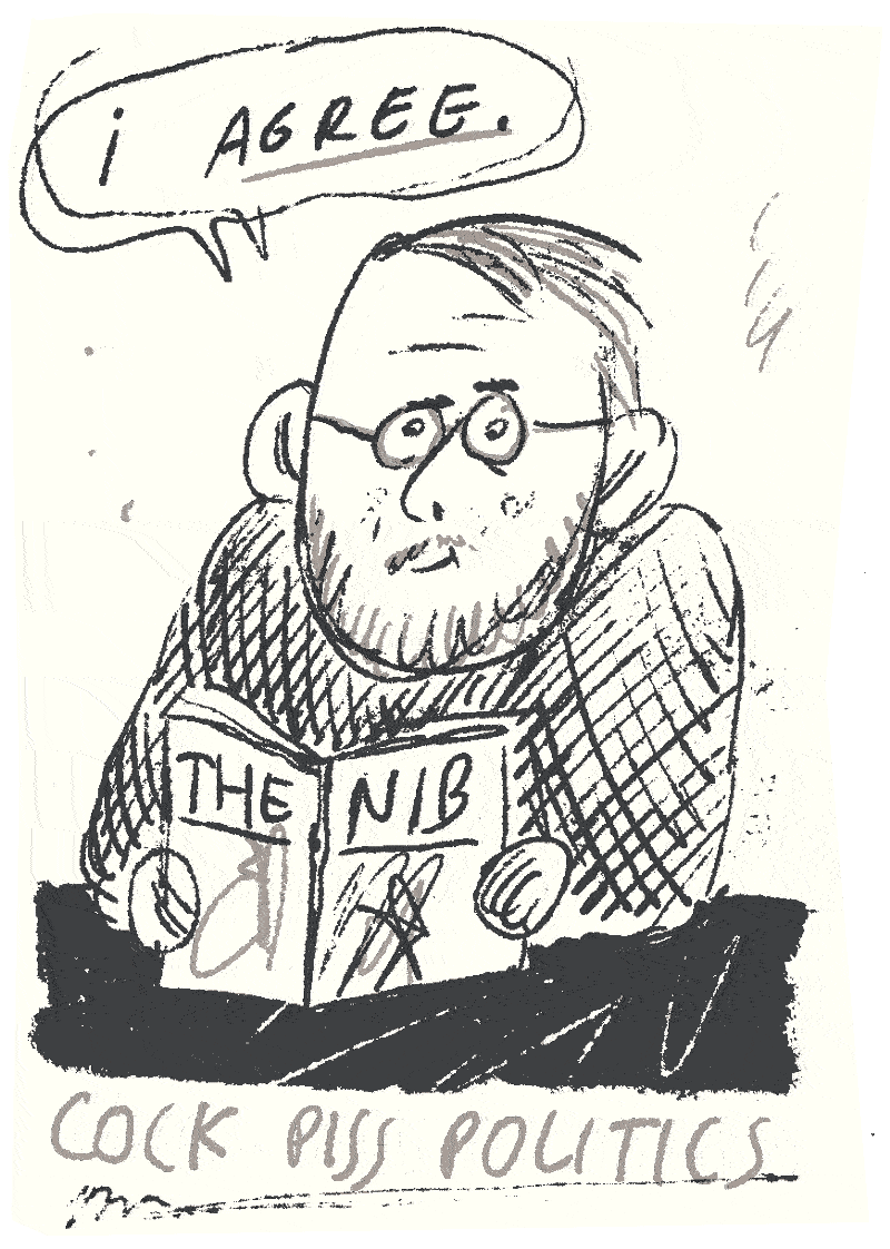
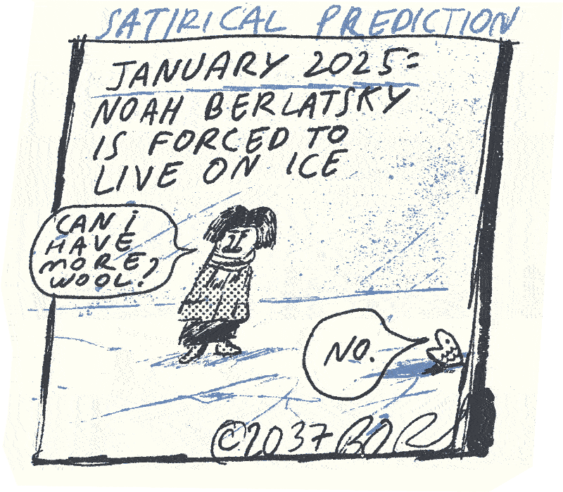
So, to attract even more paying masses, this month’s paypig section is an unofficial and very juicy reboot of your aunt’s favorite satirical publication, the Nib. If you don’t want to pay, simply refer a friend (who can be your work/school/burner account*).
*this is why I’ll never get the 1000 paypig checkmark on Substack
Keep reading with a 7-day free trial
Subscribe to DADA issues to keep reading this post and get 7 days of free access to the full post archives.


