1. PRINCIPLES OF CARTOONING EXCELLENCE
Foghorn continues further on, but first of all, in the spirit of giving, I’ve decided to write down some theoretical and practical advice on cartooning and artmaking in general for the benefit of the aspiring artist. Of course a lot of it very personal and relevant only to my work, so take it with a grain of sulfur and write out your own principles—it can be a useful exercise.
ALWAYS START WITH THE STORY
Figure out the theme as the story writes itself. If you start with the theme, you’re starting at a dead end. And never ever try to say anything, ever. If you just want to share an opinion with the world, go on social media or shout in the streets.
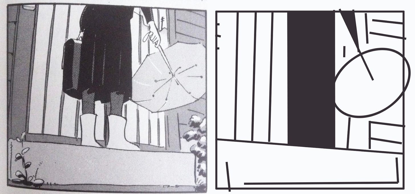
COMPOSITION FIRST, POSITION LATER
If the image reads as an abstraction, it will probably read with all the elements in place. Therefore, it is useful to draw your thumbnails as arrangements of shapes, rather than lines. Look for accidental connections and tangents between the panels—all that contributes to overall readability and atmosphere. Let the panels live and evolve as you draw, don’t call it a final until it’s in print.
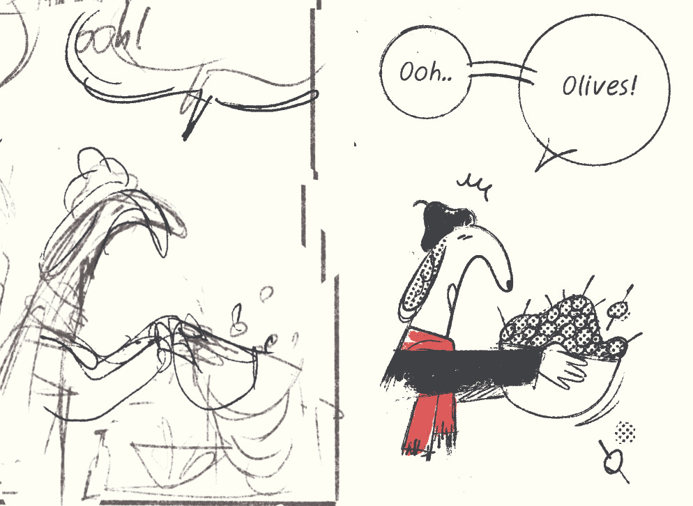
SKETCH BADLY AND TURN THE LAYER OFF
If you are trying to preserve spontaneity, keep your sketches as crappy as possible. As long as you can read them, it’s all good. I often sketch out trickier parts and leave other bits loose or even empty. Additionally, remember to turn off the lightbox/sketch layer once in a while, otherwise it’s easy to just start tracing.
THINK OF PAGES AS INDIVIDUAL COMPOSITIONS
Personally, I try to keep each and every page rhythmically self-contained. Whatever your own priorities and aversions are, build a rhythm around them, expanding from panel to page to spread to chapter to book. If it works at small scale, it will probably work for the whole thing.
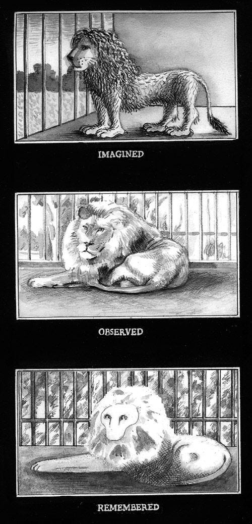
IGNORE REFERENCE UNLESS PRESSED
Even if you do look things up, first draw from memory/imagination. Your miseremembarance is always going to be more interesting that whatever is the real thing. For deeper exploration of this idea, refer to Peter Blegvad’s Imagine, Observe, Remember.
THINK OF THE TEXTURE OF THE WORK
I think this is the most important thing—you can fake emotions, stories, style, but the visceral sense of the thing cuts through all bullshit. I’m talking about the indescribable thusness of things, the stuff that comes out against your efforts. A good half of my practice is throwing shit at the wall and looking for that rare quality, in hopes of cultivating it into something coherent.
REJECT MODERNITY IN MODERN TOOLS
I draw primarily on the iPad these days (in Procreate), but I ignore half of the tools it has to offer. Same with Blender, Photoshop, etc. The process is the thing—why copy-paste, when you can use your finger to measure things? Why undo, when you can erase and leave some trace of your process visible?
TURN OFF THE LINES AND COLORS
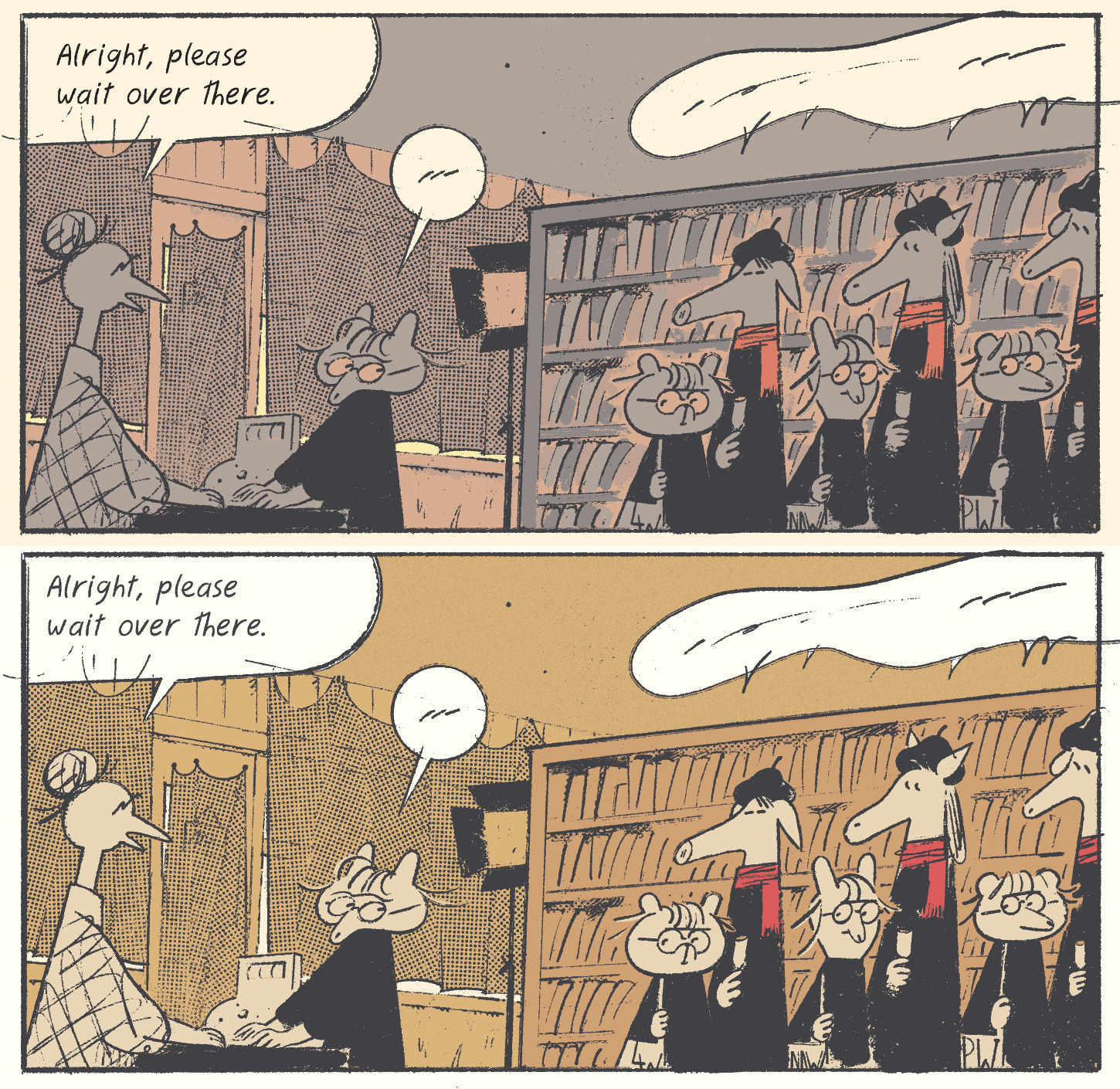
To get a better sense of color balance, turn off your inks and pick colors this way, of course remembering to check how it feels with the lines now and again, since the perception can very different (especially if your inks are pure black (mine never are)). Another useful trick is to turn the image greyscale—you will immediately see the values, which can help with readability. I’m color-blind so I often struggle with balance, and like to mix my colors with X% color blocks in Photoshop or other desktop software.
Speaking of, you can more-or-less replace basic Adobe products with Affinity, which is a similar product except it’s less evil. I’m still using Photoshop since I have it at work (don’t ever pay for this thing out of your pocket) and I can’t find a substitute for batch page-saving actions and simple clipping masks in Affinity, and the prospect of rebuilding years of muscle memory is not tempting… but I’ll keep looking. Photoshop has been getting worse and worse, and Adobe’s idea of improvement is adding a non-functional ‘save as NFT’ button and removing it a year later. And don’t get me started on their Ai crap… Anyway, we’ll continue with these in a bit, but first, Foghorn.
2. FOGHORN CONT.
⚠️UPDATE: read the fully edited first chapter HERE⚠️
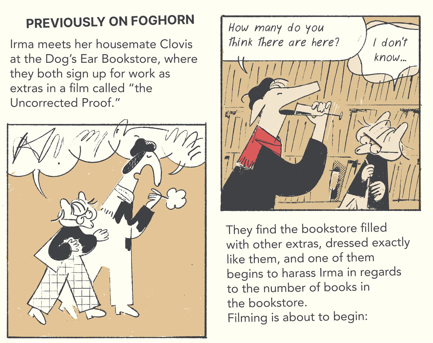
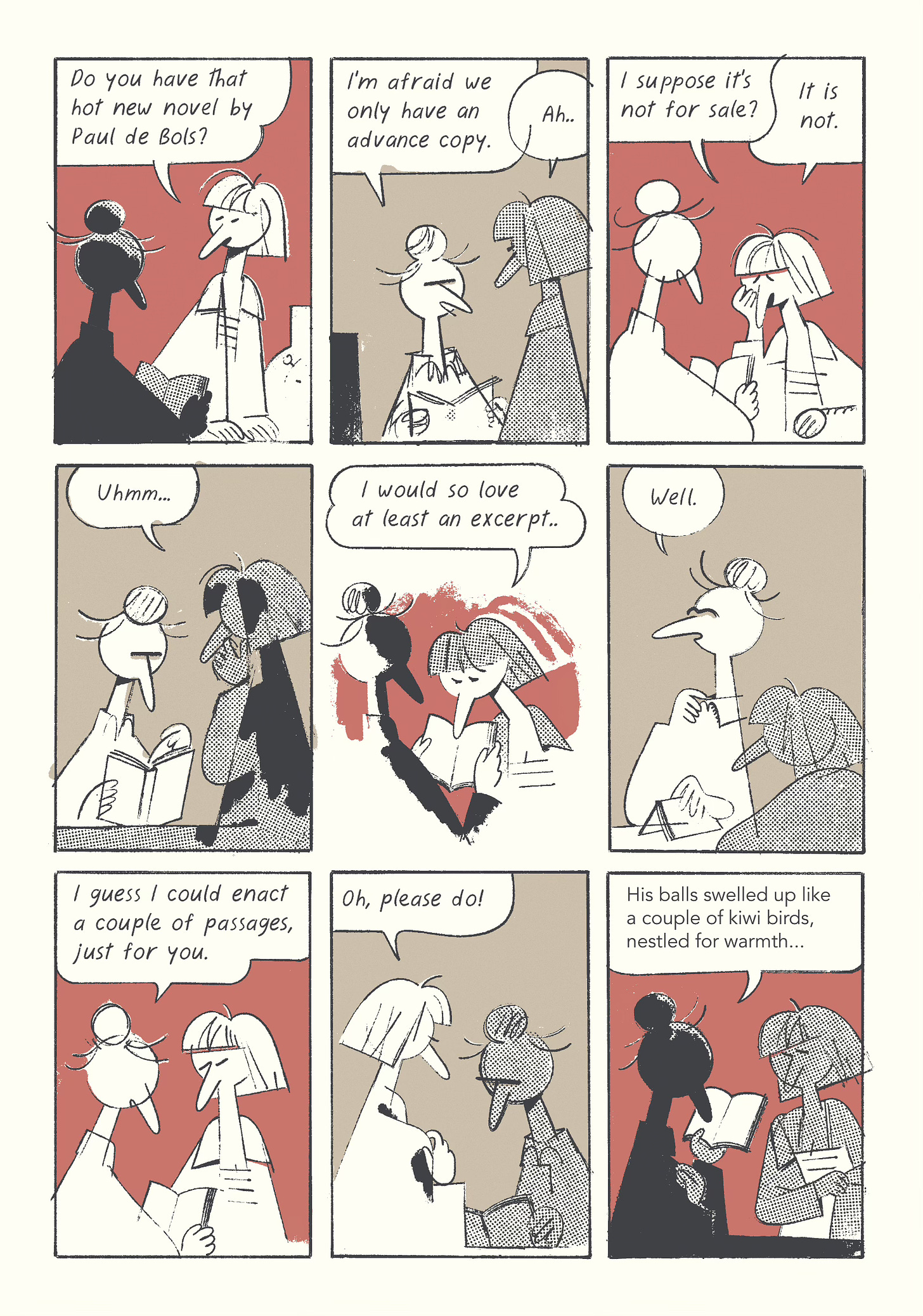
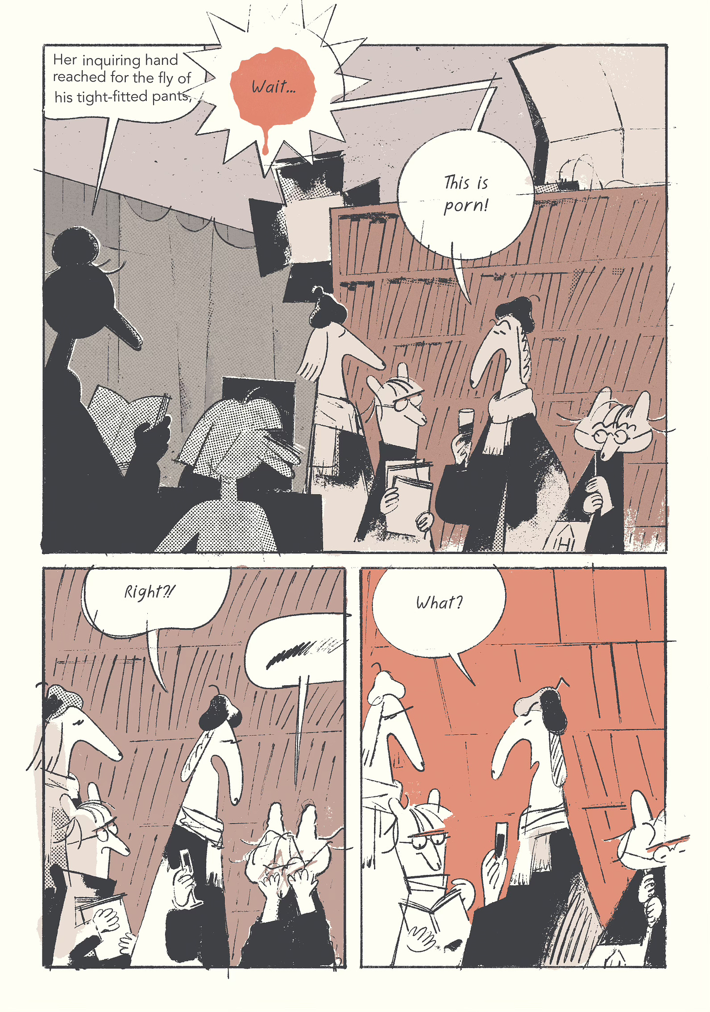
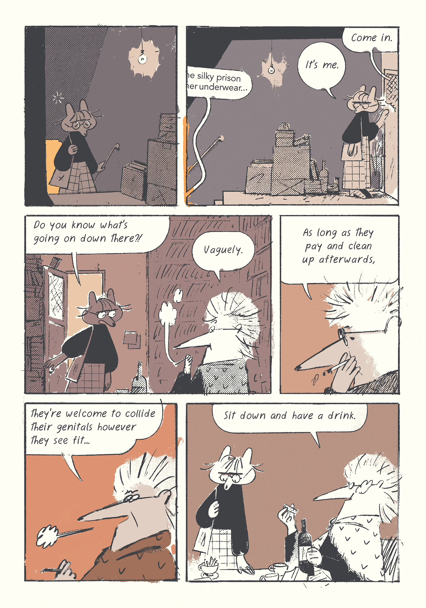
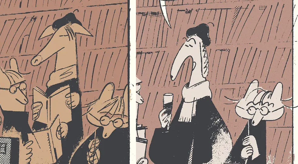
This month’s feature is a bit shorter than planned, and it will probably be this way for the next couple months while I figure out some major life stuff, on top of work and other pressing matters. Here’s the first installment and the second installment. I have de-yellowed the background, too.
Who is the hedgehog woman? Will I continue loosening up the style? Find out next month! Currently in the middle of the classic 20-page slump. Every single time, around this pagecount, I start having doubts and want to redraw everything, but I’m going to plow onwards and let it evolve on their own.
3. PRINCIPLES OF CARTOONING EXCELLENCE CONT.
THE MAP IS THE TERRITORY
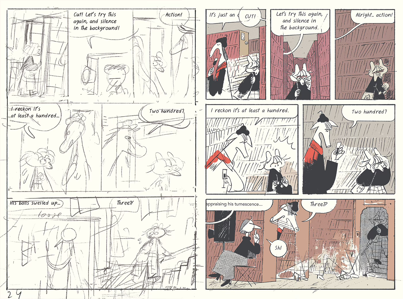
I’m very much against compartmentalized plans, as well as pure improvisation. Personally, I continue to rewrite all the way until the book needs to be sent to print, which is arguably excessive, and there isn’t much distinction in the process between my sketches and my inks. That doesn’t mean that I always do redraw and change everything, but it’s important to be open to the possibility.
That said, it is easy to get lost in revisions and whatnot. In the course of my endless redrawing I muddied the scene-setting a bit—in the first three pages, it’s implied that the pig fellow walks off, and Clovis takes his place. This isn’t particularly important to keep track of, but it can be confusing (tell me if it was, btw), since we’re only 20-so pages into the story, and already you have similar looking characters who are also wearing the exact same outfit… I might revise this later if it keeps bugging me.
FONTS AND LIGATURES
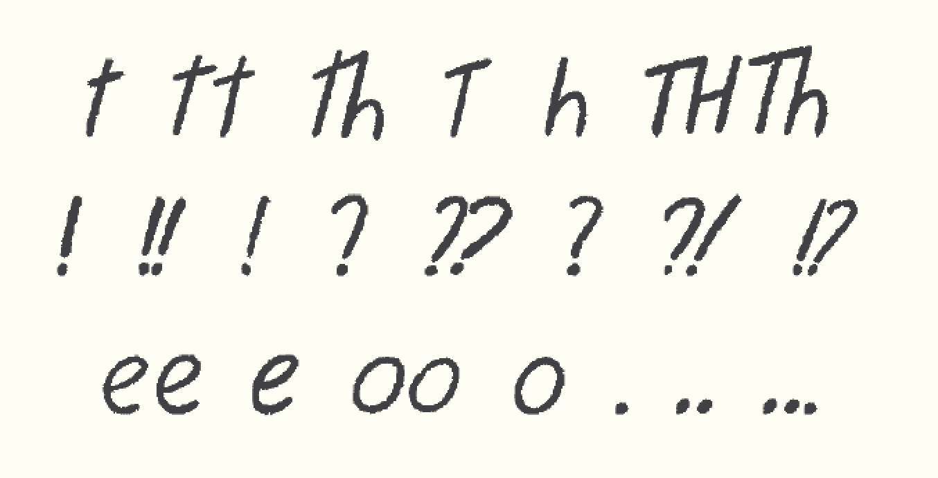
You can create your own font in a number of ways—my preferred method is via fontself. This way you can draw it with the same tools you use for everything else, and don’t have to bother with vectors at all. In my current font-in-progress I have ligatures for most common letter combos, as well as certain doubles, and even ‘hidden’ ligatures like an alternative question mark when you type “???” or a smaller period for “.,” and so forth. This method involves a good deal of tweaking, but you have a greater amount of variation and control than even glyph randomizer scripts in inDesign. Plus, you don’t have to use inDesign. You can download my previous font, used for the Duchamp book (which I’m currently revising and expanding for the English edition) for free here.
USE THE FINAL TOOL FOR SKETCHES
This is something I adopted halfway through the first chapter of Foghorn—instead of using a loose, chunky pencil brush for sketches, I started drawing with the nibby brush I use for actual inks. It works better for this project, as so much of it relies on line weight and consistency—I’m actively trying not to do my usual thing of character designs morphing from page to page—it would be exhausting in a long story. That said, for other projects, having a very different tool for sketches might be much better.
PLAN COLORS IN ADVANCE
I don’t actually do this often, because I like to put myself into annoying situations and find ways out, but it makes sense for most cartoonists—instead of going from thumbnails to sketches to inks to black fills to color, try mocking up black shapes and colors at the sketch stage (or even earlier). Again, if it works as a collection of shapes, it will probably work in the final.
MASTER THE CURVES
Especially if you struggle with color perception, like me—it’s one of the most useful tools in Photoshop and other applications. I personally always color in CMYK, since that color breakdown just makes more sense to me, conceptually, and often go between color mixing and individual curve adjustments. You can also have a curve mask layer on top of your entire thing to try and adjust the overall color scheme without individually recoloring every area. I tend to start coloring straight in Procreate using my intuition, then adjust in Photoshop with a more systematic approach.
MAKE YOUR OWN TOOLS
Don’t download popular brushes and presets—or do, with the intentions of messing with them and mending them to your purposes. I spent months on my procreate brushes, because I want them to feel right in my hand, with the specific light pressure curve that I have (highly recommended for other people with hypermobility and/or chronic pain), and I’m constantly tweaking them as I work on one project or another.
ON MINIMALISM
To me, minimalism is not just keeping things simple, it’s an attitude of using as few things as possible to do as much as possible without muddying everything up. The last bit is what makes everything tricky, and what has often turned my earlier work into unreadable mess. These days I think of it as repurposing everything. Lines of hair can suggest emotion without relying on predictable expressions, for instance. I try to examine every detail and ask if it’s doing anything, and whether it can do more than that one thing. Same with words. Again, the tricky thing is relying neither on elimination, nor intuition. If you cut everything non-essential, things get unwieldy and overly dense. In short, I see it as a process of constant addition and subtraction, both with writing and drawing.
WORK ON YOUR PROJECT EVERY DAY
This is an obvious one that you’ll find in every productivity bro manual, but it’s also very easy to screw up. I’ve lost momentum so many times, and had to spend ages just remembering how to draw and trying to reconstruct what I was planning to do with this or that project. Even if you just do half hour of small edits (or just re-read what you’ve done so far), it’s better than nothing. And personally, I recommend doing your personal work in the morning, even if it’s only 20 minutes. I’ve also adopted a rule of working on just one major personal project at a time, instead of trying to cram everything in—think prioritization, rather than productivity.
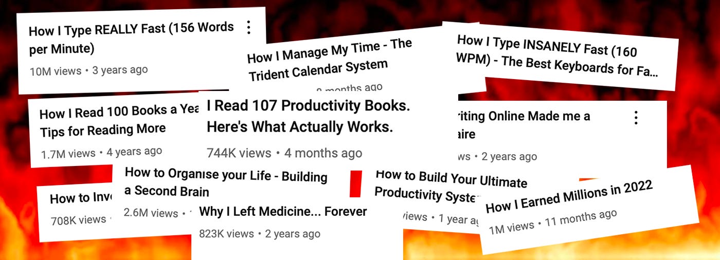
And please dear god don’t ever pay for project management templates or listen to any productivity experts, they are literal scammers. Just put the things you want to do in order and attend to them one by one. The rest is repetition and discipline, and unfortunately, there are no tricks to that—just have to train yourself, like a dog. Gaslight yourself into thinking that what you really want to do with your life is spend years on a book that, if published, will only bring you regret and anxiety. But then look at the “real” life on offer: dating, Sunday brunch, NASCAR, theater, haircuts, Netflix, bridges, pole vaulting, Spotify Wrapped, pottery, raves. Anything is preferable to living, even being a cartoonist.
4. THE BEST MORNINGS OF 2023
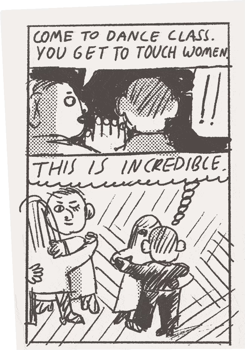
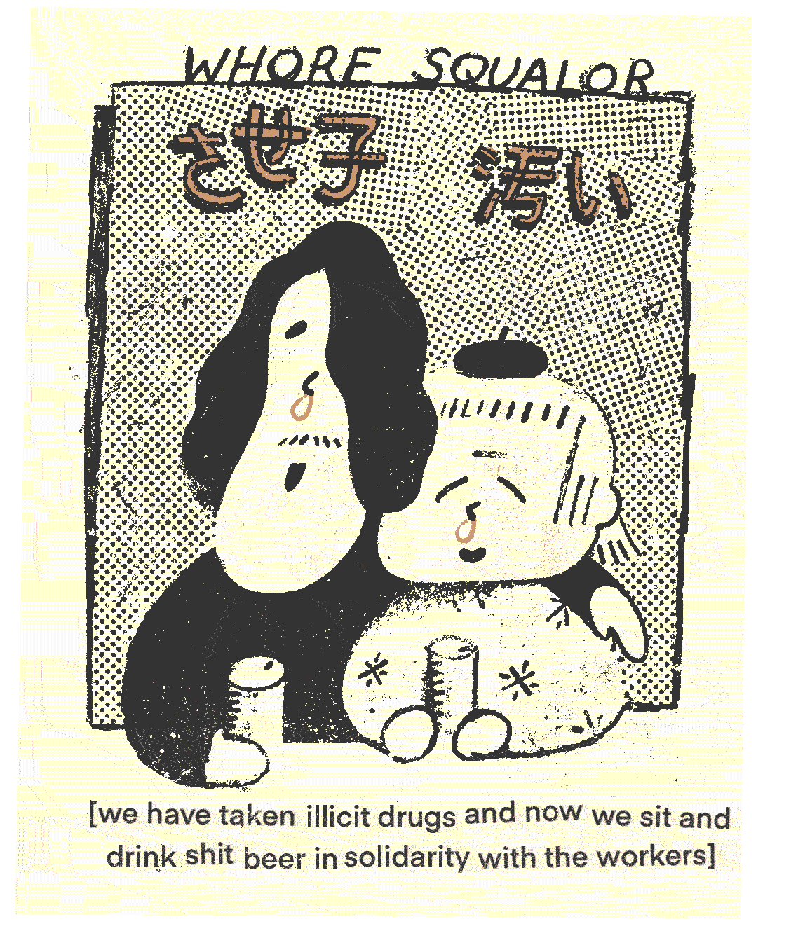
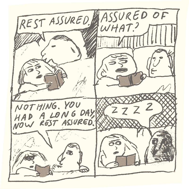
For a while I was trying to draw cartoons as soon as I wake up, with varying results. Here are my three favorites from this year:
And of course the fan-favorite ‘conceptual illustration’ comic, which will be included in the upcoming issue of Fantagraphics’ NOW. As for the top posts, here is my monumental, already-classic three-part essay on comedy: part one (on narrative vs abstract humor), part two (on cruelty), part three (on quipping).
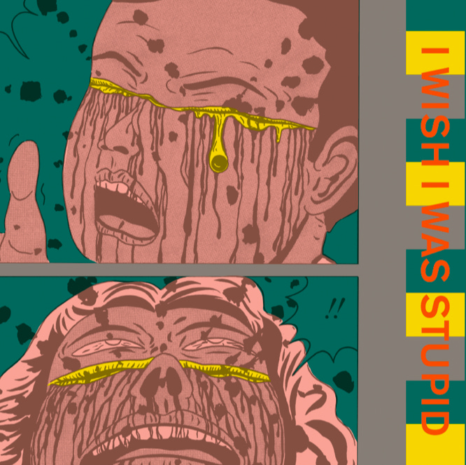
As for other people’s stuff, there’s been so many good comics this year, I don’t even have to time to compile half of it, but one book that really stood out is I Wish I Was Stupid by Ebisu Yoshikazu. I liked the first volume, too, though it was in parts underwhelming, but this one is a huge step up, and the thing I really enjoyed about it is the certain melancholy that permeates these demented stories and elevates Ebisu’s edgelord humor. This is exactly what I mean by the texture of the work—you can’t just replicate this feeling. Also, I really related to the introduction to this volume, in which he talks about laughing at funerals and in other inappropriate situations—it is the bane of my life.
Ok, one more stand-out was Fujiwara Maki’s My Picture Diary. Autobio comics tend to be one-sided affairs (naming no names), and My Picture Diary shows the other side of Tsuge’s memoir, the Man Without Talent. Unlike Tsuge’s work, it’s a much warmer and humbler account—Fujiwara is almost always present as a member of the family, rather than herself (now and then she goes somewhere on her own, and usually feels guilty or disappointed). But the book is much more than a flipside of their relationship—it’s incredibly sensitive, and beautifully drawn. Despite all her hardships, there’s so much love in this book, for her family, and the little details of life. Of course all this perception is entirely personal. When the Man Without Talent came out, I was in the epicenter of a lockdown-era black hole, and related to all the book’s sad men longing to escape, but these days I feel closer to the Picture Diary, somehow. I guess poetic loneliness feels less appealing, the older you get
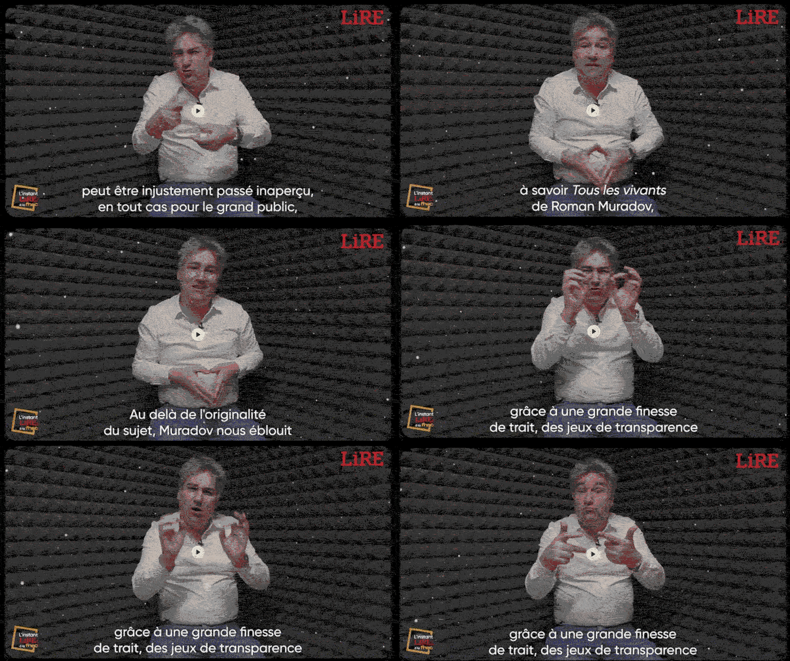
But let’s get back to talking about myself: here’s an exuberant Frenchman locked in some kind of soundproof bunker in the middle of a snowstorm, explaining why my latest book is the best graphic novel of the year. Your turn, Clowes.
“Beyond the originality of the subject, Muradov dazzles us with great finesse of line, truly astonishing plays of transparency and numerous pictorial references. In short, it's a pure feast for the eyes,” he says.
Contrary to my pessimistic predictions at the beginning of the year, it looks like the book in question will (hopefully) come out in English in 2025, by which point we will all be living in snow-filled bunkers and gesticulating to keep ourselves warm.
5. PRINCIPLES OF CARTOONING EXCELLENCE CONCLDDddddr../
Ok, the more conceptual (and contentious) principles are behind the paywall, along with some pragmatic tips and a bit of customary shittalk. You can get through by becoming one of my paypigs, or referring someone to this newsletter (I set the numbers and prices as low as substack would let me, but if you have no friends, you can “refer” a school/work email or a burner account and scam me this way):
Keep reading with a 7-day free trial
Subscribe to DADA issues to keep reading this post and get 7 days of free access to the full post archives.


