Here’s a new animated short, improvised using only flat plains in Blender. Thanks again to Dory for a banging soundtrack. Particularly happy with the way he handled the ending, and the whole final scene justified all the pain with the indoors (that one camera movement almost broke my brain). And now, some topical humor!
TEAR DOWN THAT PAYWALL
I’ve been doing this newsletter for a year now, and a number of people (one, if you must know) have pledged to pay for it. DADA issues will always remain free, but I added a paywalled mid-month newsletter for all you paypig(s). You can already read the first installment with some inspirational corporate art.
I set it up with the lowest price substack would allow me, but I can always add you for FREE if you don’t want to pay—the main purpose is to have a sort of close-friends section for some of my more upsetting work in the future. So do let me know if you want access to a the bonus letter—I want my stuff to be available to anyone who enjoys it, and I’m not in it for the $$$.
PHASING INTO THE LOLHS
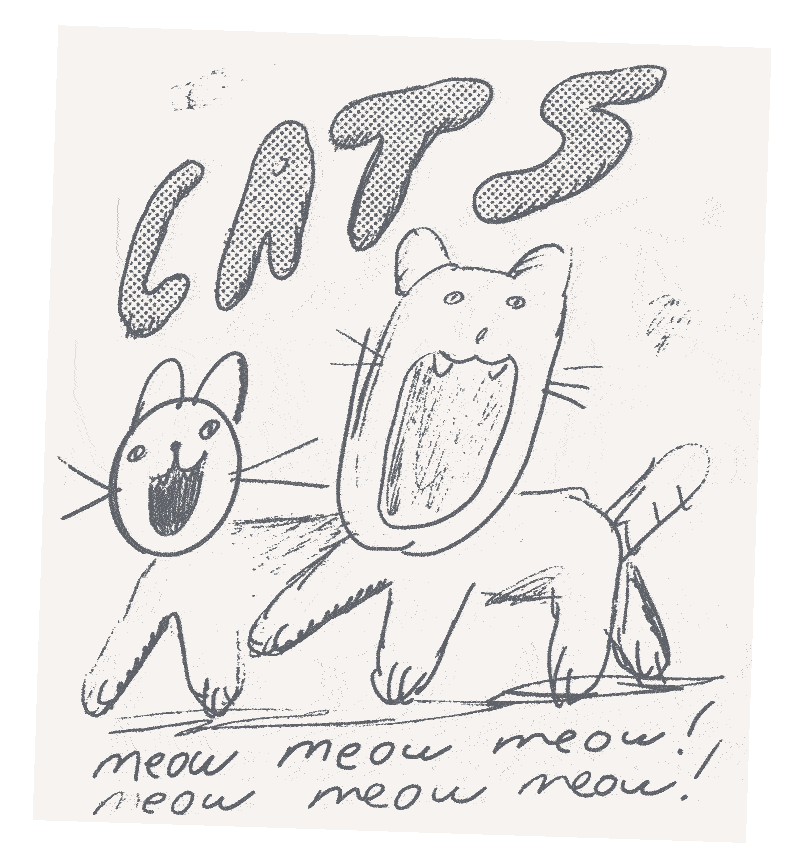
My last book was all about suicide, so the humor in it is very subdued—it felt wrong to have laugh-out-loud-hilarity (LOLH), but now that I’m done with it, all I want is to have a comfortable fun-to-draw ongoing LOLHfest that I can build in installments without fretting over style and color on every page. Well, why haven’t you started, Roman? Don’t you know by now that the best way to figure out how to do things is by doing them?
Yes, yes, shut up—I will start soon, but before I do so, I thought I should write down some thoughts in an attempt to understand what things that make me laugh have in common, and how I can channel that energy into a longer, narrative-driven work without losing interest after a month (which has so far happened with every single book I’ve made—the last one being particularly torturous). Knowing myself, there’s about 0% chance of it not devolving into something depressing, but the plan is to aim for pure comedy and see how things derail this time. And so, without further ado, here’s my…
THE FIRST DISTINCTION
Can you break comedy down into rules and directions? Probably not, but you can certainly dissect and analyze the editing process, which is at least as important as the initial joke (I use the term here broadly). And while you can break down jokes into a million categories, I’d like to focus on this distinction: narrative vs abstract.
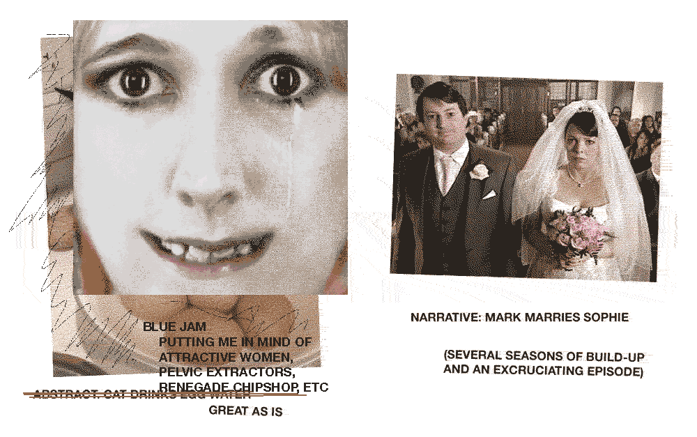
Narrative funny is something structural, whether it’s long-form or not, relying on the sequence of events of dialogue lines, something that has a flow, and (usually) some investment in establishing the rules of the world, personalities of the characters, etc. Here’s the above-mentioned narrative segment from Peep Show—the writing is pretty light, no particularly funny-on-their-own lines, and there shouldn’t be any—the build-up and the horror of the situation carries everything along, and zingers would probably just make it less painful, and therefore less funny.
Abstract funny is something that just works—a certain turn of phrase, a silly drawing, something absurd. For a largely abstract example, you can’t beat the dance chart from Blue Jam. Imagine catching this on the radio in the middle of the night with no context. What a classic plantain!
Now, here’s my point: the most memorable and original funnies are an organic combination of these two distinctions, with no clear separation, and no sense that the author should’ve just stuck with one, or the other. Here’s a perfectly mixed sketch from Armando Iannucci: not only does it contain sharp observation, immediately recognizable characterization, and great escalation, but also the very memorable lines ‘hello, television’ and ‘we’re so good at television.’
So often you get books and shows that seem to have all the right ingredients, a good premise and solid writing, but nothing quite clicks. It’s a mysterious and infuriating thing, the idea of dumping years of your life into something like that, only to find out later that it’s bundle of okayish ideas poorly stitched together… I certainly know the feeling and I don’t want to feel it again.
A CLOSE INSPECTION OF SEVERAL EXEMPLARY FUNNIES
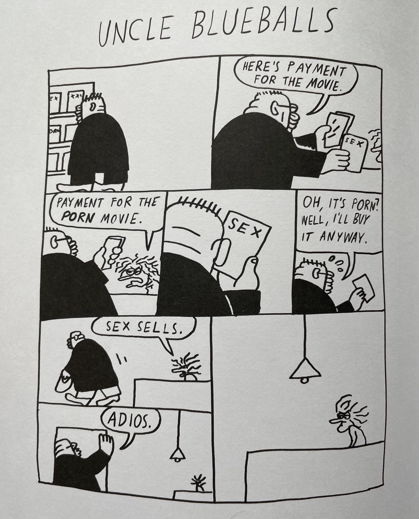
As for comics, Bendik Kaltenborn has made some of my favorite comics that look and feel improvised (and are, allegedly), but they can still have a degree of editing. Here, in the Dongery collection that I just got in the mail, is a very funny strip:
The panel of him looking at a box that just says ‘sex’ gets me every time. And here it is, revised for his solo book, Adult Contemporary:
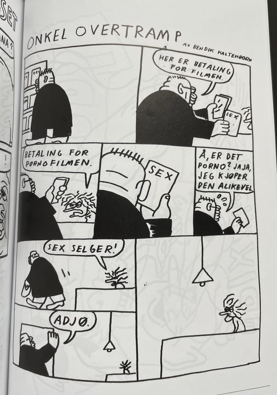
I personally feel that ‘here is payment for the movie’ is on its own much funnier, but in the context the revision makes sense, and the incongruous ‘adios’ ties it all together nicely. The visual pause after ‘oh it’s porn’ is nice, not sure why he removed it, and I do prefer ‘top uncle’ as a title. The Norwegian version is the best, though:
Onkel Overtramp! Over, not under. Anyway, different strokes for different cocks. Let’s look at another Dongery strip:
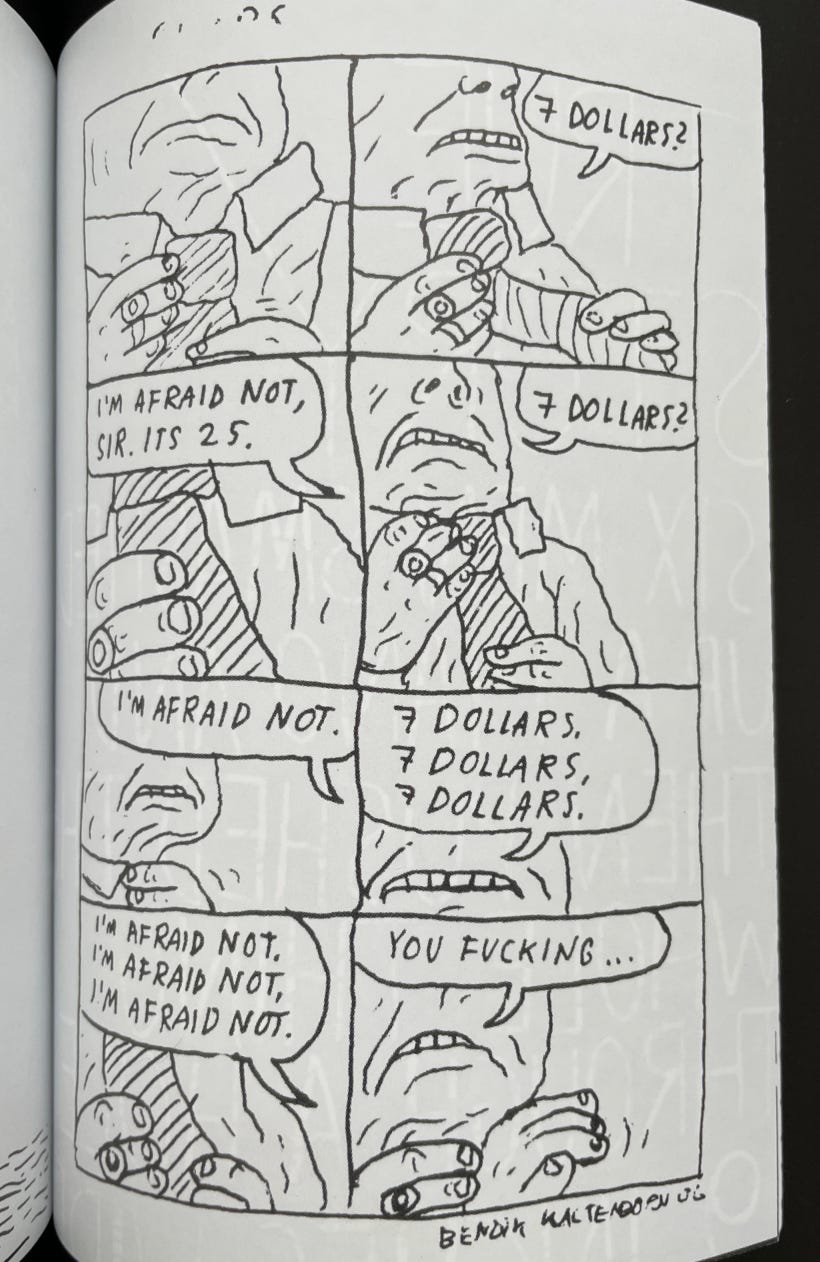
The escalation is fun, and there’s a sense of something bombastic about to happen. And here is the same strip in Adult Contemporary:
Now it’s pure repetition, which somehow feels more menacing and more uncomfortable, and ‘bucks’ instead of ‘dollars’ carries some of the aggression that got lost with the removal of the ‘you fucking.’ Ok, one last strip from Dongery:
And its revised version in Adult Contemporary:
Can you see the difference? No? Come on, look closely.
No? Good, because there isn’t any, apart from the missing title. Idiot! Ha ha! But. In all seriousness, the decision to not change anything is still editing. Think about it, yea? There’s this concept of ‘punching up’ dialogue in sitcoms, the idea that practically anything can be made funnier by editing. I think that’s why so many shows feel torturously over-written—it’s good to explore all the options, but you must be able to keep things as they were in the first draft, which is much easier to do if the whole thing is written by one person who doesn’t have to deal with anyone else’s ego. Ok, here’s one of my favorite comics of Bendik’s:
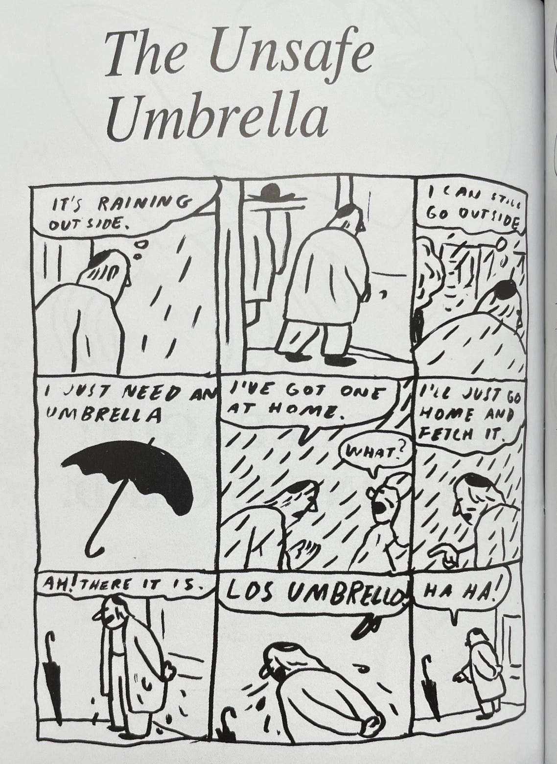
This is the perfect marriage of abstract and narrative comedy within a one-page format: the phrase ‘where is it boiling’ is hilarious on its own (‘it’s boiling somewhere’ would be so much worse), as well as the idea of a man shouting ‘take the lid!’ to a passing cyclist, and the progression just makes it all funnier—the loose rough style leaves a lot to the imagination, and the whole thing doesn’t overstay its welcome. Some of the strips from this collection have been adapted into a short film, and it’s remarkable how well his humor translates into another medium:
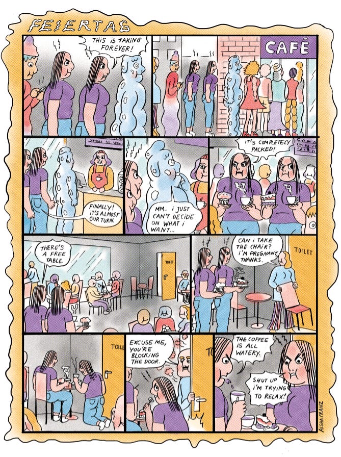
And here’s a one-page strip by Aisha Franz that also exemplifies that unity:
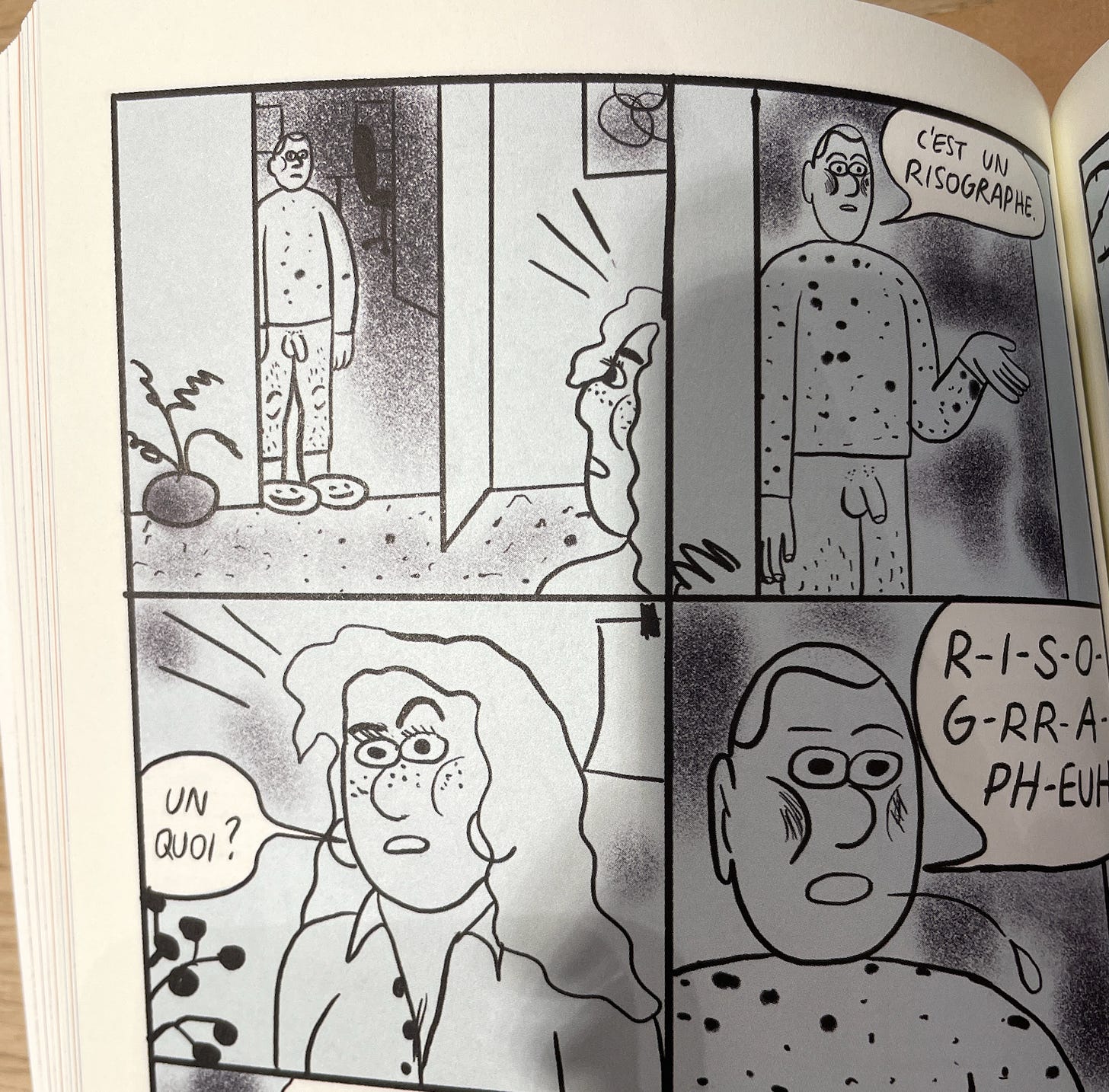
Is the indecisive person liquid? Are the protagonists twins, or the same person duplicated? So many questions… still, there’s a narrative backbone to the whole thing, and the writing heightens the discomfort by keeping it all plain and stern. It feels familiar and alien at the same time. The phrase ‘I’m pregnant, thanks’ is particularly good—it would make more logical sense to put the thanks elsewhere, but it’s so much funnier where it is. Also, Aisha has a new book out called Work-Life Balance, and it looks great. Here’s a sequence from it that made me laugh out loud heartily (LOLH) in public—it’s in French, a language I refuse to learn, but that somehow makes it funnier to me:
Anna Haifisch is also brilliant at that—you can take practically every page from her books out of context and look at it alone, and it works, but together they form a more complex narrative with a very peculiar rhythm, partly achieved by that individual staging in each panel/page. Another aspect of her work is elision—you never get a full view of the world, just a collection of glimpses. That’s good comic editing.
Anouk Ricard’s Benson’s Cuckoos is one of my favorite comedy books, ever. There’s something in her writing that escapes analysis—her humor is so totally and completely hers alone, that it feels wrong to dissect it. A true original.
To wrap up the funny animals, I can’t not mention Jason. His humor is more subdued, but there are some real bangers, and in my favorite books of his (the 46-pp albums) he usually manages a great balance, using (mostly) the same grid for self-contained sequences that build into a longer story. I’m always impressed by how much nuance his minimalist style can carry, and how perfectly it plays into his brand of melancholy comedy. Also must mention his late colorist, Hubert, who really gave those books a full personality—having these naturalistic palettes grounded the stories in reality and tied Jason’s cartooning together. A rare example of a truly perfect collaboration.
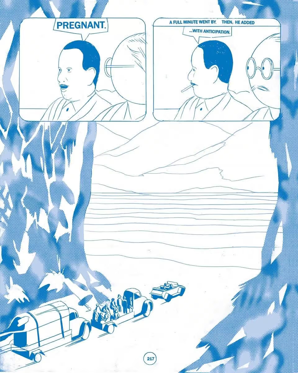
And here’s a page that probably made me laugh more than anything else, ever—it doesn’t quite work on its own, but if you know, you know. If you don’t, buy yourself a copy of Arsène Schrauwen by Olivier Schrauwen immediately, that book is a masterpiece, and a great example of very disparate kinds of humor (and not humor) working together seamlessly (in part because the tension and incongruity are so integral to his cartooning language).
Now, here’s a book that achieves that perfect balance in a single long story. It goes all over the place, and the style allows Schrauwen to play with awkward pacing and make it part of the experience—even after reading it a million times, I still find myself surprised. Everything coexists on every level—just like his drawings are at once beautiful and ugly, so is the story at once ridiculous and moving, and that elusive sense of unity and wholeness is a real accomplishment, even more impressive than the sum of its parts.
THE SECOND DISTINCTION
One of the things Schrauwen, as well as Franz, Ricard and Kaltenborn do exceptionally well is clever stupidity. So let’s examine another distinction, and here I’m going to be far more judgmental: clever stupidity is great, and stupid cleverness is not great.
CLEVER STUPIDITY
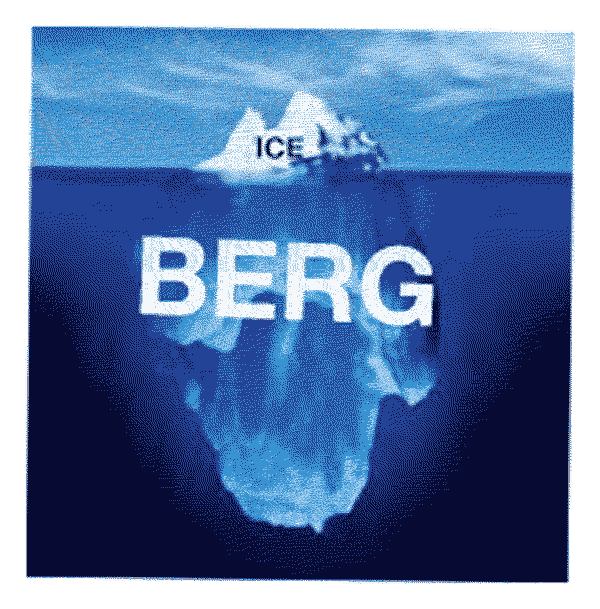
Something special can happen when someone clever decides to write something stupid—you get that tip of the iceberg situation with all the cleverness hidden but still there, and one bit of stupidity peeking out. Stupidity is funny, but it gets extra funny if it’s standing on something unstupid.
STUPID CLEVERNESS
The opposite is a mildly clever person scrambling up all their cleverness and ending up with something shallow and stupid. This is all your internet satire, TED talks and Malcolm Gladwell types, so many awful things…
A SHIT ON SELF
I’m not going to shit on my colleagues so I’ll shit on myself. Here’s a bit from one of my worst books, Vanishing Act. Shambles of a story trying to rescue itself by over-complicating everything and burying all humor in layers upon layers of reference—stupid cleverness at its shittest:
A PAT ON BACK
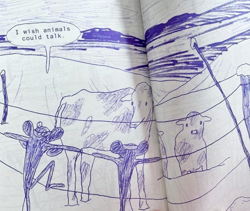
And to offer myself some redemption, here’s a panel from a recent comic. English is my second language and it’s pretty easy for me to come up with broken phrases—unfortunately I’d been struggling with that typical immigrant insecurity for ages—trying to polish and censor it up as much as possible, but now I’m ready to treat the written word like a corpse in a communal grave.
There are other things I’ve done that hit the right tone, yachts, caption contest, emily in paris. Short form is a low-stake affair—if it doesn’t click right away, you can just abandon it and do something else. Here’s another one of Iannucci’s television sketches, a perfect example of clever stupidity:
As much as I love this stuff, Iannucci’s latest show, Avenue 5, did nothing for me (though I only watched a couple of episodes), as well as Chris Morris’s the Day Shall Come. Both are over-edited and over-produced, and it’s hard not to imagine that the length had something to do with all the familiar elements not clicking. How does one maintain the tone in long serialized form, other than doing and failing and doing better, which is a huge investment of time and energy… I think (and hope) that examining the mechanics on a small scale can help. From panel to page, from page to chapter, from chapter to book.
That’s how I’ve so far justified obsessing over style and design of the characters for the new thing—I want it to feel good on the level of individual lines, then shapes, then characters, etc. I’ve spent months refining the brushes, trying to get that right tone—a very specific feeling that I want to maintain on every level, from writing to design. There’s something to be said for that obsessive planning, and there’s something to be said for simply sitting down and doing it, and obviously there is no right and wrong here—simply finding the right balance for your story, your process, your shortcomings and strengths. Anyway! Thanks for reading—this is your reward:
If you have any thoughts/theories/things to share, do smash that reply button!


