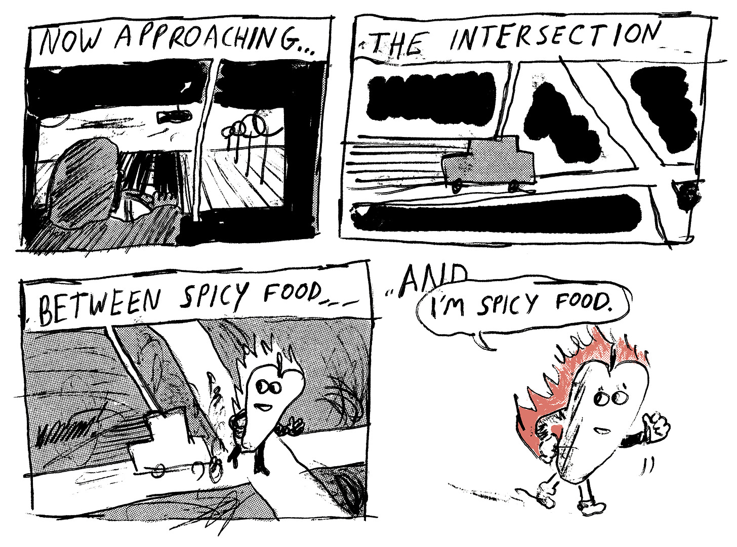
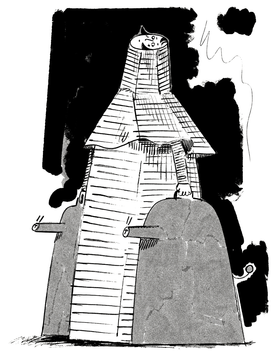
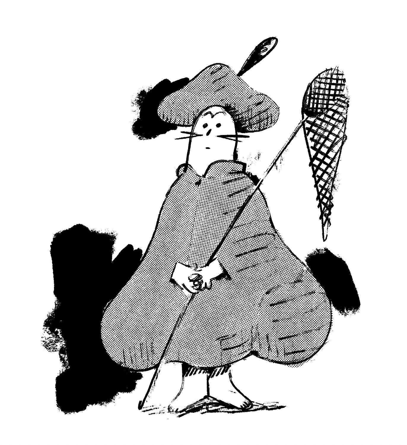
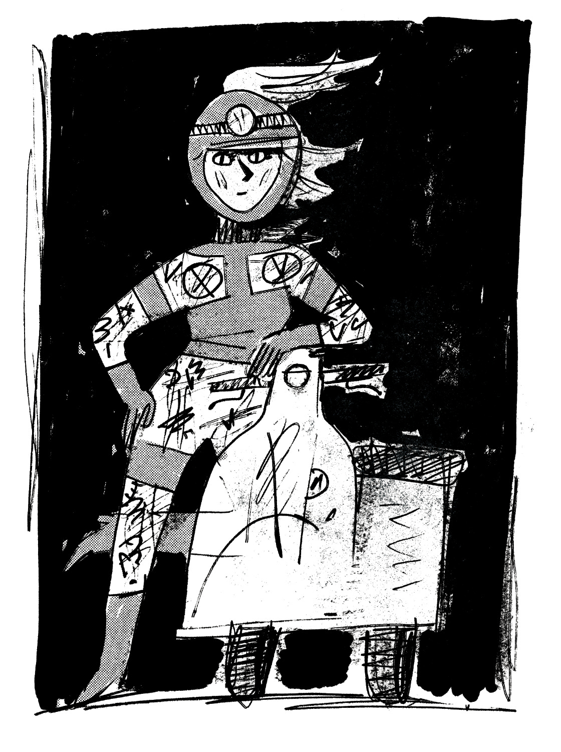
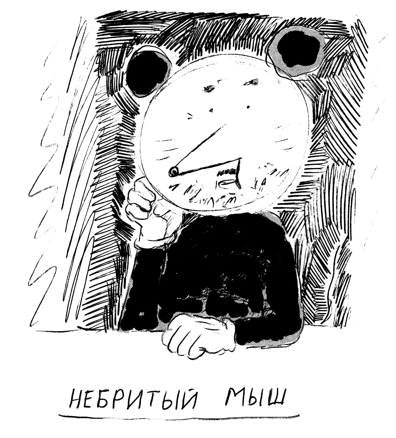
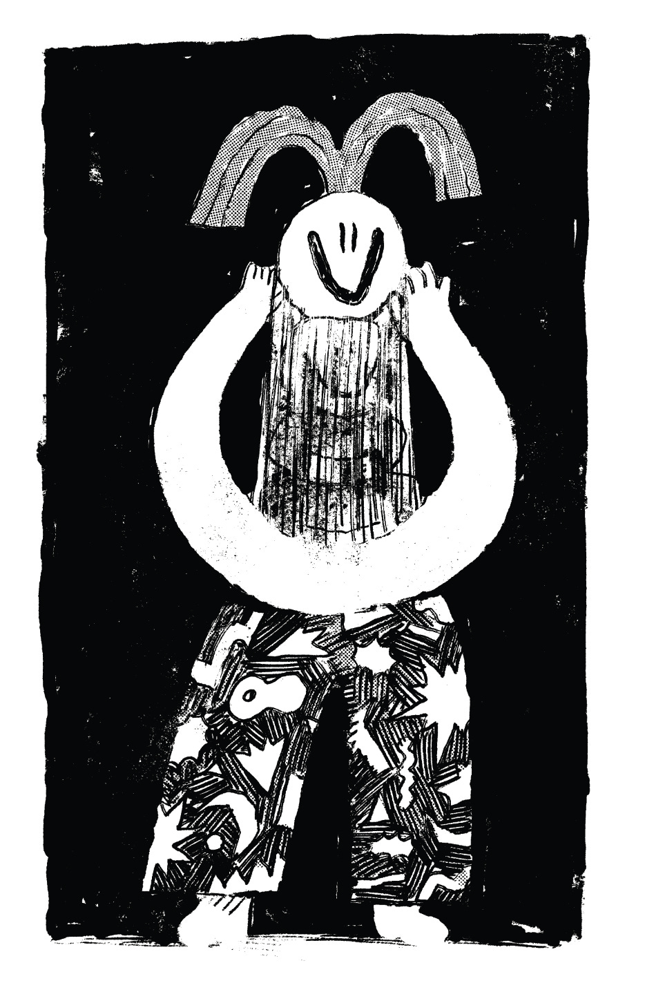
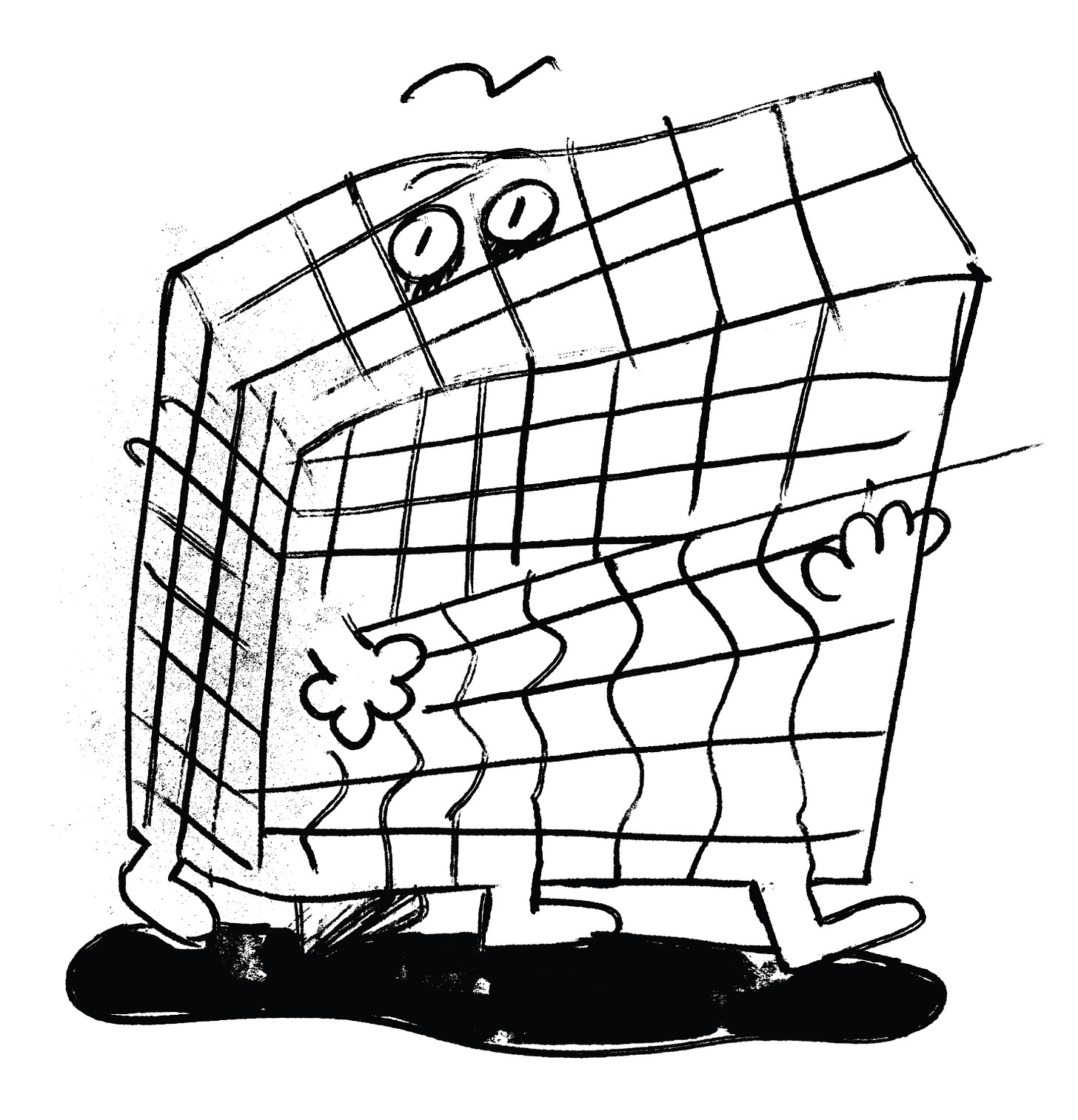
Lately, I’ve been thinking about what makes a visually compelling character. In this post you’ll find lots of new character designs, and no stories about them. I’ve been traveling a lot, so this is a bunch of semi-scattered thoughts, and not a thought-through essay. Such is September.
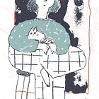
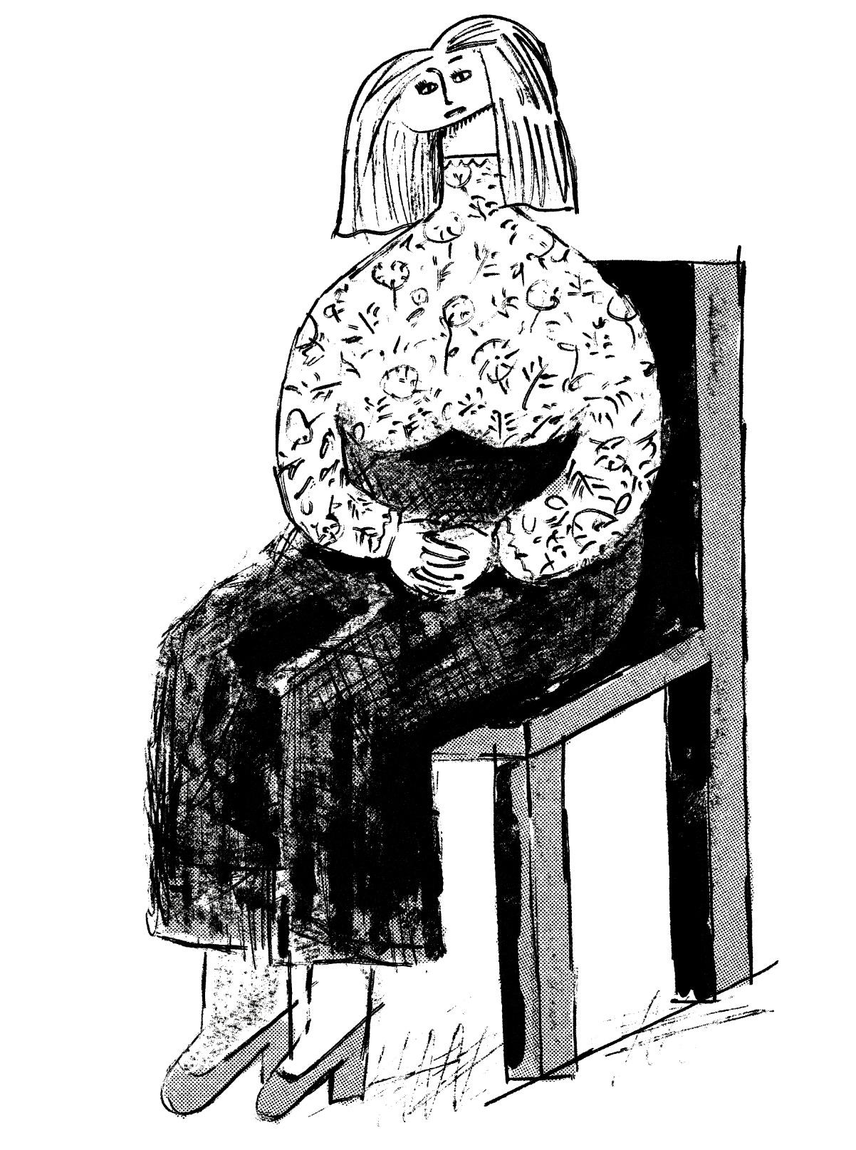
Most of my characters tend to carry suitcases, or some other bags, or something—one can probably psychoanalyze it as some manifestation of my many many migrations, and one probably wouldn’t be wrong.
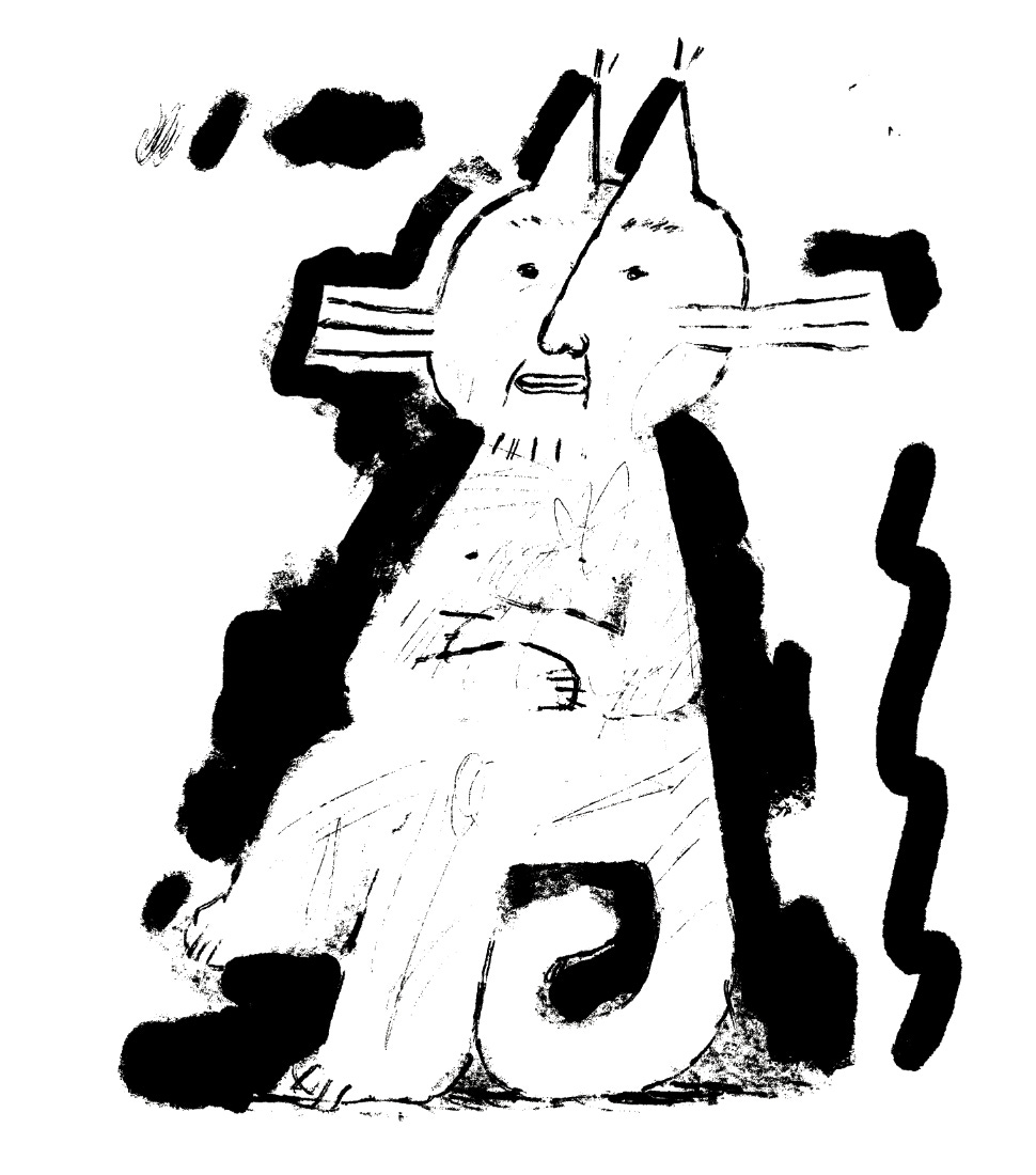
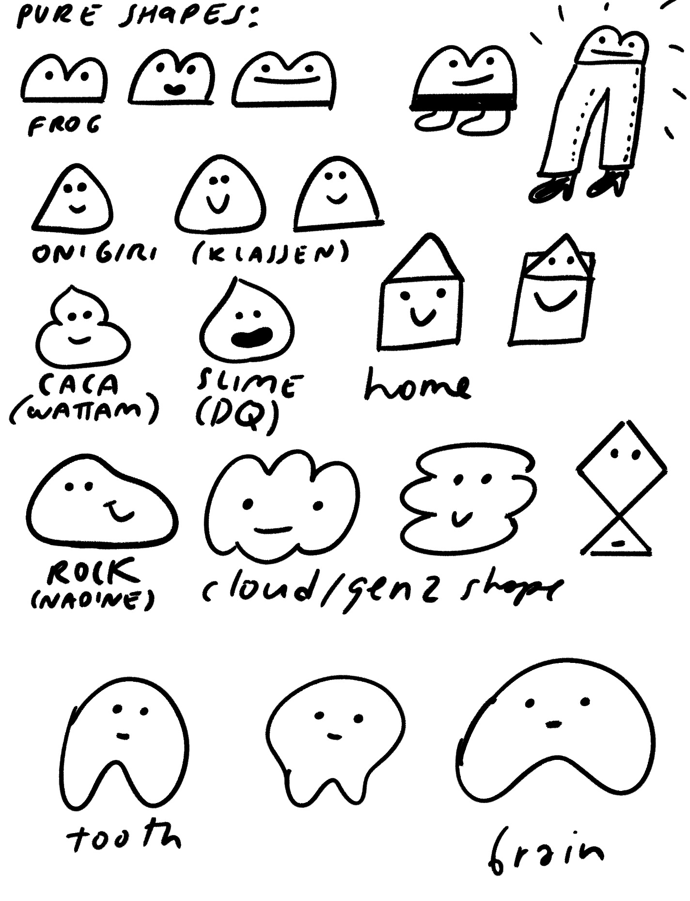
I think a good character is a balance of shape and reference.
A distinct shape makes it readable, while a connection with something in our world (humanoid, animal, object, etc) makes it feel familiar.
For the characters in Foghorn, I was very deliberate in making their designs not too clearly referencing one animal or another, so some people think Irma is a cat, others think she’s a fox—myself, I have no idea.
If it looks too familiar, the character can appear dull, and if it has no connection to what we know, the brain has little to hold on to in distinguishing it.
A good character design, I think, is somewhere in the middle.
If we try to imagine what it would feel like to look at the most widespread cartoon animals with new eyes, it’s often clear that Mickey Mouse or Hello Kitty just barely look like the animals they are supposed to represent.
Depending on where you live, you might see more Mickeys per day, than real mice, and so the peculiarity of the character’s design becomes flattened by over-exposure, and becomes the default reality, which independent artists build on.
If we have someone making a subversive fan-art of Mickey, then someone doing a parody of that fan-art, then a hundred more covers, to the extent that the final work has no characteristic in common with the original Mickey (let alone a mouse), is it still a mere variation?
Anyway, moving on to the shape—it’s not hard to make distinct Pixar-ish shapes that represent the characters, but that runs the risk of them looking and feeling too predictable and clean.
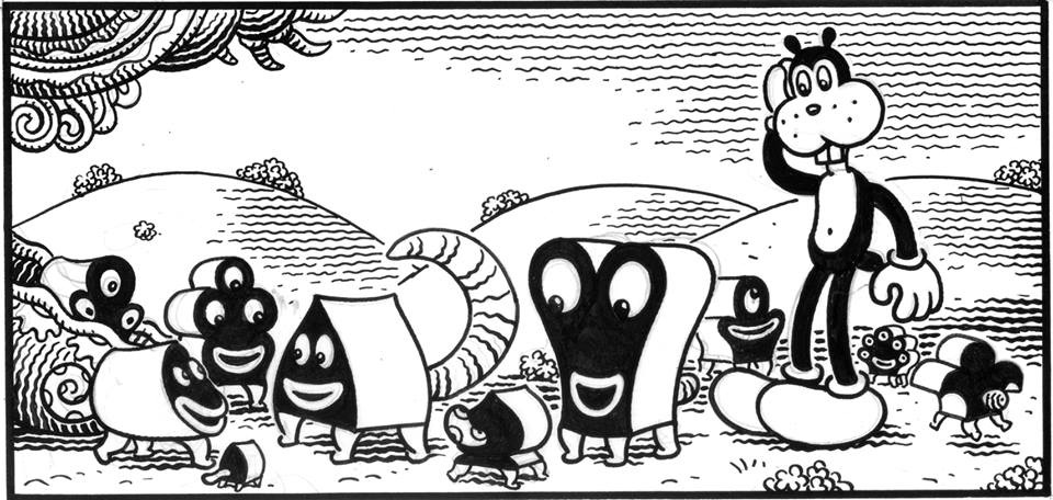
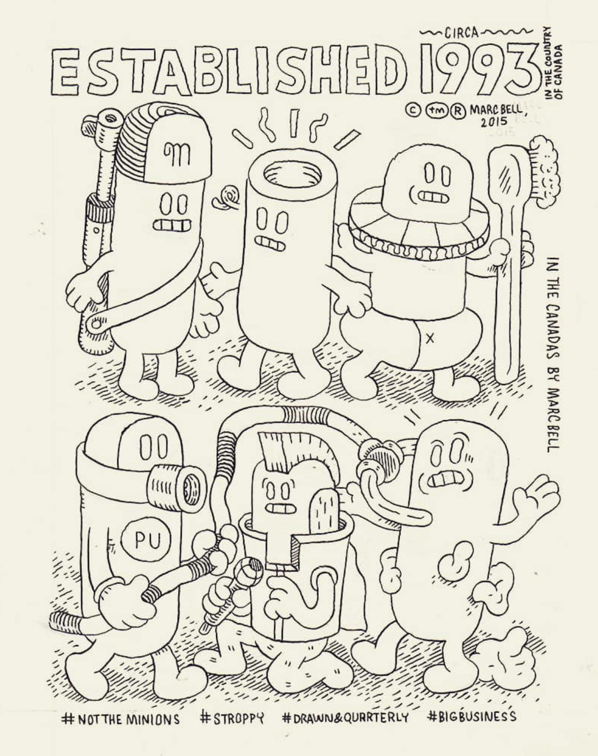
Something should be a bit off to be interesting. AC-BU once again come to mind, and their work was recently covered by the excellent Animation Obsessive:
I also wrote about them back in my dissection of humor and comedy here:
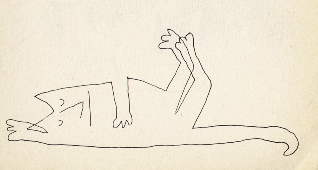
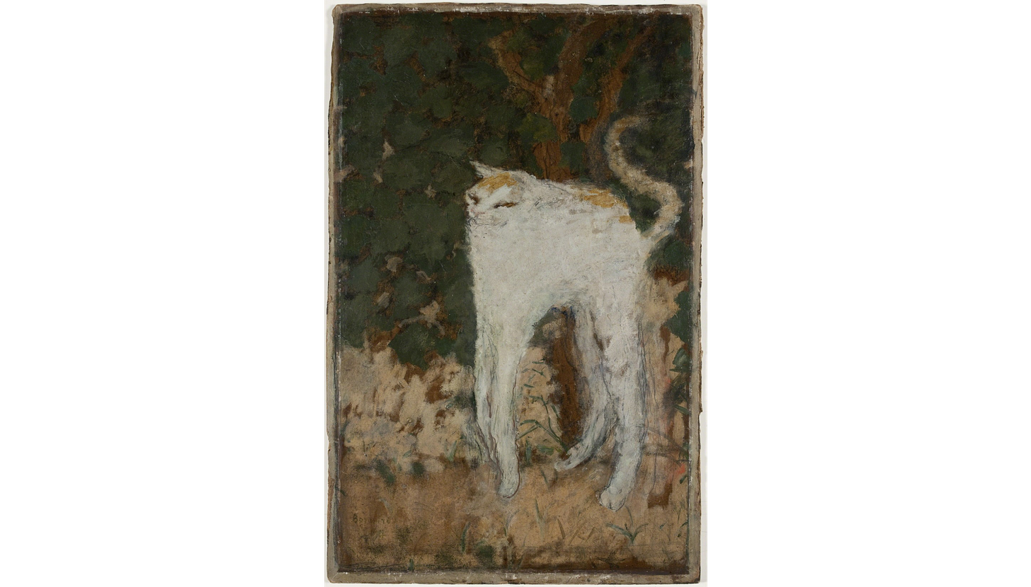
So it becomes a matter of the right allocation—a cat stretched into an unfamiliar shape, or an unfamiliar entity fitted into an unusual shape tend to feel right, while too much familiarity in both directions can feel like too much/not enough.
In the end, we are limited by the frames of our reference, the stuff we recognize and the motions we ascribe to shapes and their combinations. Of course there’s also the matter of the line itself, and the subtler variations in the drawing.
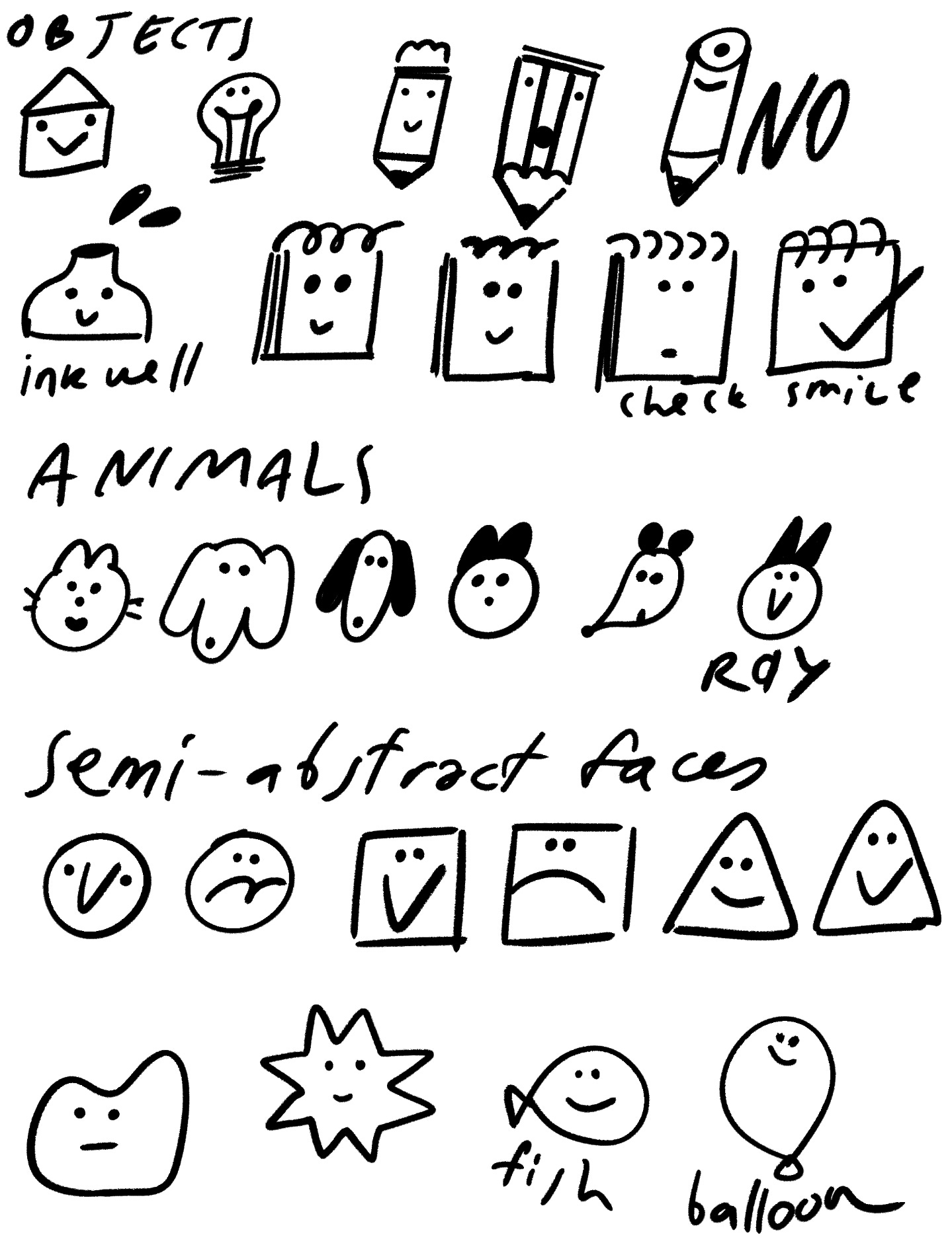
Most characters we see are variations on animals, people, and objects, sometimes abstractions, as well as their various arrangements and remixes. The more detached it is from reality, the harder it is to sell the character.
Is it really possible to come up with a character that doesn’t look like a mix of things, but still ‘reads’ and has a personality? I don’t know, but it’s interesting to explore.
When I drew these, I wasn’t thinking much about these matters—the brain does its own thing, and these decisions appear happen after the strokes, justifying them.
ASS-T FACE
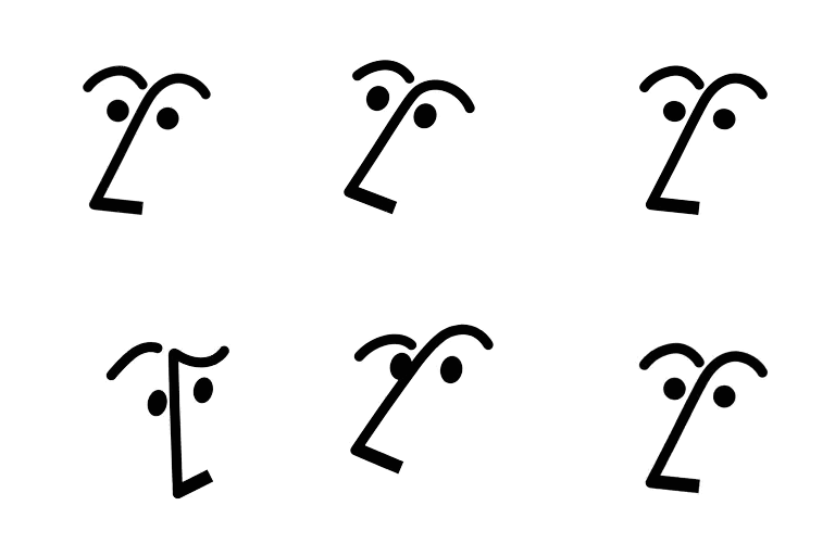
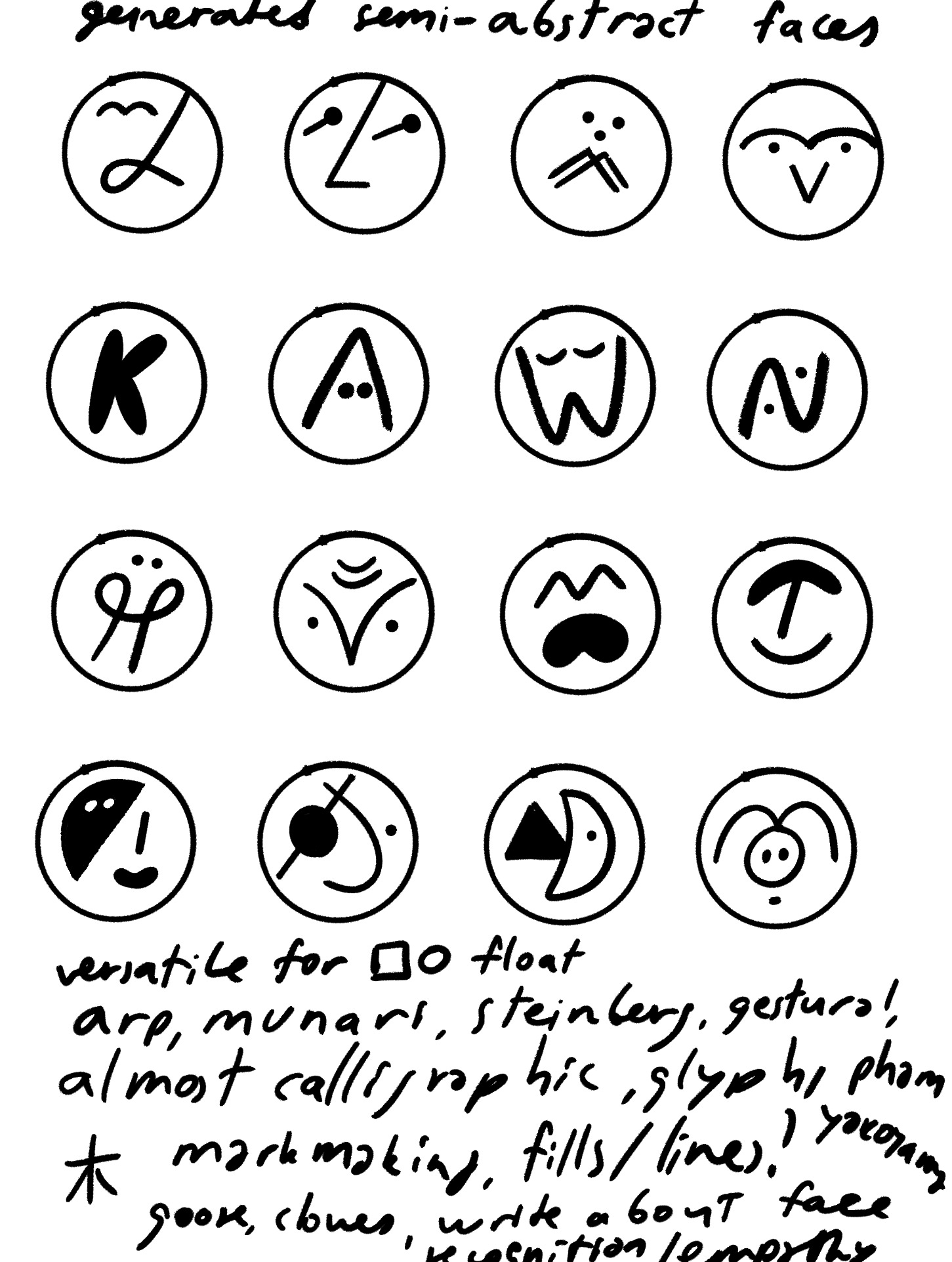
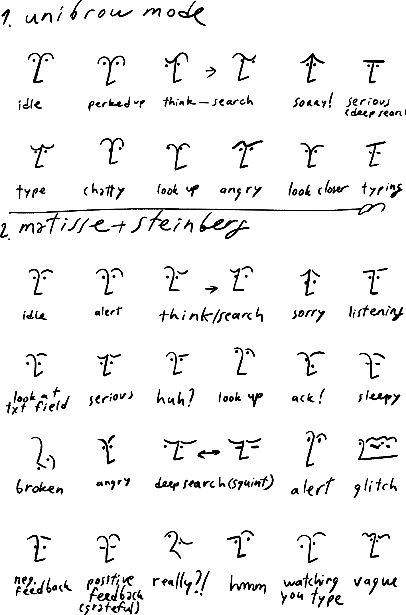
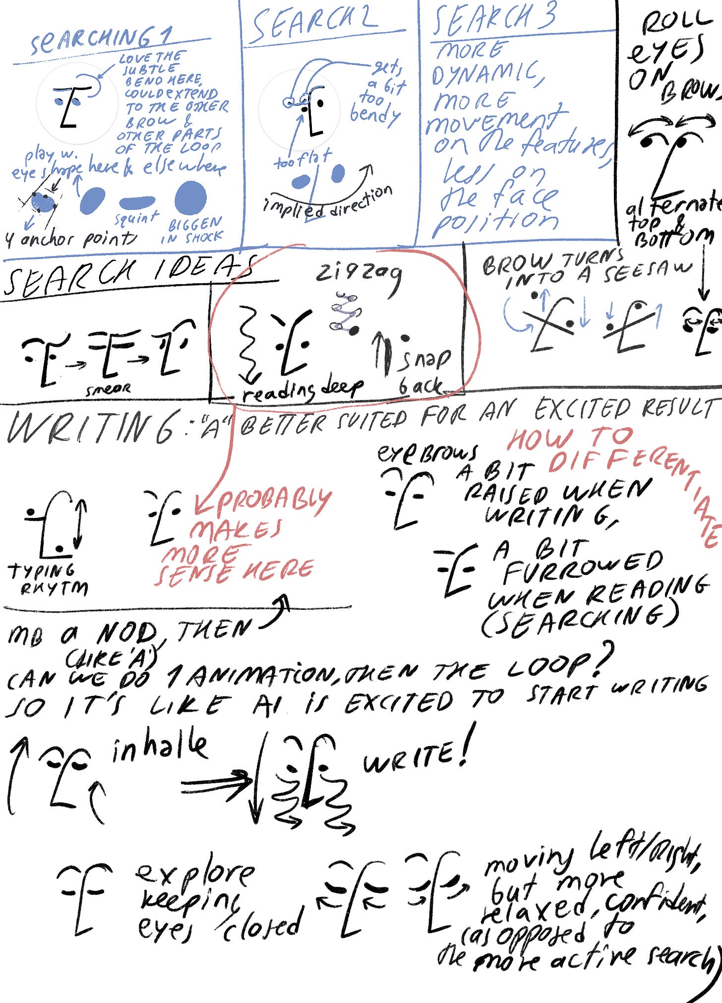
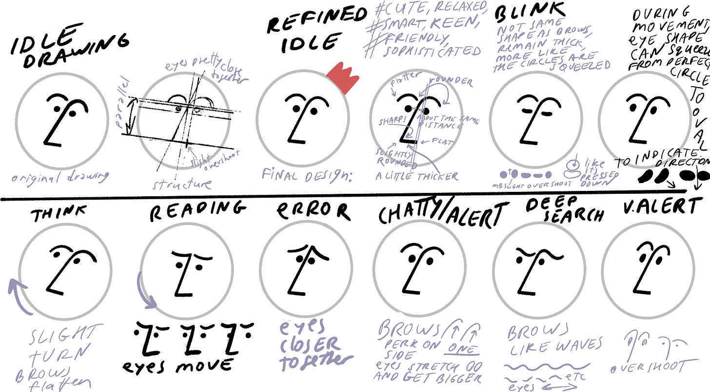
For the last year or so I’ve been working on the assistant face for Notion. You can find it in the bottom right corner of the page if you use the app.
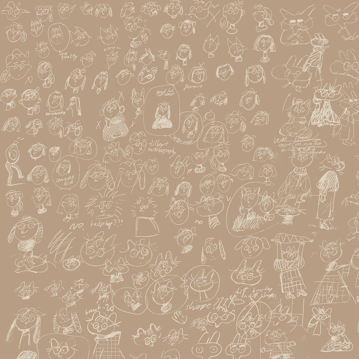
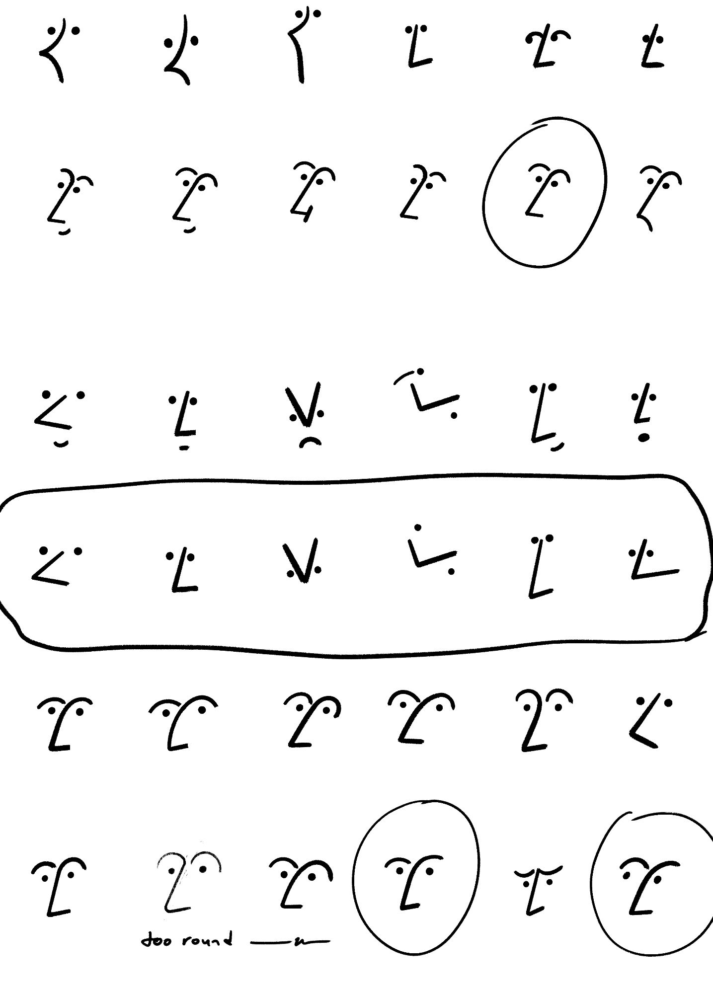
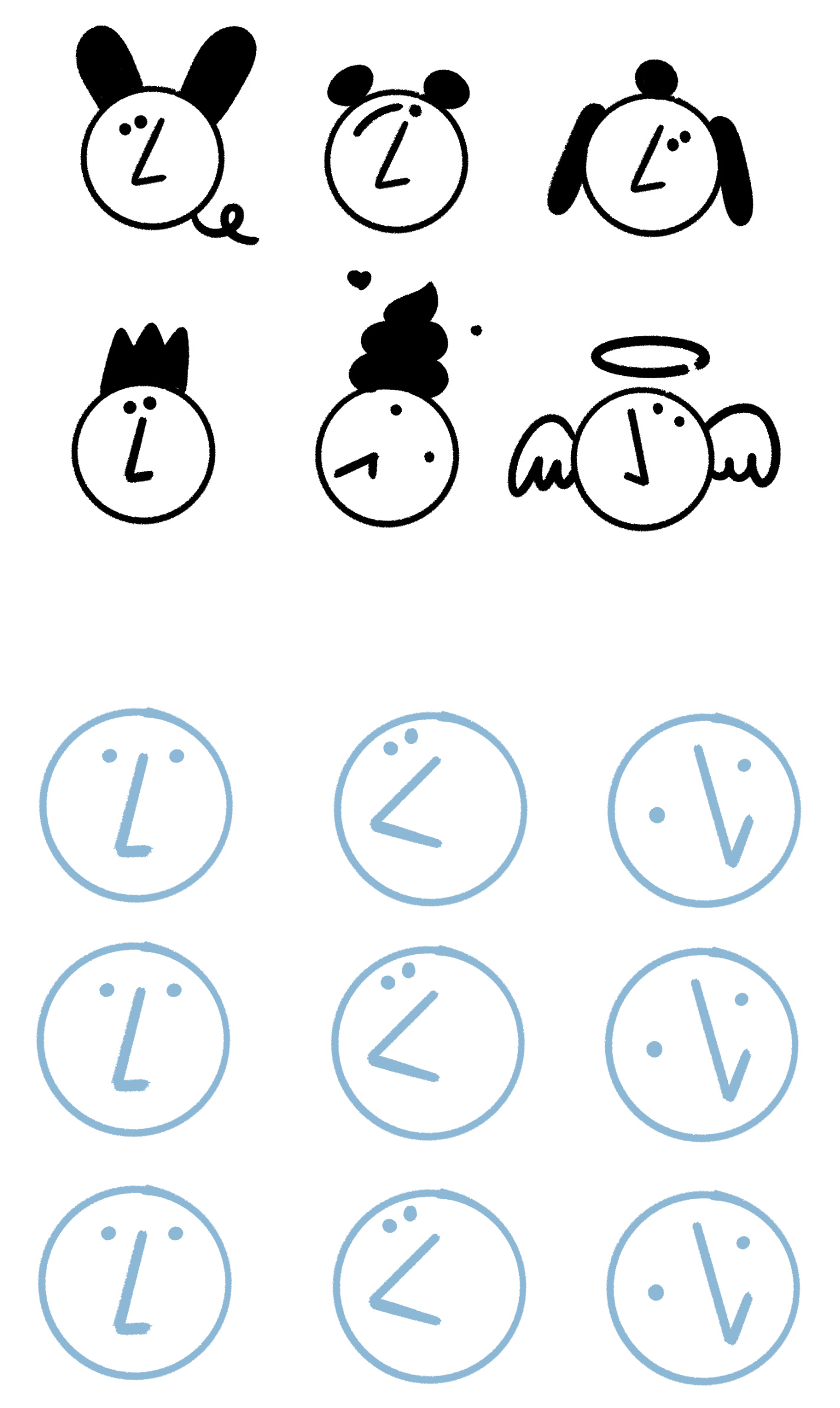
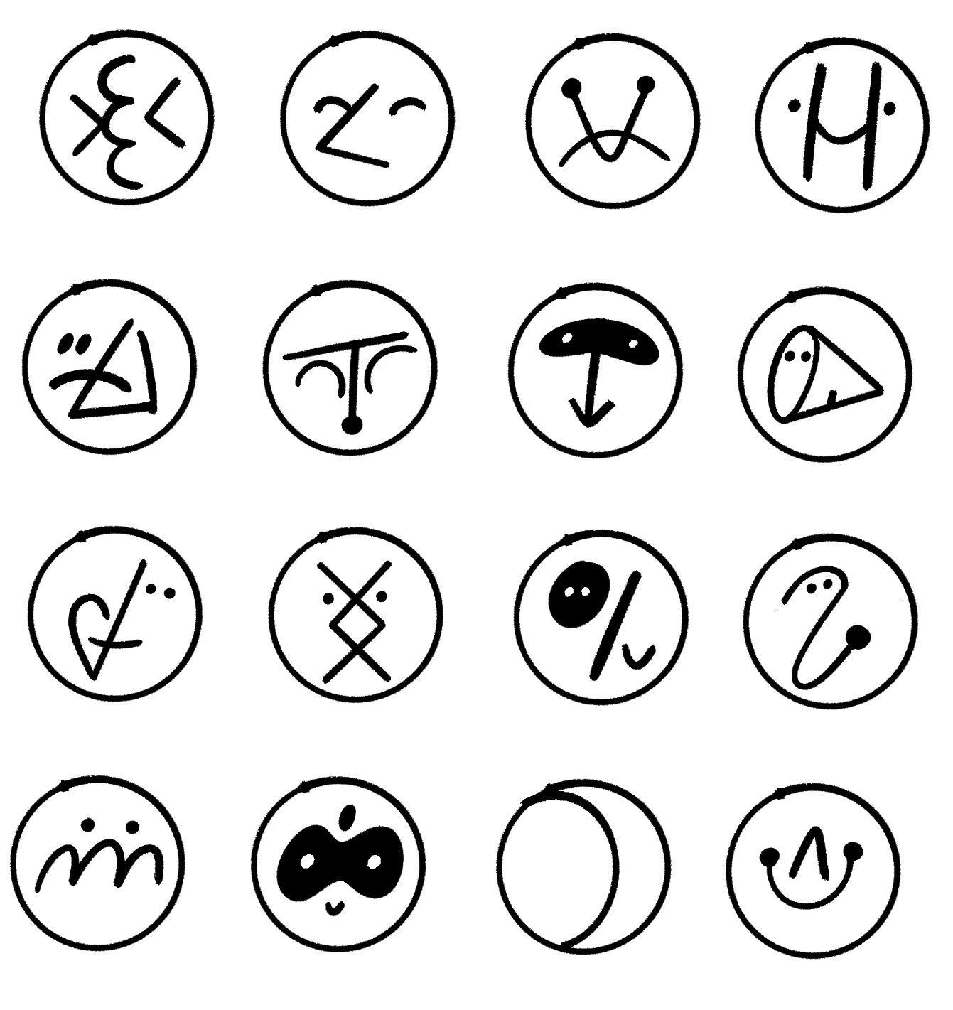
It was a huge, long project that involved close collaborations with animators and product designers. Here are some scenes from the making-of. From vague exploration, to details and refinement.
I wanted to abstract the face to the point that it almost feels like a collection of shapes, using the nose curve as an anchor.
Then, after the design was finally approved, it was a matter of pushing the personality through animation and behaviors, going for something silly, but not too whimsical.



This is so good! I have AI turned off on Notion but I love the lil guy and his wavy eyebrows and it's fascinating to see the stages you went through to get to it. The 'error' expression is heartbreaking!
These explorations really are delightful, the playful eyebrows alone are SO much more expressive than I thought two lines could ever be. Really wonderful work, thanks for the behind the scenes!