Reader, rejoice! Your favorite misanthropic funny animal is back, but first, I have a couple of quick extra thoughts on character design, following up on the last few letters.
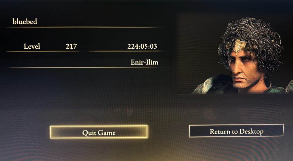
Yes, I finally beat Elden Ring, including the DLC! It’s been a long journey, and I felt pretty wobbly towards the end, although the very uninteresting final boss of the DLC didn’t leave a great impression. The side characters, though, stayed with me, even though they didn’t do much—mostly I kept thinking about their helmets.
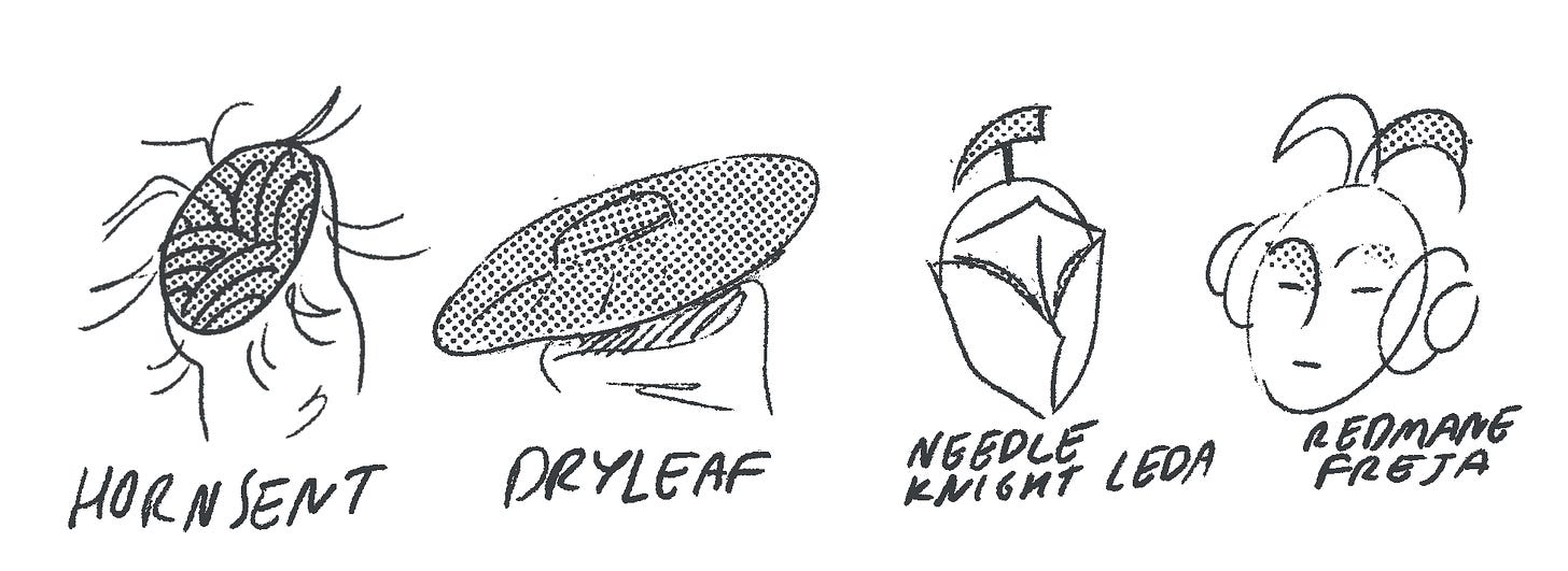
Faces have never been From Soft’s strongest suit, and in the DLC they made a brilliant decision to simply not show them. Pretty much everyone in Shadow of the Erdtree has their face obscured, with the exception of Miquella, who is the central figure of the story. In this decision, Miyazaki & co aren’t just tightening the art direction by omission, they are also doing it in a way that’s organic to the story and the setting. In this world, the masks these characters wear feel more appropriate than whatever faces they are hiding, and in that sense, it’s not that dissimilar to the writers of Peep Show withholding the lore of Sophie’s birthday ritual—see the previous post:
Facial Punctuation in Consequential Nation
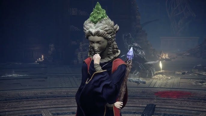
The mask designs are subtle, but expressive. Despite the high level of detail, all of them can be reduced to punctuation—they are memorable, a little otherwordly, and each one feels perfectly matched to the character. In the main game, I was particularly fond of the Raya Lucaria statue heads—when most cgi people create old statues, they spend hours on textures and cracks, but leave the structure untouched, which just feels incongruous and fake.
Sorceress Sellen’s adopted face has the worn smoothness of the artifacts you’d find in John Soane’s and other museums, it doesn’t feel like a prop created for this one purpose. There’s a history implied in the its surface. Also, it’s just beautiful and serene, completely at odds with the pretty horrific stuff that happens with the characters. There’s that melancholy dignity that Miyazaki always goes on about.
FOGHORN RESUMES
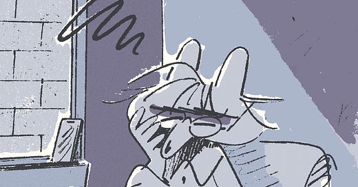
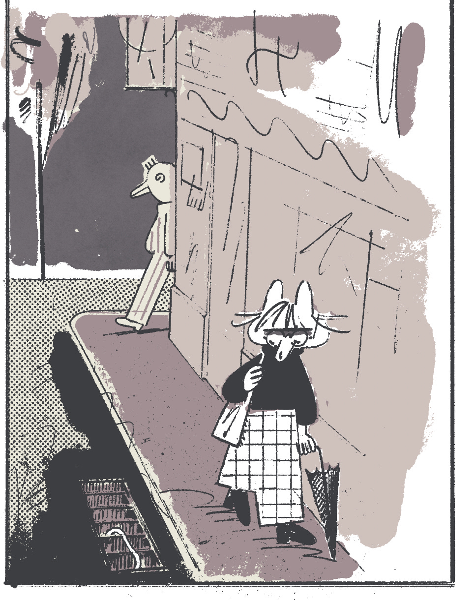
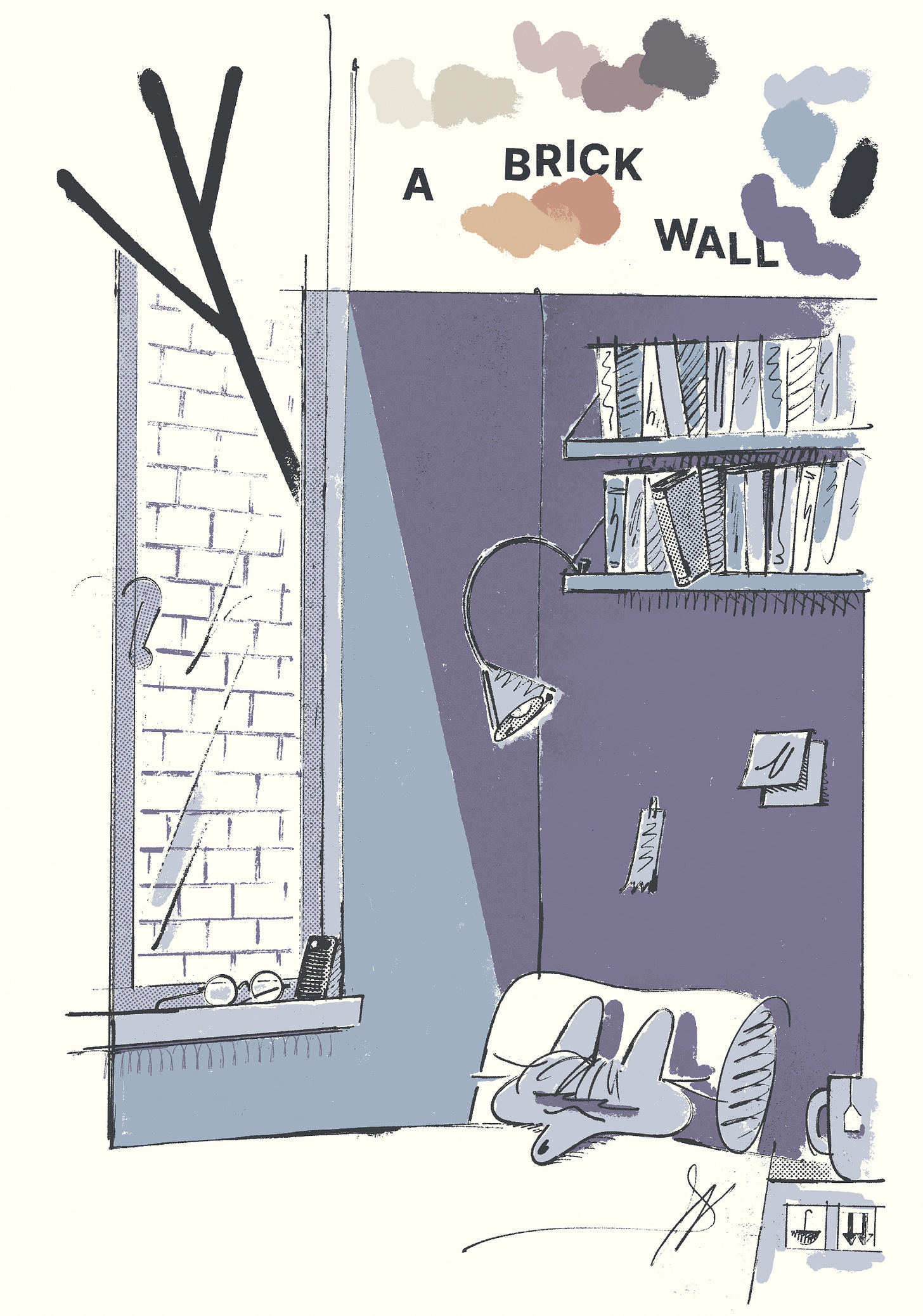
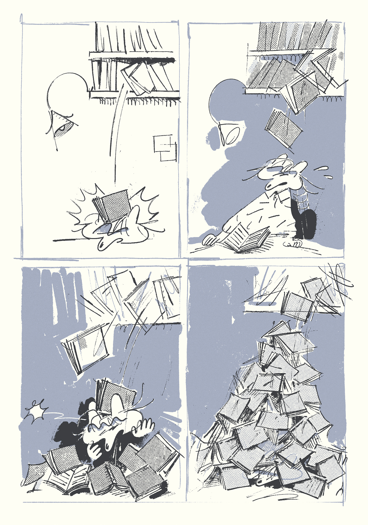
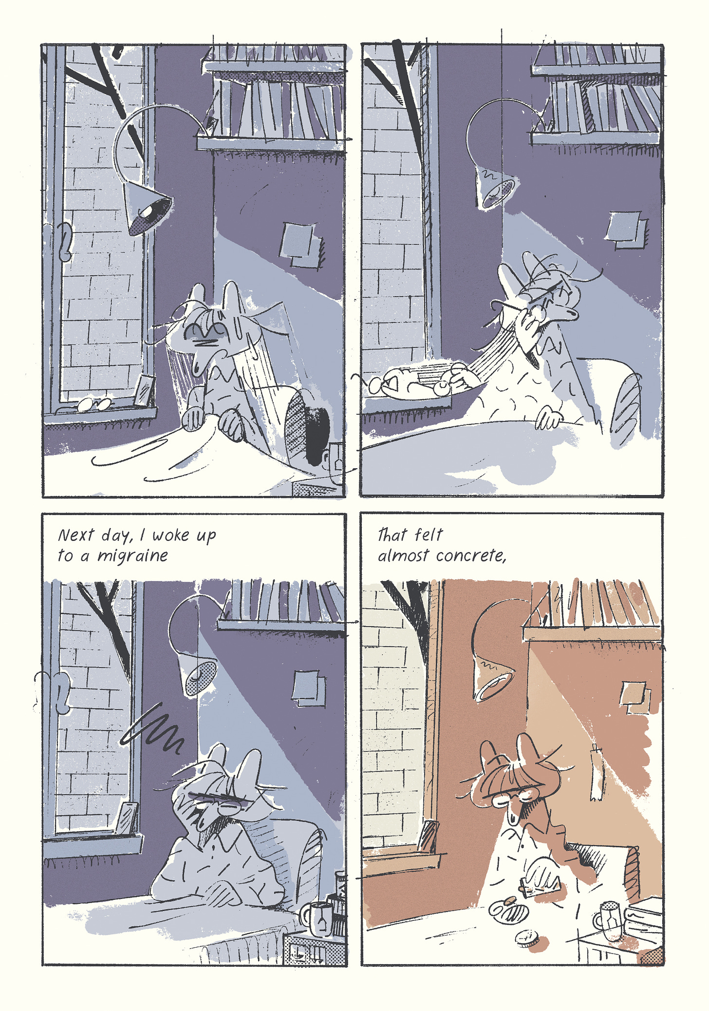
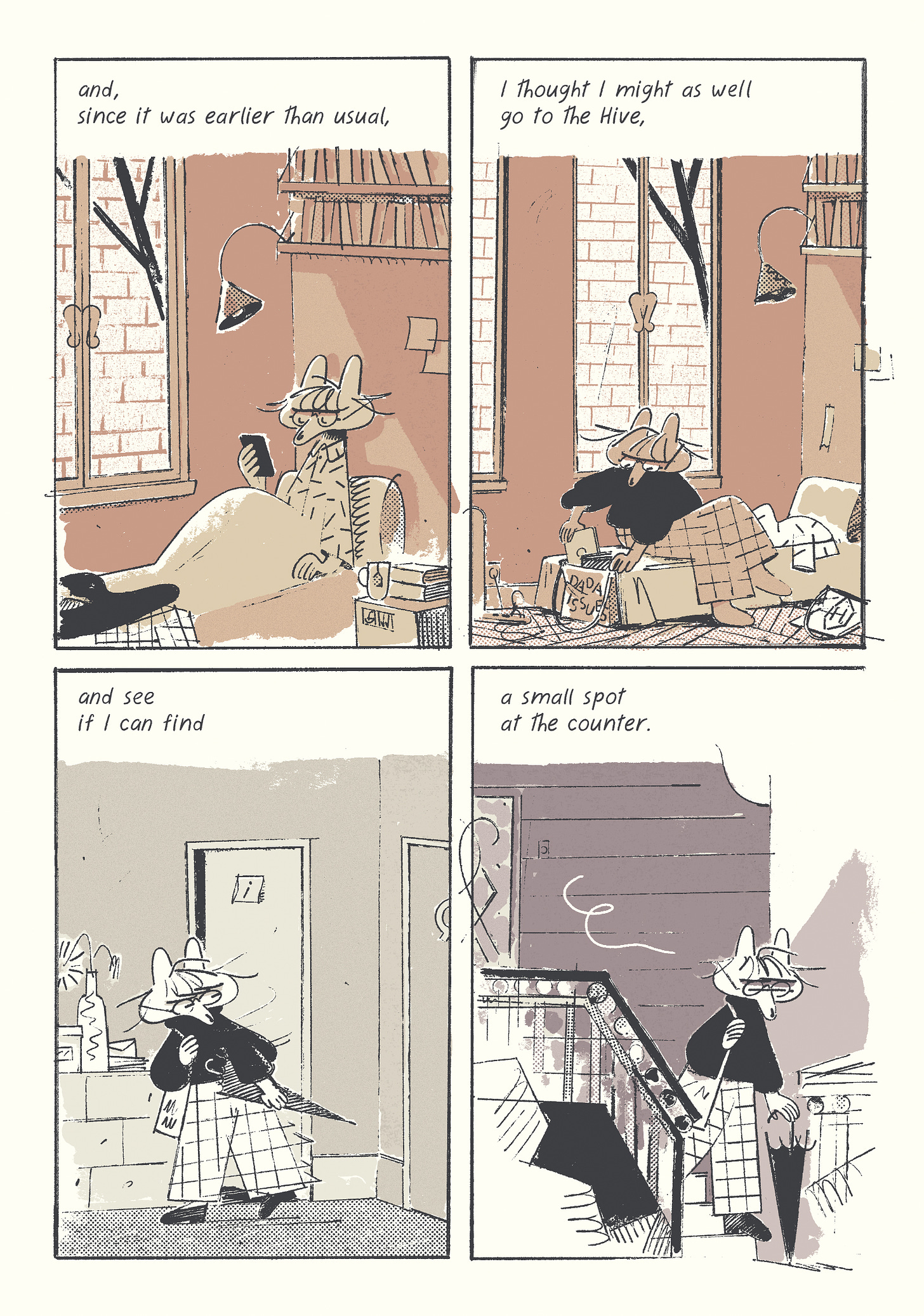
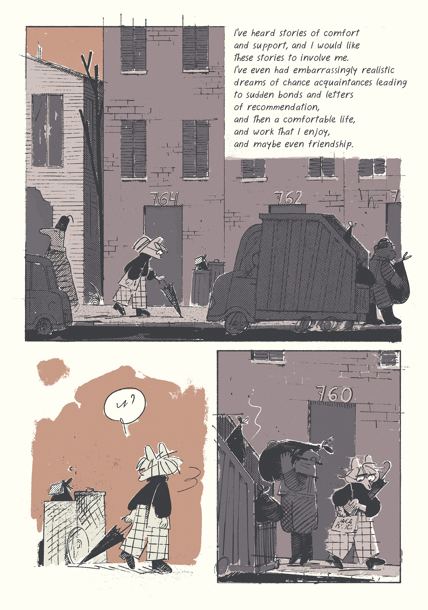
If you’re new, this is my ongoing story about the creative class in its various permutations. Moving on, I’m only going to serialize it in the paywalled section of these mid-month posts, since I imagine most casual readers aren’t going to follow along with something so long and slow.
By the time the comic is done and collected in a book, it will undoubtedly be rewritten and tightened up, so the stuff you’ll be seeing here is always a work in progress. That said, hopefully the second and third chapters will be a smoother ride than for the first one, which I edited a million times, and completely recolored at least once.
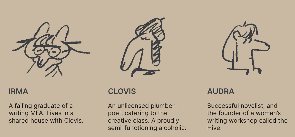
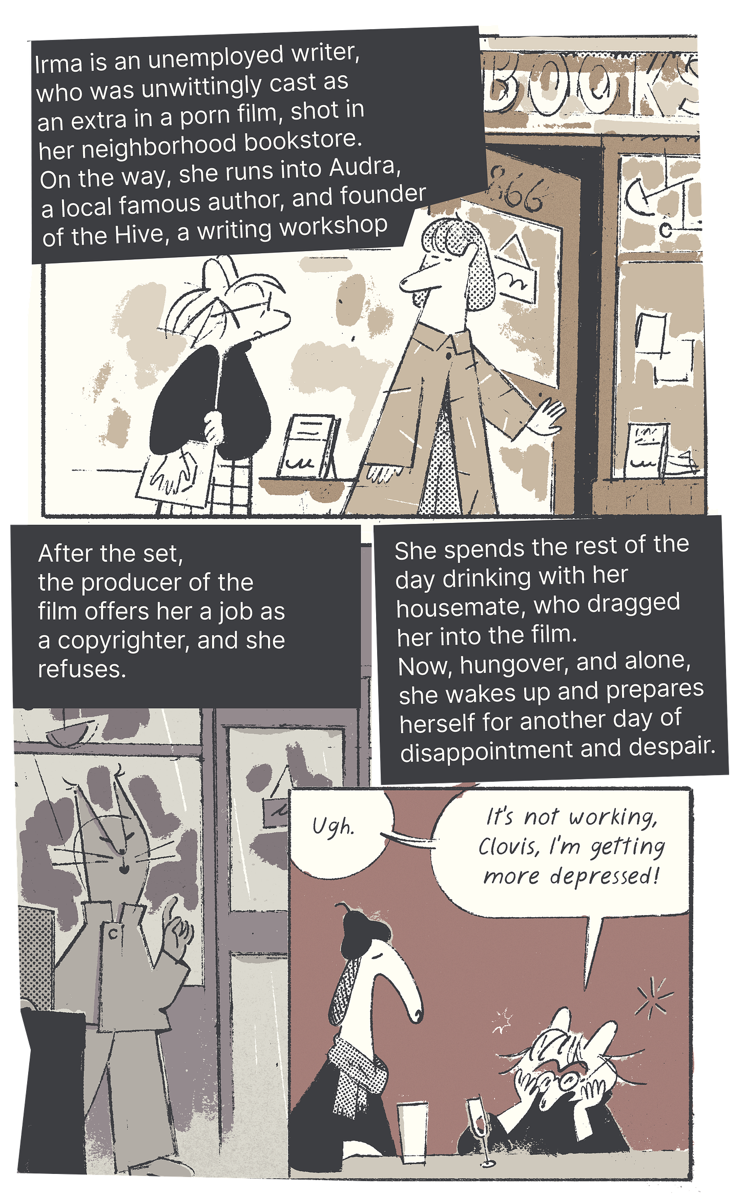
You can read the whole of that first chapter for free on this dedicated microsite—it even has a handy character sheet button. Or, if you have already read it, here’s a quick summary:
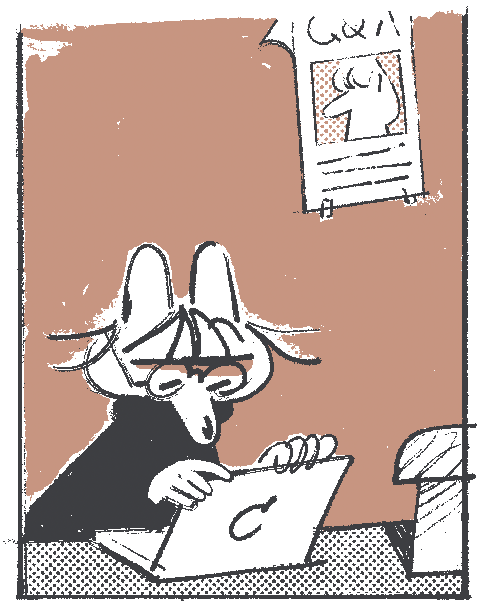
You can also buy a print version of the Uncorrected Proof, along with other comics and zines, Grafixx in Antwerp (Nov 21-24). I will be teaching a workshop in Brussels afterwards, btw. When I’m back in London-town, I’ll restock it at Gosh! Comics (thanks to everyone who bought a copy). Anyway, here’s the first 9 pages of the next chapter, half-paywalled for true Foghornheads:
The rest is behind the paywall, and that’s where it gets spicy.
Keep reading with a 7-day free trial
Subscribe to DADA issues to keep reading this post and get 7 days of free access to the full post archives.

