Facial Punctuation in Consequential Nation
awful political satire, more notes on character design, Tintin and Nabokov, omission and deceit
A message to Belgians: I’m going to Grafixx in Antwerp (Nov 21-24), where I’ll be selling my latest comics, zines and prints, and a potential surprise item. They will also be screening three of my animated films (along with those of other great experimental animators), and here’s a little intro page they have for me, in case you read my newsletter, but have no idea who I am.
Afterwards, I’m going to Brussels (Nov 25-27) to teach a workshop on the evening of the 26th, more info on that here. It’s part of Zine Club, curated by the excellent Joana Estrela, who also invited several other artists to teach their workshops, check them out.
PUNCTUATION, DRUG OF THE NATION
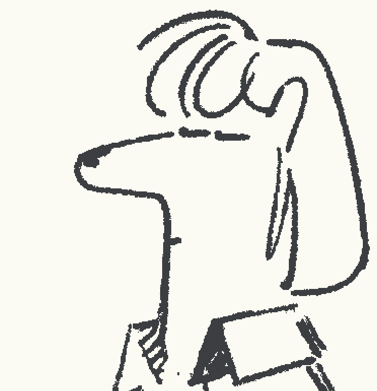
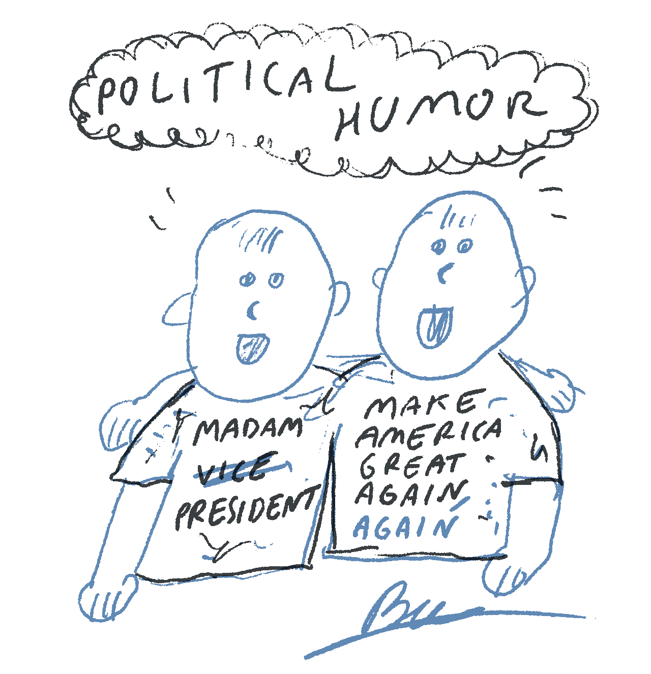
In my recent post on character design, I talked about good design as a balancing act between reference and shape. Since then, I’ve been thinking more about faces, and how expressions can naturally gravitate towards punctuation in the process of simplification and refinement.
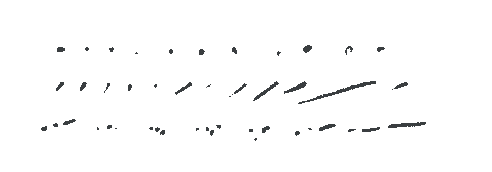
The thing I find fascinating in punctuation, is how much character these tiny dots and lines have. A comma, for instance, can have a ton of variation, depending on the way you draw it—it can be aggressive, humble, pointed, or plain. It can drive attention to whatever it’s bracketing, or take that attention away from it. The ellipsis is even better…
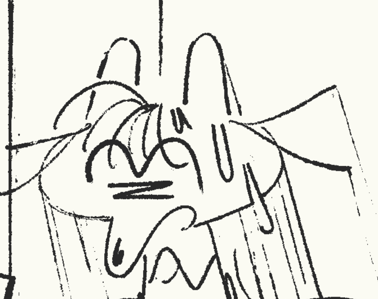
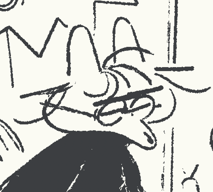
When I design the faces and expressions, a lot of the time the features begin to act like handwritten punctuation. I don’t spend much time polishing the drawings per se, but I can spend hours redrawing the eyes or mouth, looking for the right expression, and a way to get there with as few strokes as possible.
New Characters
The rightness of that expression has little to do with the quality of the drawing, it’s the same as editing a sentence—you want to arrive at a point, where nothing feels out of place, and sometimes that involves putting things out of place deliberately.
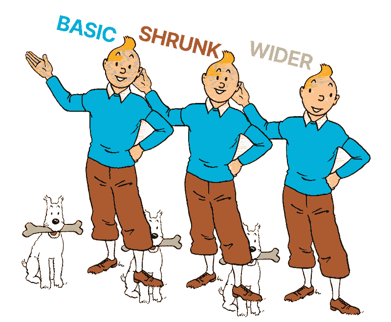
Tintin is a classic example of punctuation faces. Hergé had something of a vocabulary for these, and you often see him recycling the exact same expressions, hand gestures, etc.
In the visuals of Tintin, clarity and flow are probably the top priorities. Hergé’s aesthetics are pared down for the most effortless readability, and so it isn’t laziness or lack of flair, but pragmatism and focus on the narrative.
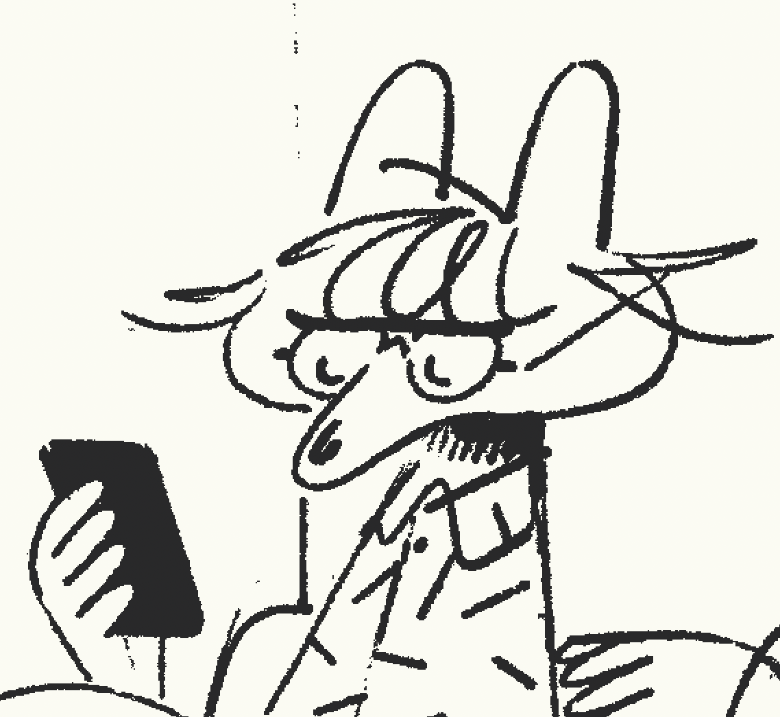
In the case of the comic I’m currently working on, the facial punctuation is fairly gestural. This is very much a byproduct of my impatience—I have tried to be studied and slow, and it always felt like an affectation. There’s a great Ivan Brunetti quote, something like “style is temperament”. Can’t escape your nature, g-d knows I’ve tried...
I also like to look at it as one of those mathematical equations where you can ‘shorten’ the hefty formula by grouping and crossing things out (no idea what the terms are in English). So, if you have a character with bangs, the direction and curvature of that stroke can remove the need for eyebrows.
Another aspect of it is my obsession with unfinishedness, and that elusive threshold between abstraction and familiarity. I often look for an expression that sits somewhere on that margin, without crossing it. There’s great allure in finding a stroke that gives enough of a hint at the expression without spelling it out—it’s the same thing as finding a combination of words that makes you see something familiar in a new way.
Btw, I will soon resume serializing Foghorn, this time for paid subscribers only, so make sure you sign up. Otherwise, evil wins.
WOOD FOR THE PNINS
As for written depictions, you can write something banal, like ‘she rummaged in her purse,’ or you can come up with something tortured like ‘her hand was swallowed up in the blackness of the small black satchel that hung about her waist,’ or you can find something that’s neither of these extremes, and that is often the hardest thing.
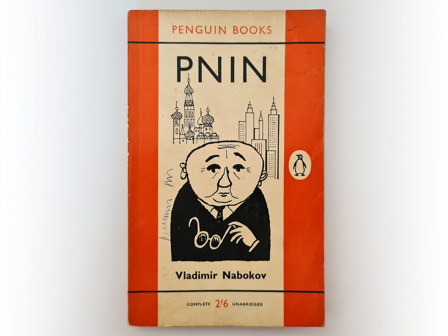
But it’s not just the choice of words, or the expression of the lines—their relative placement is just as (or even more) important. I wrote this in a ‘note’ about a sentence from Nabokov’s Pnin the other day, and might as well copy-paste it here:
“He consumed a ham sandwich, ordered another, and consumed that too.“
Even if you don’t know anything about the character of Pnin, this one short sentence gives a pretty clear picture, and it does so through rhythm and syntax as much as through the actual content.
Nabokov could’ve written “he consumed two ham sandwiches in quick succession,” or “he consumed a ham sandwich, and then another,” or “he consumed a ham sandwich, ordered another, and consumed it too.” Once you start dissecting the words and their order, it becomes clear how deliberate the placement is, not just the obvious stuff like the repetition of “consume” (and the choice of that word in the first place), but also referring to the second sandwich as “that.”
Then the broader characterization—Pnin would’ve been a different fellow, had he consumed a ham sandwich, then bought a different kind of sandwich. Or if he saw all the sandwiches on offer, and bought two ham sandwiches at once, having perfectly estimated his hunger and preferences.
Nabokov’s version doesn’t paint a clear picture—Pnin is not plain dull, or unadventurous—there’s an ambiguity and a detachment that’s everywhere in the novel, if you zoom out. The sentence is a miniature of the paragraph/chapter/etc, the same way any given page in a graphic novel (in my case, at least) contains the entire book in its layout and style.
For the drawings, it’s a similar arrangement of easily readable, often repeated signs, and bits that are more spicy, to get at something more exact and capture something slippery. The distance between the eyes is always a funny adjustment—even a slight variation can completely change the expression. When eyes are closer together, the face tends to make things cuter, when they are further apart, the expression gets dumber.
IRRELEVANCY STATEMENT
I’ve also been thinking more about familiarity, and how it relates to everything, from humor to syntax, coloring things surprising, or dull. As an irrelevant almost 40-year old cartoonist, I no longer have the enthusiasm and curiosity of youth, which was always very limited in me anyway. Still, back when I was a wean, playing any video game felt like entering a new dimension, now I scroll through my steam library, pick something for half hour and lose interest immediately.
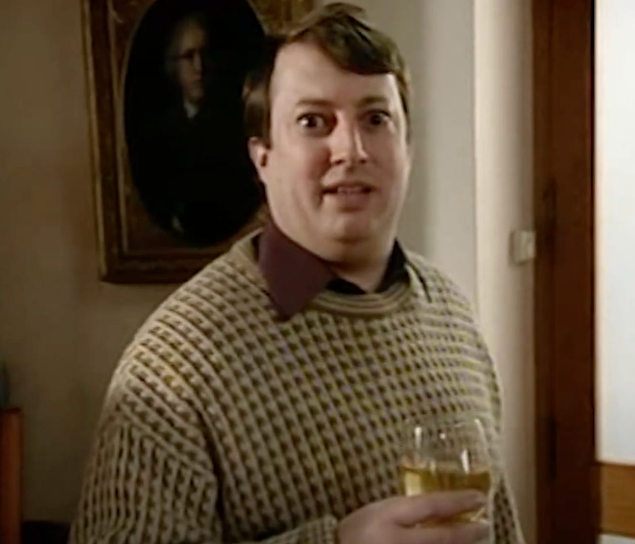
Practically everything feels trite and predictable, and whenever I hear of some important new media that everyone must have an opinion on, NOW, I just want to die and take the world with me. This line from Peep Show is getting ever more relatable.
"Should I get an Elbow CD? Probably. And the Killing, and Mad Men, and an iPad, and everything. God, why won't everyone leave me alone?"
I had a birthday the other day, and as a result of that, I am now even more old. As a matter of fact, on that day I woke up with a hangover (from one pint), thinking of Sophie’s birthday scene from Peep Show season 4:
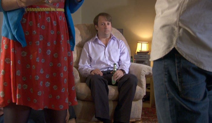
In it, Mark’s fiancé walks down the stairs of her family home, wearing a fancy hat, while her relatives are awkwardly singing a birthday song. We briefly see Mark’s bewildered face, then Sophie takes off the hat and says ‘this old thing.’ From what I know, one of the writers of the show shared a story about going to someone else’s birthday party and witnessing something like this, so they wrote it in.
The idea of unexpectedly stumbling upon another family’s ritual or inside joke, and being the only person in the room who has no idea what’s going on is very compelling, and it turned out to be an elegant and understated scene, one that could’ve been easily butchered by showing or saying just a little more.
We could’ve had Mark’s inner thoughts go ‘what the hell is this,’ which wouldn’t be out of place in Peep Show, or we could’ve had Sophie, or her relatives, explain this tradition, maybe spicing it up with some extra jokettes milking the last drops out of the comedy teat. Instead, we are simply allowed to be confused along with Mark, and the awkwardness is left alone to simmer and linger. That lack of closure is what makes it memorable.
By the way, I always thought the song in the show is something made up, part of the ritual, then I heard it on the radio in the Fruit & Nut section of a grocery store, and thought I was losing my mind or shifting realities. Turns out, it is a real song by the Scottish new wave band Altered Images.
That’s it for today’s content gumbo. Log off.


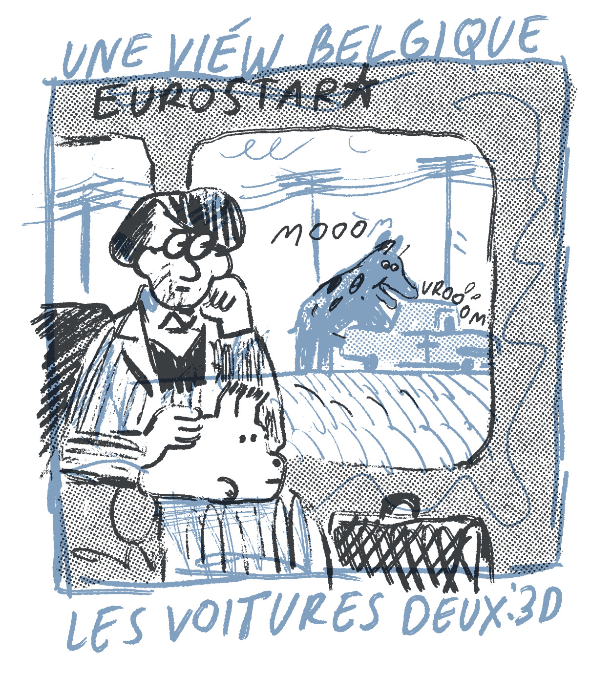
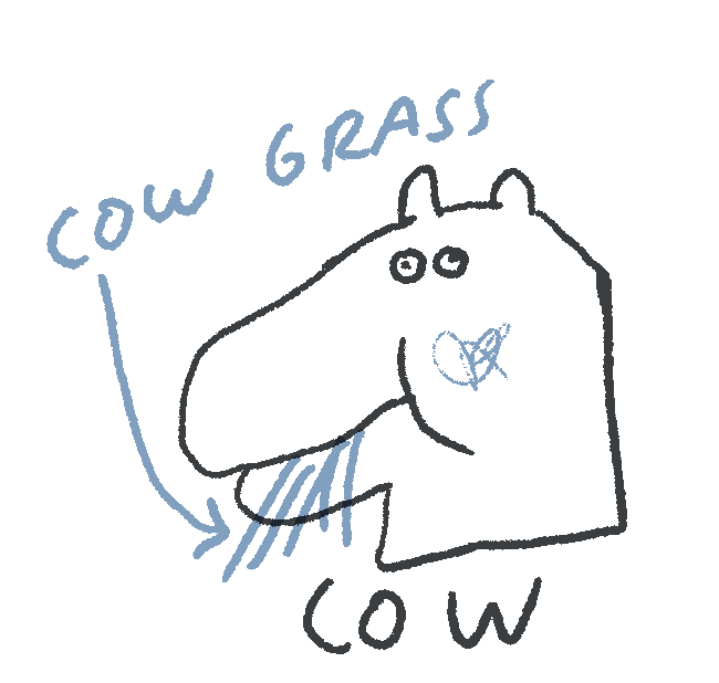
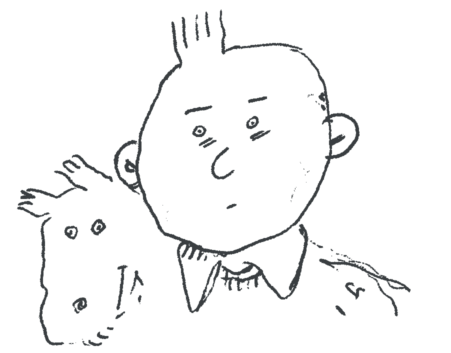



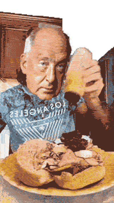
You are right. It’s good writing. On a practical note, I always order one espresso, drink it, order another, and drink that too. Never a double espresso, nor two at one time.
My honest feelings while reading: - ; , , … (some are just punctuation).