

All the Living
All the Living
french nano-tour/new book/new riso/more cool sites/animation picks

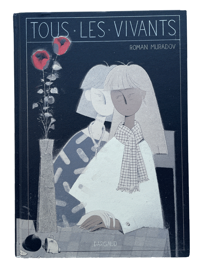
This month’s newsletter is early, because my new book is out TODAY! It’s my most straightforward graphic novel so far—a melancholy ghost story with a literal silver lining on the cover. You can buy it from Dargaud, or in person from a French bookstore, and if you’re in Paris, I’ll be signing the book on:
Wednesday the 25th, 15h – 18h: Bulles en tête, 235 bis boulevard Vaugirard
Thursday the 26th, 18h30: Atout Livre BD, 54 Bd de Reuilly
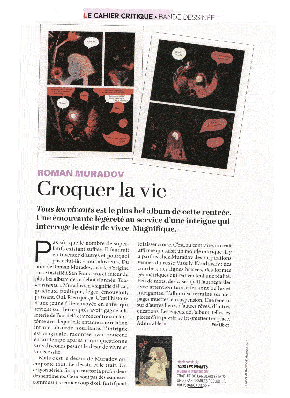
Please come by and tell your evil French friends! Here’s a 5-star review from Lire magazine, if you need to convince them. Here’s also an animated trailer from last month.
And then I’ll be at the Angoulême festival in the big tent (Stand MB 25, Le Monde des bulles, Place du Champ de Mars 16000). Here’s my current schedule, possibly subject to change, so double-check if you can:
Friday the 27th, 15h – 17h
Saturday the 28th, 13h – 15h
Sunday the 29th, 13h – 15h
I should mention that the book begins with a suicide. It’s not just about that, and I hope there’s plenty of humor and lightness too, but it’s definitely one of my bleaker books (was drawn through the pandemic and you can certainly tell), so consider yourself warned. There’s a bit more backstory here, and some more info/previews in French.

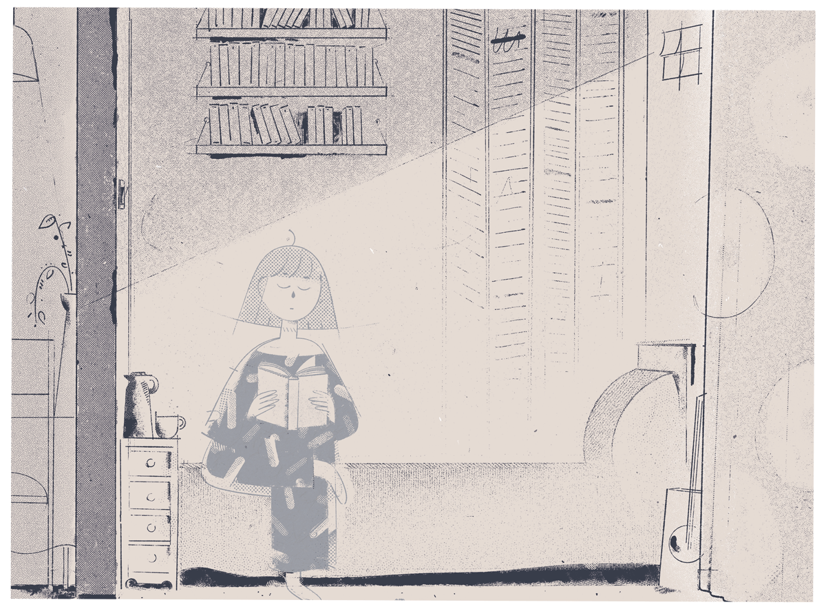
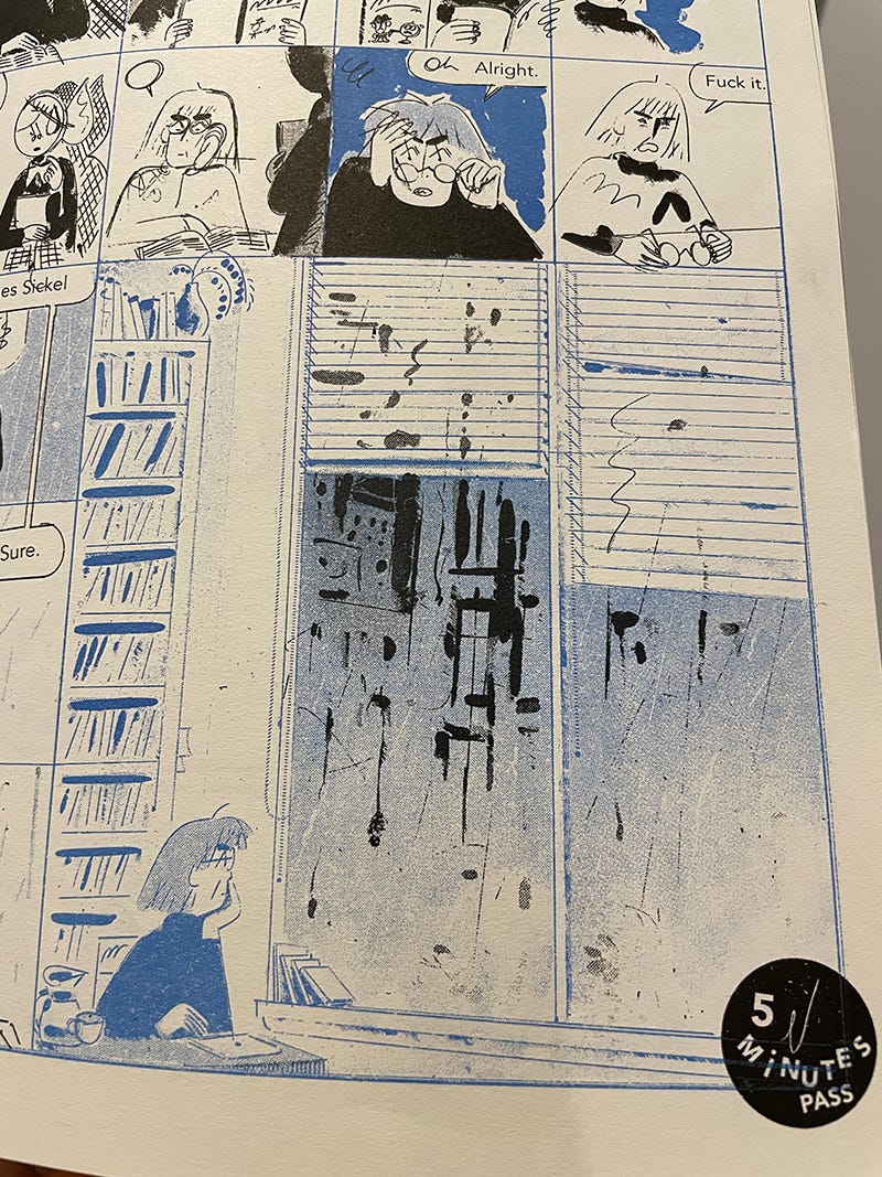
I’m also bringing a very limited edition of a new comic (and a bunch of old prints to give away for free) that I recently risographed in 2 colors and stapled myself, just like grandpa used to. Unlike the new book, which is long, quiet and sensitive, this comic is short, nasty and brutish. From now on Roman just wants to have fun.
Also, following up on last month’s post about reworking one’s website, here’s a few more interesting examples that I remembered afterwards:
Michel Esselbrüegge has a pencil instead of a cursor, and it scribbles all over the place. The lines disappear when you click on one of the sections, which prevents it from getting overwhelming. His comic Link in Bio meanwhile is formatted for smartphones (though it works on desktop well, too), resembling instagram stories—another good example of utilizing format for storytelling.
Connor Willumsen has a very tight website, and the way he presents the sketchbook is in line with his aesthetics. Also note the color choice on the front page—the clashing red/grey (or maybe it’s just my color-blindness) is well-balanced by putting most of the important stuff on the lighter color, so that the viewer doesn’t have to endure reading on red more than necessary.
Molly Fairhurst has a clean irregular 3-column structure, which gives a nice break between walls of text. Also some draggable things. If you’re using cargo, note that you can adjust rotation on individual images—clicking on them de-rotates on zoom (it’s the button next to the gallery one, took me ages to realize that you can change properties on each image, not just the full gallery).
Brooklyn riso printers/publishers TXT Books have a very extra website that’s fairly easy to navigate despite all the nuttiness. It’s worth looking at the individual sites for each of the founders of the studio—there’s a good range, from minimalist to chaotic.
Finally, Catherine Lacey’s site is another great mess, very different from the sort of stuff that most writers do (wholesome biography, list of accolades and publications, picture with an animal). It makes sense to me—you’re not presenting the whole novel, so might as well use your website to do things that the novel can’t.
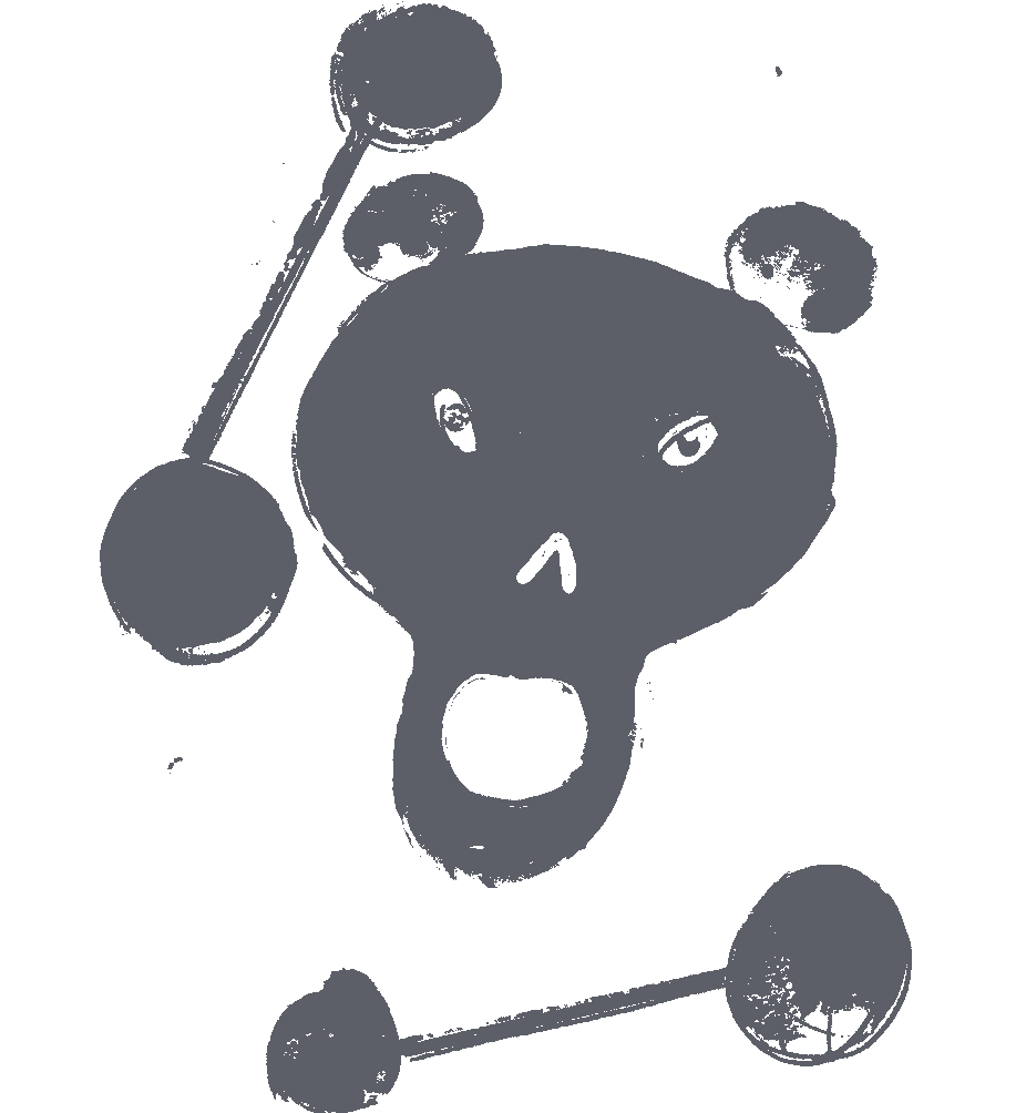
Yep, the cover of my mini-comic can be animated with a telephone! Whatever next.
Here are some more short animations that I’ve enjoyed recently. Hope to see you in France, or elsewhere! Thanks for reading, smash the button, spread the word, etc &c.